Independent identity projects I build for external clients ready to find a voice of their own.

Nimax

[x]
Nimax cover visual
About

Nimax is a digital agency from St. Petersburg—one of the oldest and most respected in the field. I've known the team for a long time. It started with their meetups, where I also took part in portfolio reviews. Joining their studio was a dream back then—one that eventually came true, along with several joint side projects. Later, the team trusted me to refresh a visual identity that hadn't changed in over five years. That was a real privilege. The result is a system that makes Nimax more digital, open, and modern.
Nimax visual 01
Nimax visual 02
Nimax visual 03
Nimax visual 04
Nimax visual 05
Nimax visual 06
Nimax visual 07
Nimax visual 08
Nimax visual 09
Nimax visual 10
Nimax visual 12
Nimax visual 13
Nimax visual 14
Nimax visual 15
Nimax visual 16
Nimax visual 17
Nimax visual 19
Nimax visual 20
Nimax visual 21
Nimax visual 23
Nimax visual 24
Nimax visual 25
Challenge

In the digital agency category, visual language is part of reputation. It has to read as current to clients who live in tech aesthetics themselves. Nimax's system hadn't been updated in over five years. It was dark, near-black, serious and premium, with 3D illustrations as its signature move. The task was to refresh and modernize the language without losing the recognition and weight built up over the years.

Solution

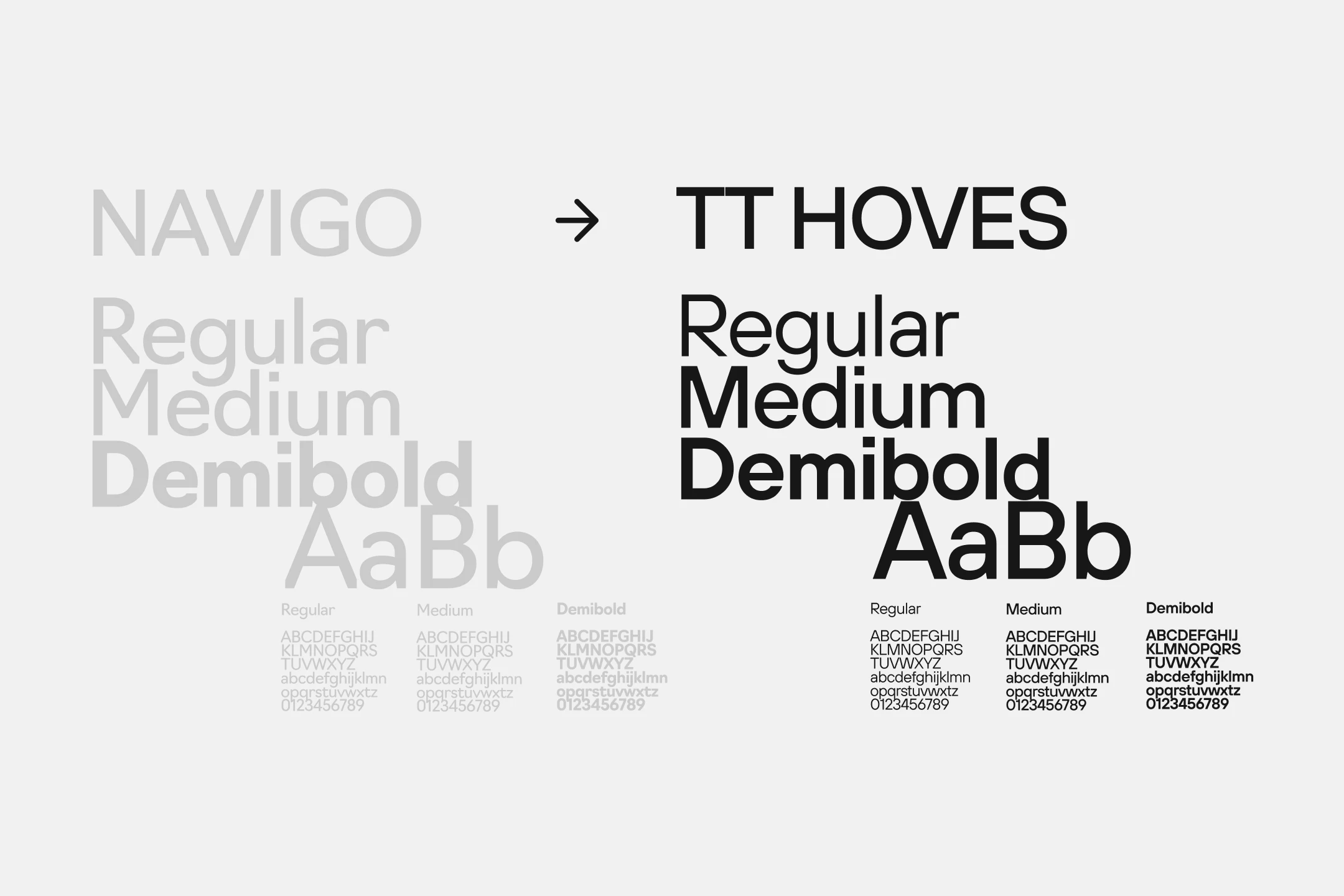
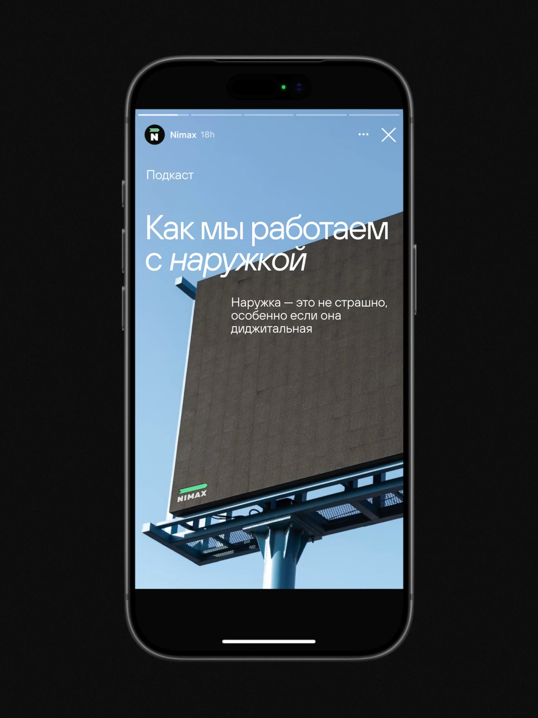
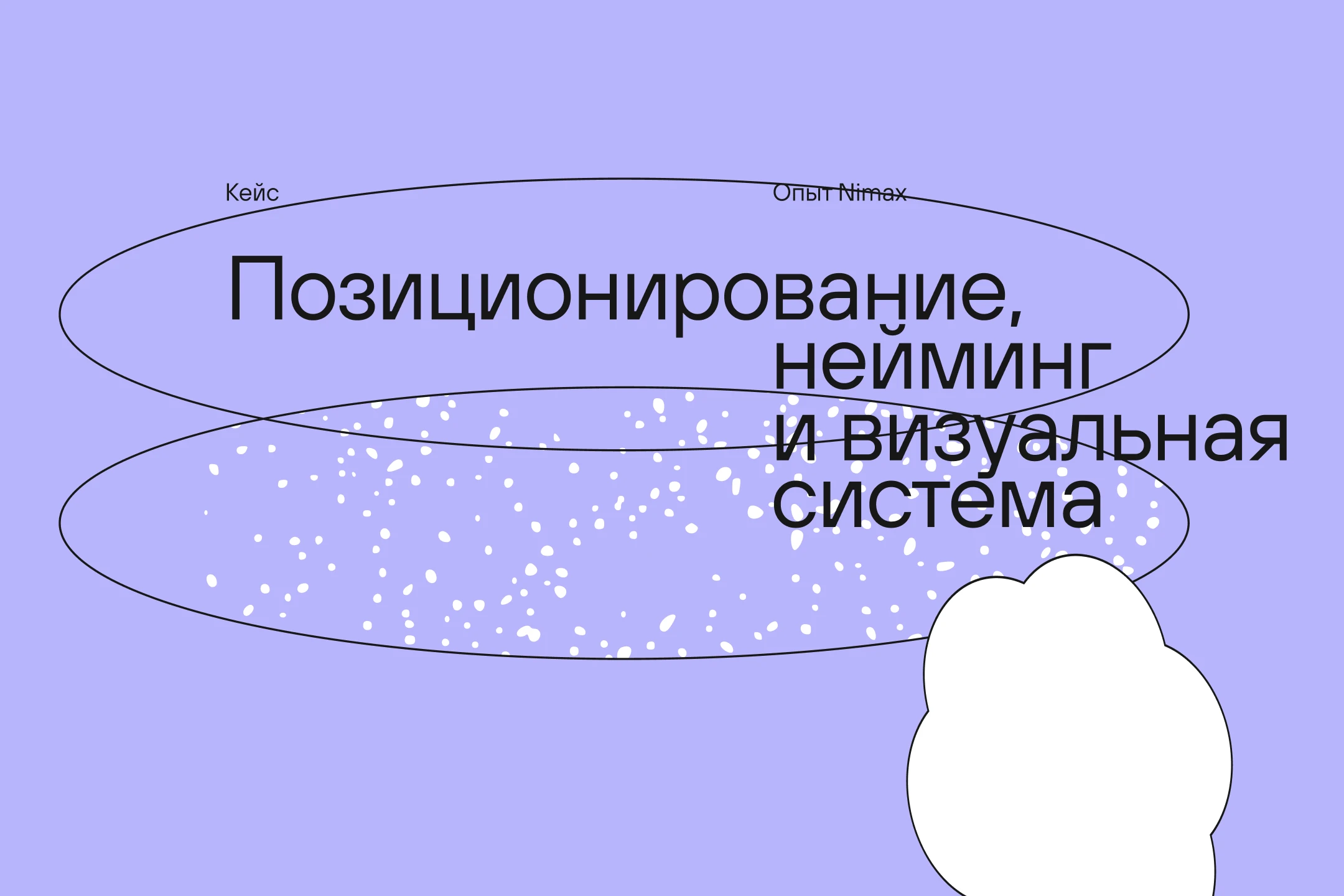
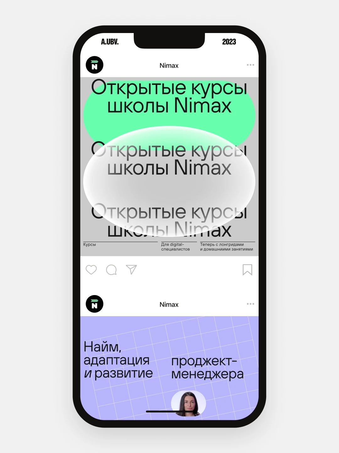
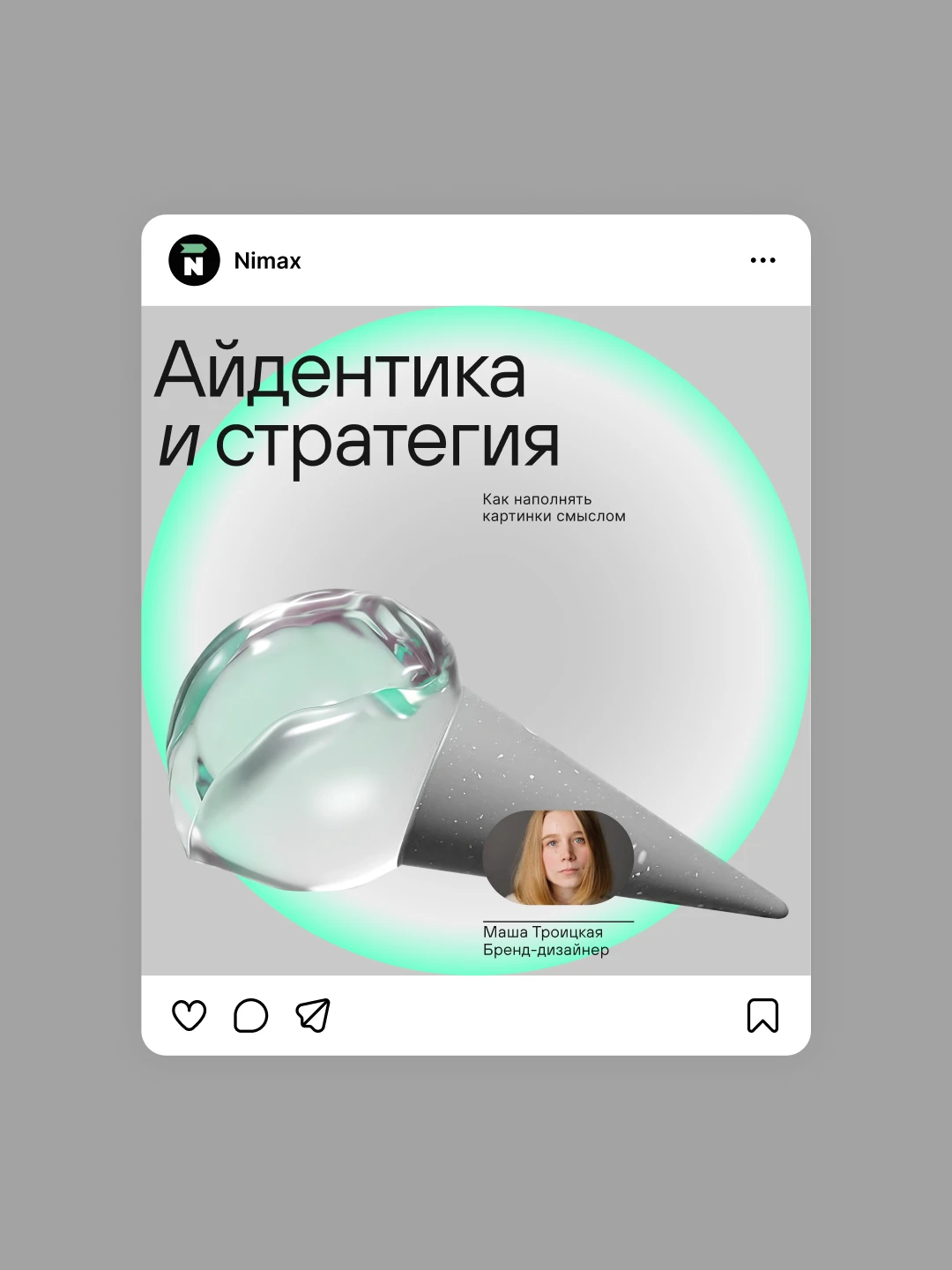
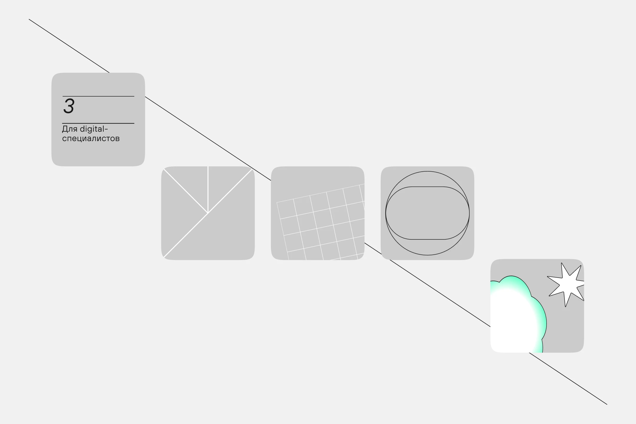
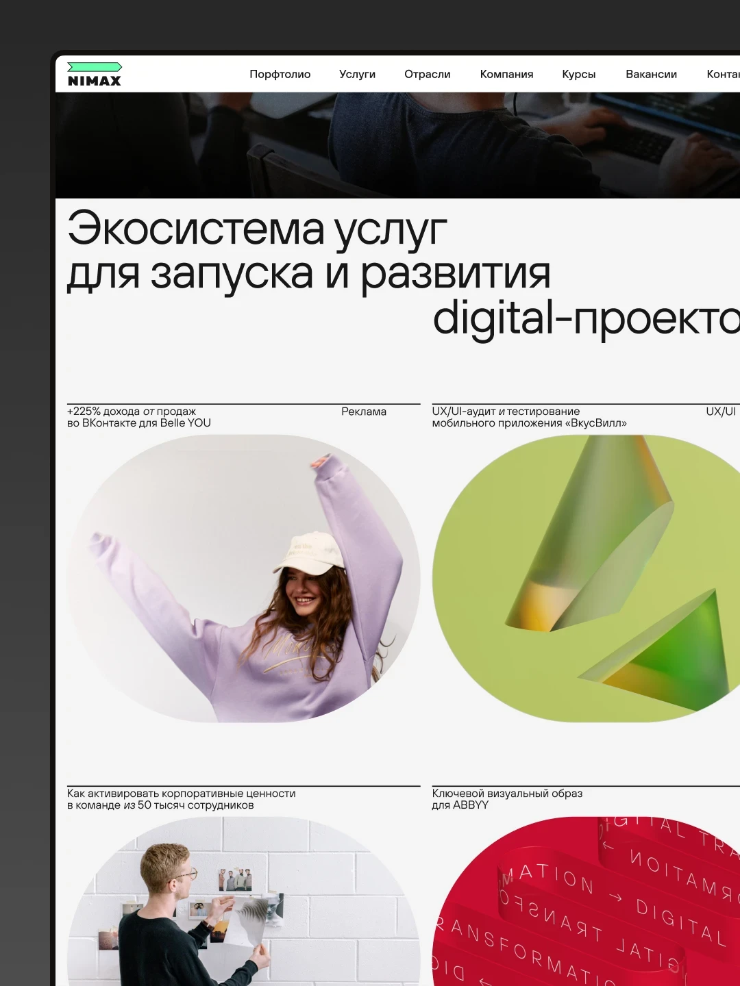
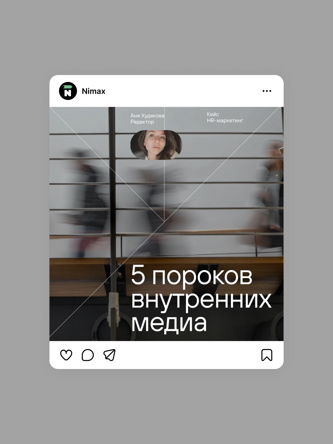
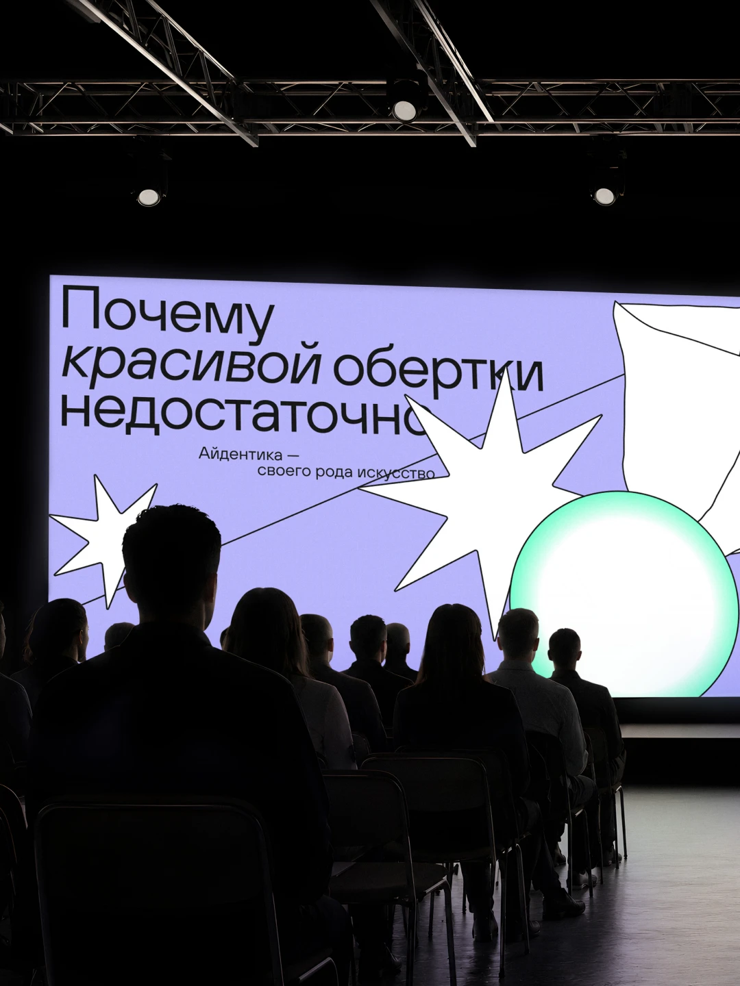
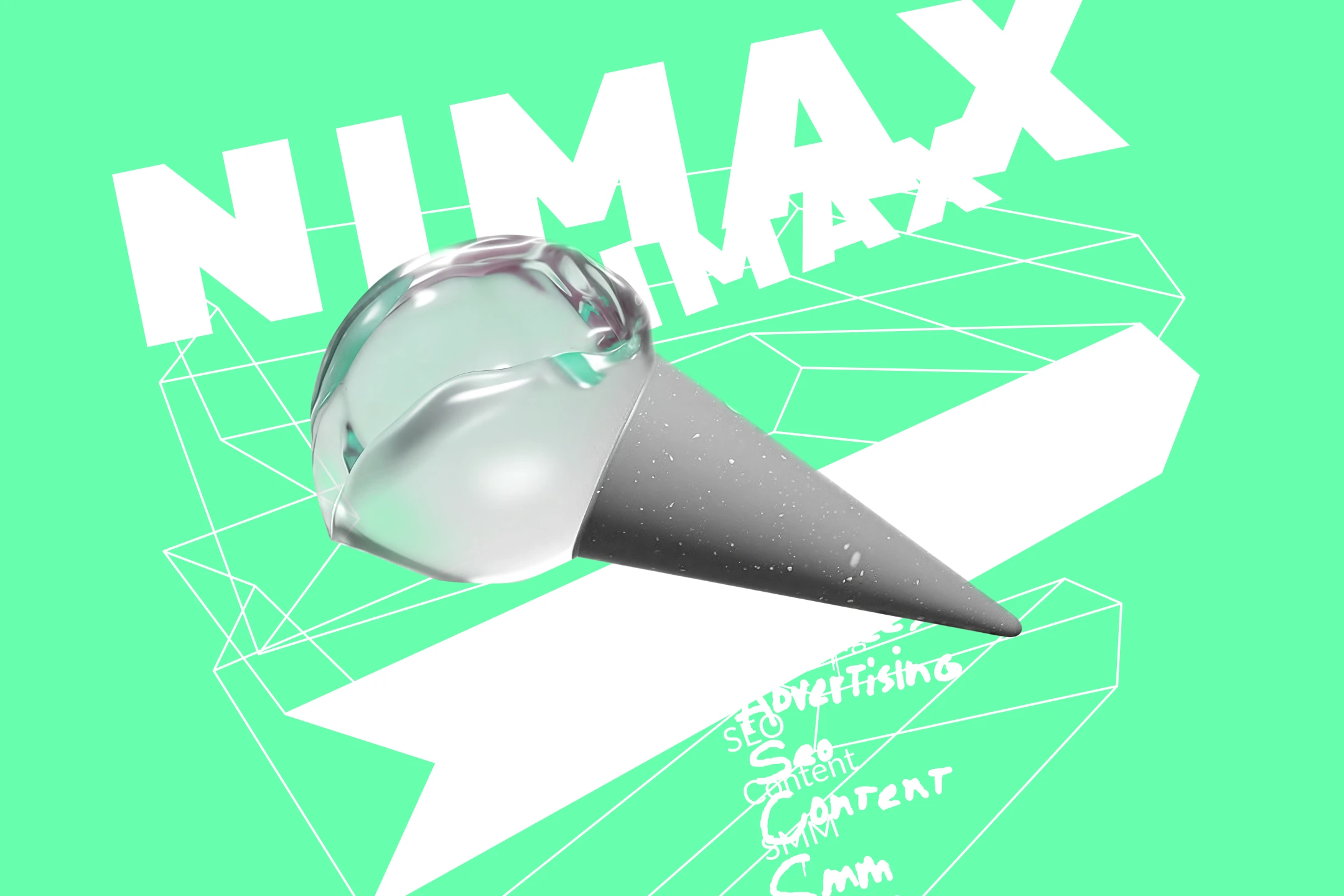
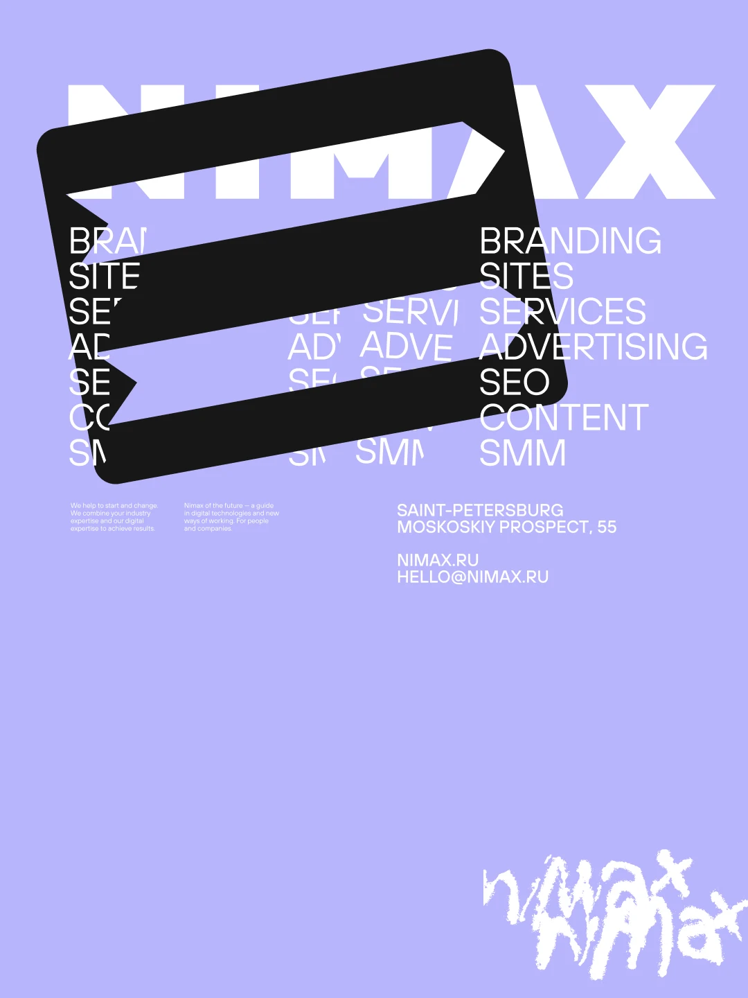
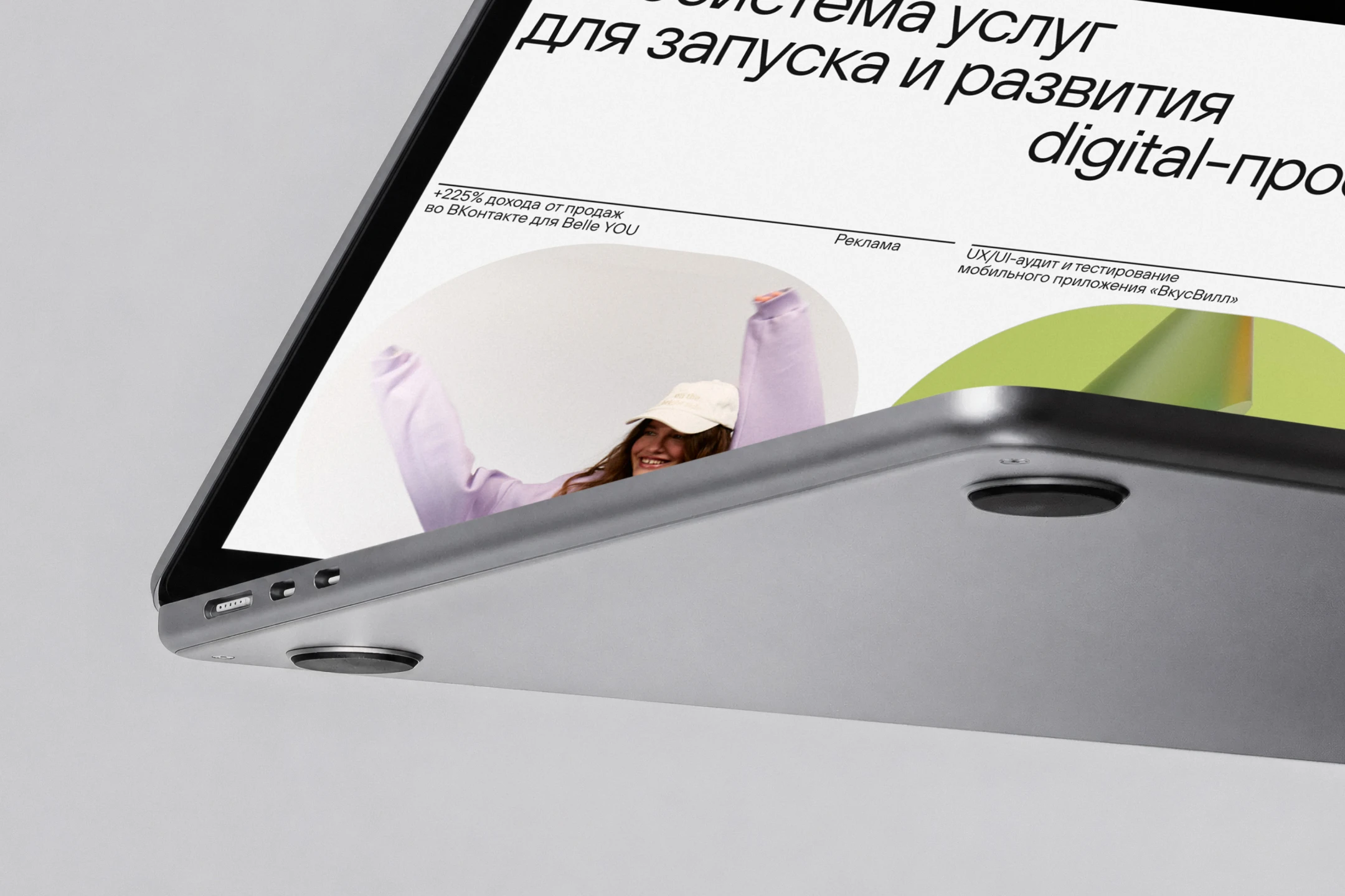
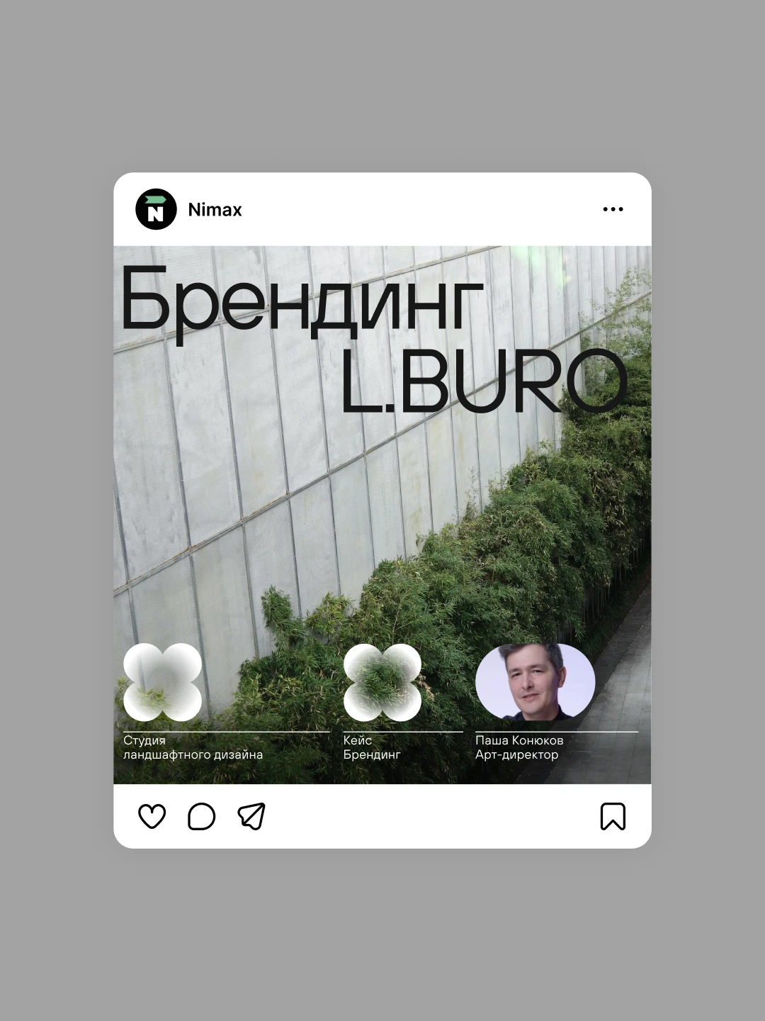
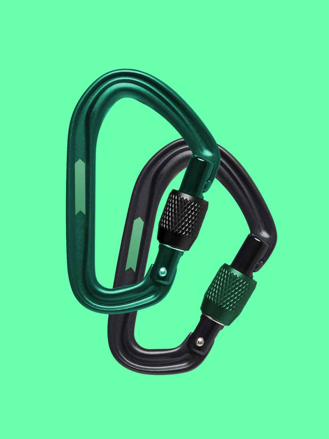
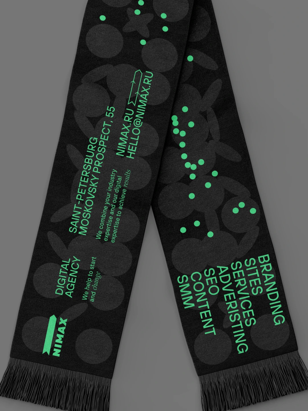
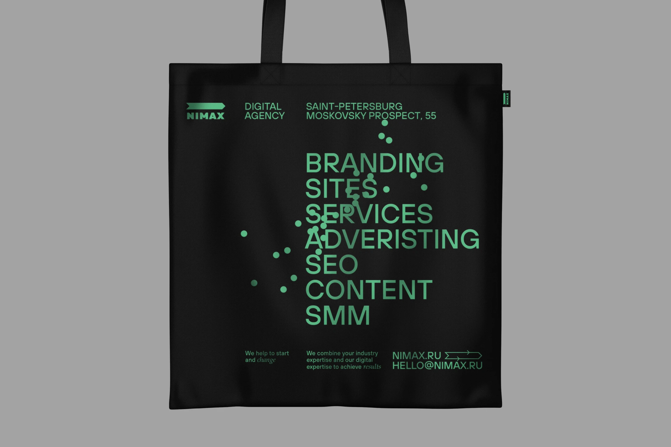
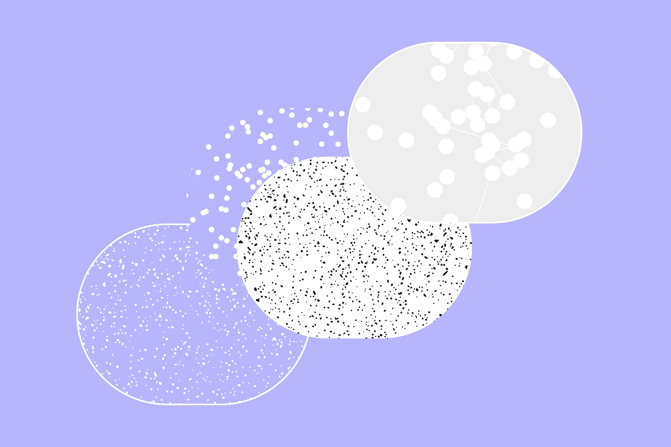
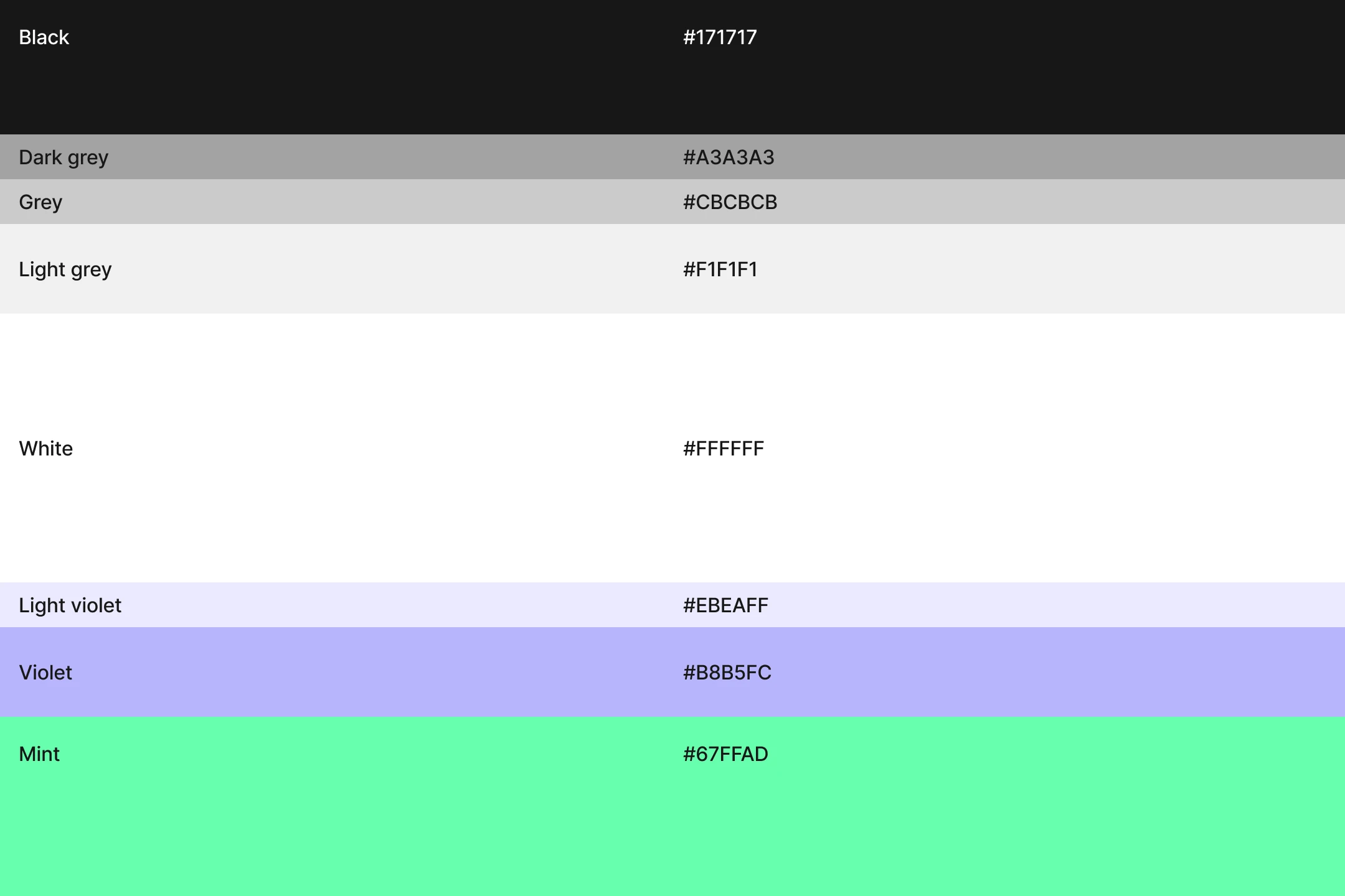
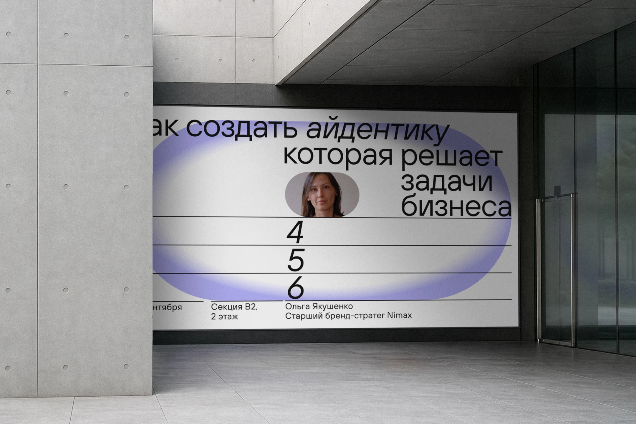
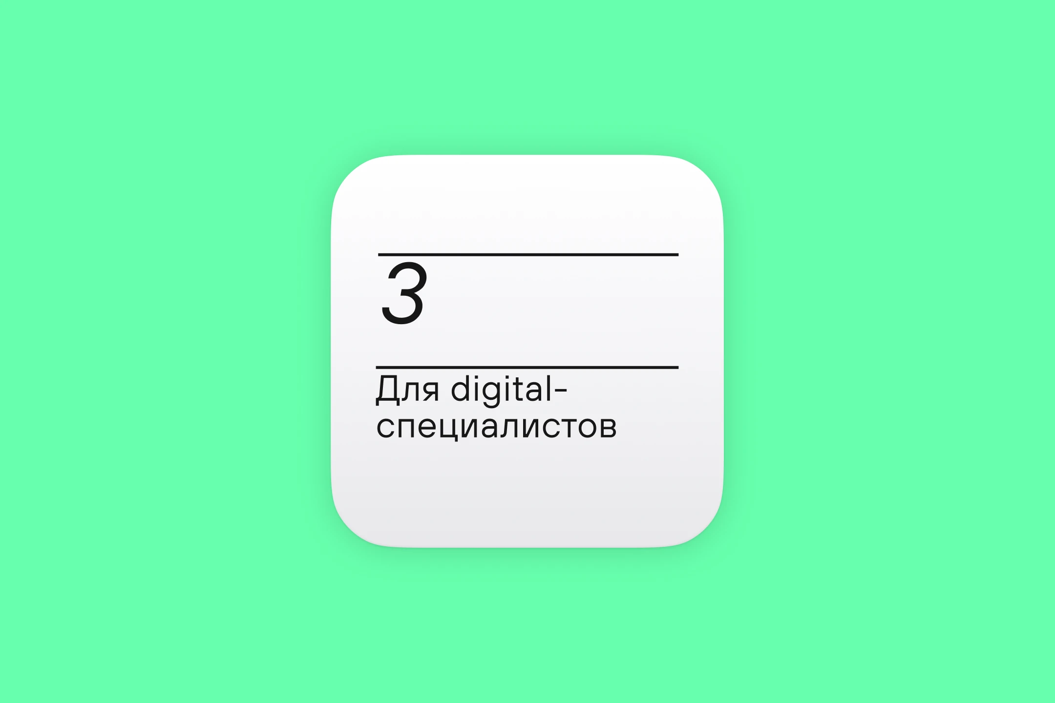
The core decision was to refresh Nimax's dark theme—opening it up toward a lighter, more technological future, and updating the color palette. Nimax's own groundwork became the foundation, including their base of 3D illustrations, the signature move carried into the new vibe. The dark base gave way to a light one, with vivid mint as the primary color and purple as a secondary accent, paired with the TT Hoves typeface. Aggressive caps were dropped from headlines, graphic tags were simplified, and large rounded shapes softened the system—while sharpness stayed where it holds the character: typography, dividing lines, type shifts. The system made it to physical objects too, with several merch items, including tote bags, actually shipping. Banner carousels now feature banners the Nimax team built on their own, without me, but within the style that was set—proof of how it kept living on. Sparking this change feels meaningful: the brand is now lighter, more modern, and more digital, with a foundation for its continued evolution.

Nimax [X]
Nimax cover visual
About

Nimax is a digital agency from St. Petersburg—one of the oldest and most respected in the field. I've known the team for a long time. It started with their meetups, where I also took part in portfolio reviews. Joining their studio was a dream back then—one that eventually came true, along with several joint side projects. Later, the team trusted me to refresh a visual identity that hadn't changed in over five years. That was a real privilege. The result is a system that makes Nimax more digital, open, and modern.
Nimax visual 01
Nimax visual 02
Nimax visual 03
Nimax visual 04
Nimax visual 05
Nimax visual 06
Nimax visual 07
Nimax visual 08
Nimax visual 09
Nimax visual 10
Nimax visual 12
Nimax visual 13
Nimax visual 14
Nimax visual 15
Nimax visual 16
Nimax visual 17
Nimax visual 19
Nimax visual 20
Nimax visual 21
Nimax visual 23
Nimax visual 24
Nimax visual 25
Challenge

In the digital agency category, visual language is part of reputation. It has to read as current to clients who live in tech aesthetics themselves. Nimax's system hadn't been updated in over five years. It was dark, near-black, serious and premium, with 3D illustrations as its signature move. The task was to refresh and modernize the language without losing the recognition and weight built up over the years.

Solution

The core decision was to refresh Nimax's dark theme—opening it up toward a lighter, more technological future, and updating the color palette. Nimax's own groundwork became the foundation, including their base of 3D illustrations, the signature move carried into the new vibe. The dark base gave way to a light one, with vivid mint as the primary color and purple as a secondary accent, paired with the TT Hoves typeface. Aggressive caps were dropped from headlines, graphic tags were simplified, and large rounded shapes softened the system—while sharpness stayed where it holds the character: typography, dividing lines, type shifts. The system made it to physical objects too, with several merch items, including tote bags, actually shipping. Banner carousels now feature banners the Nimax team built on their own, without me, but within the style that was set—proof of how it kept living on. Sparking this change feels meaningful: the brand is now lighter, more modern, and more digital, with a foundation for its continued evolution.

Scroll to top