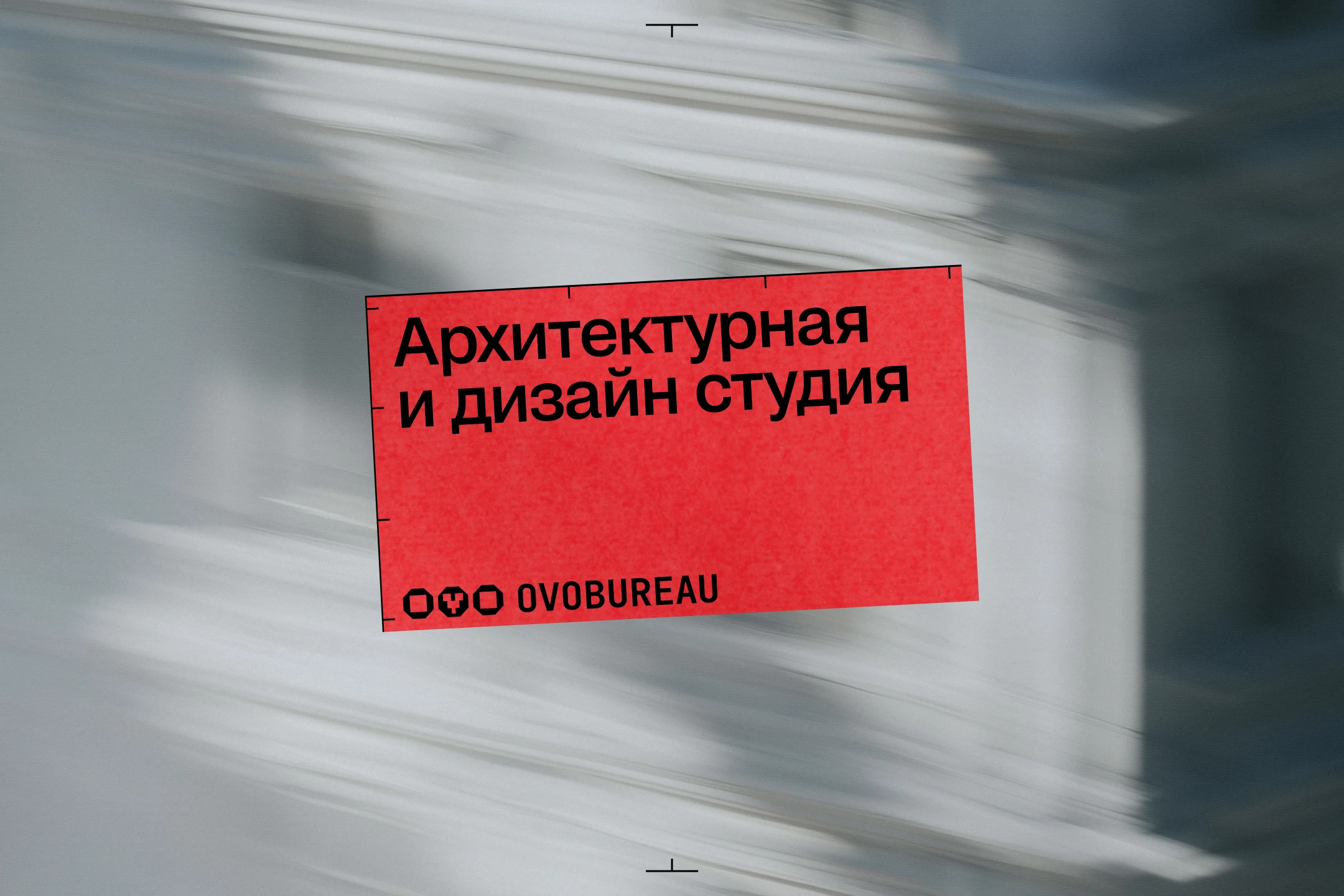
OVO is a full-cycle architecture and design studio, working across residential and commercial spaces, built on depth—not references or trends, but a client's character and inner contradictions turned into the foundation of every project. I designed the studio's logo earlier, and the founders loved the approach enough to invite me back for a full, scalable identity—the studio had grown, and it was time for a new level. Word of mouth carried the work, but the visual image never matched it: every touchpoint was solved from scratch, and commercial clients began choosing studios with more visual weight instead. The task was a visual language that speaks for the studio before any conversation does.
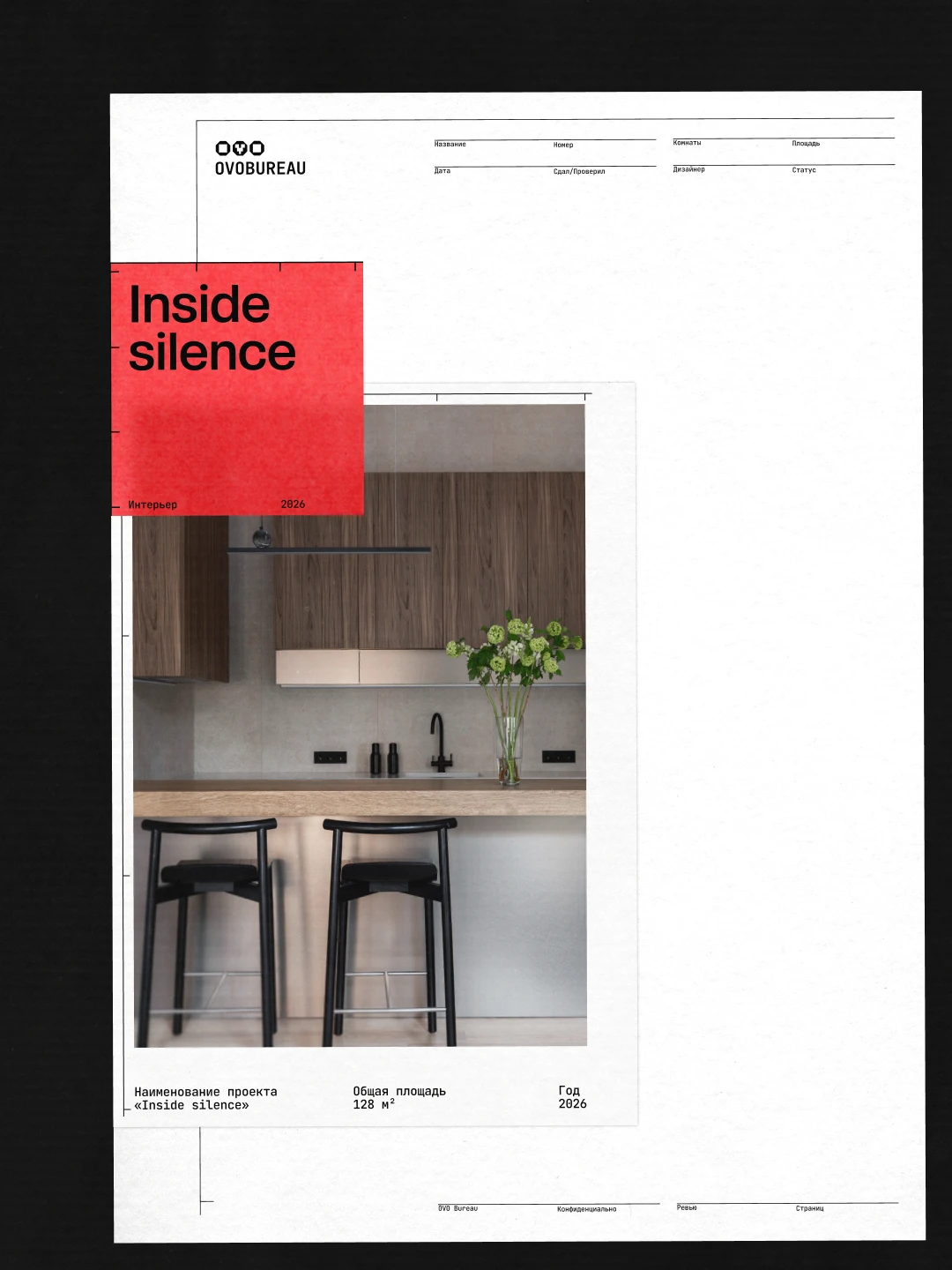
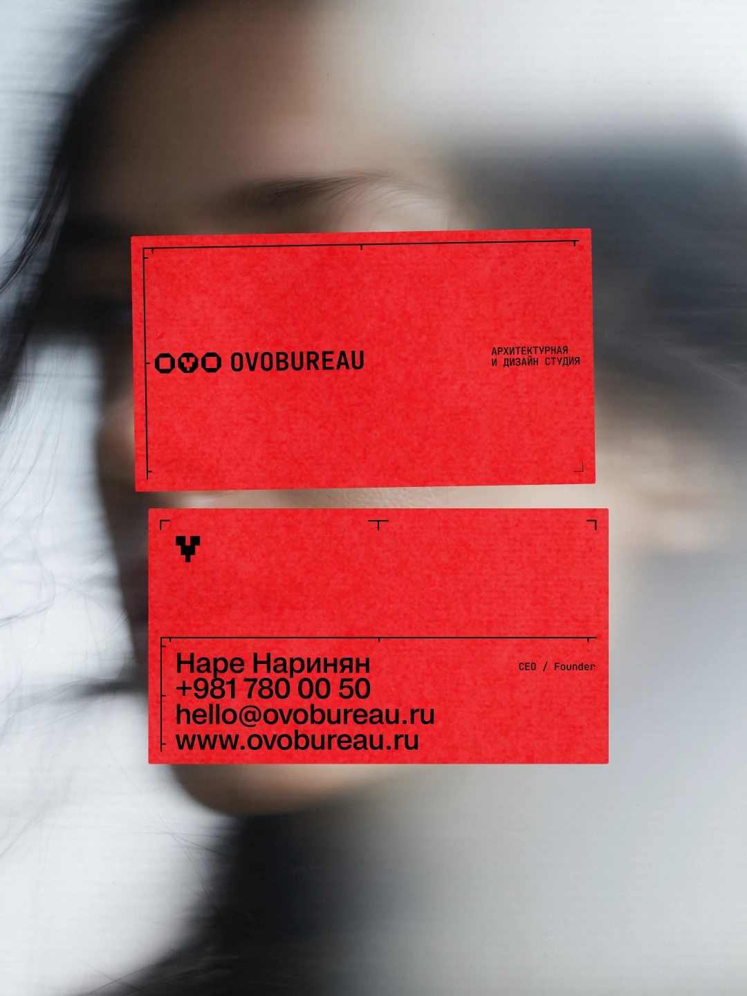
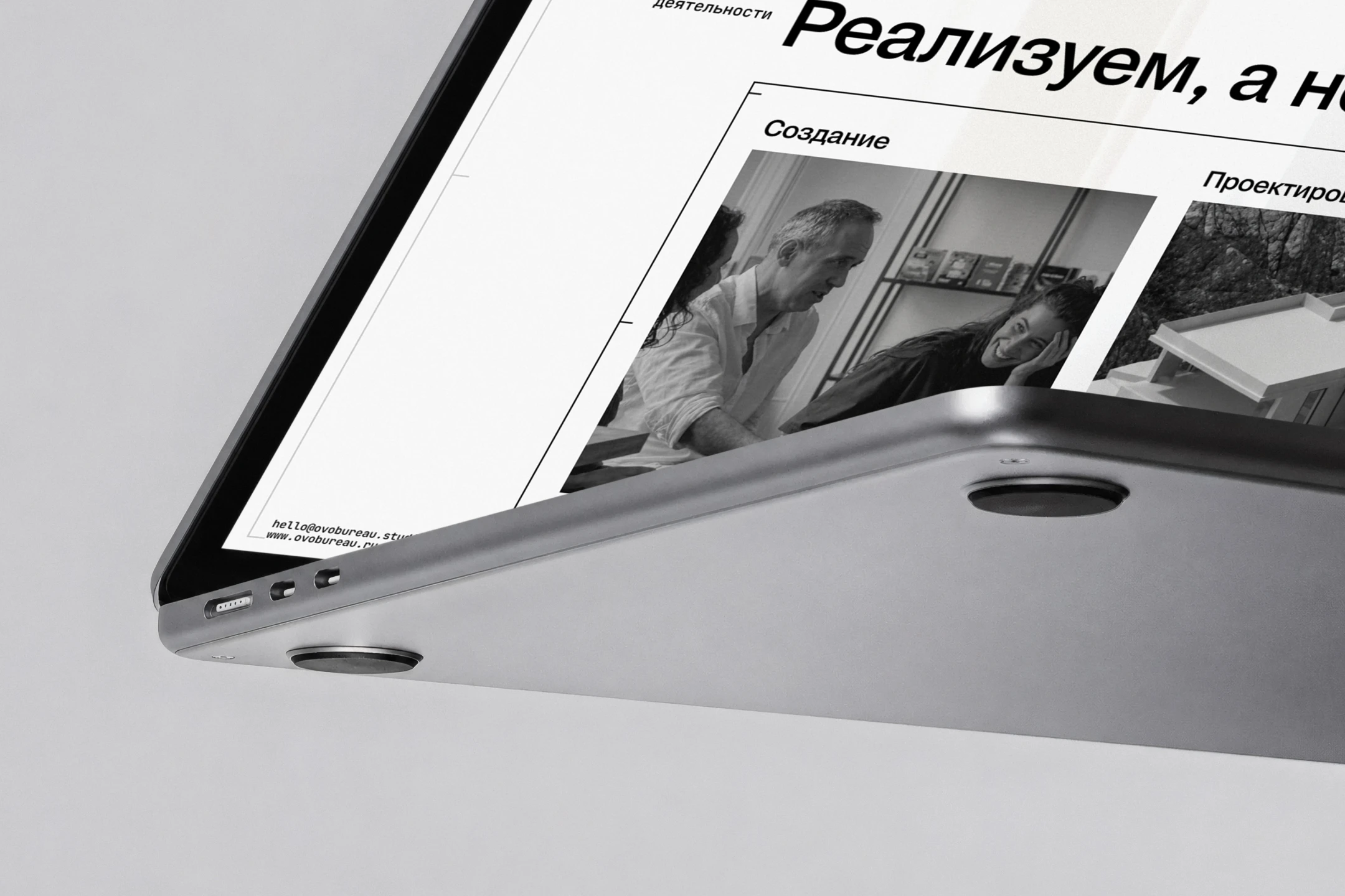
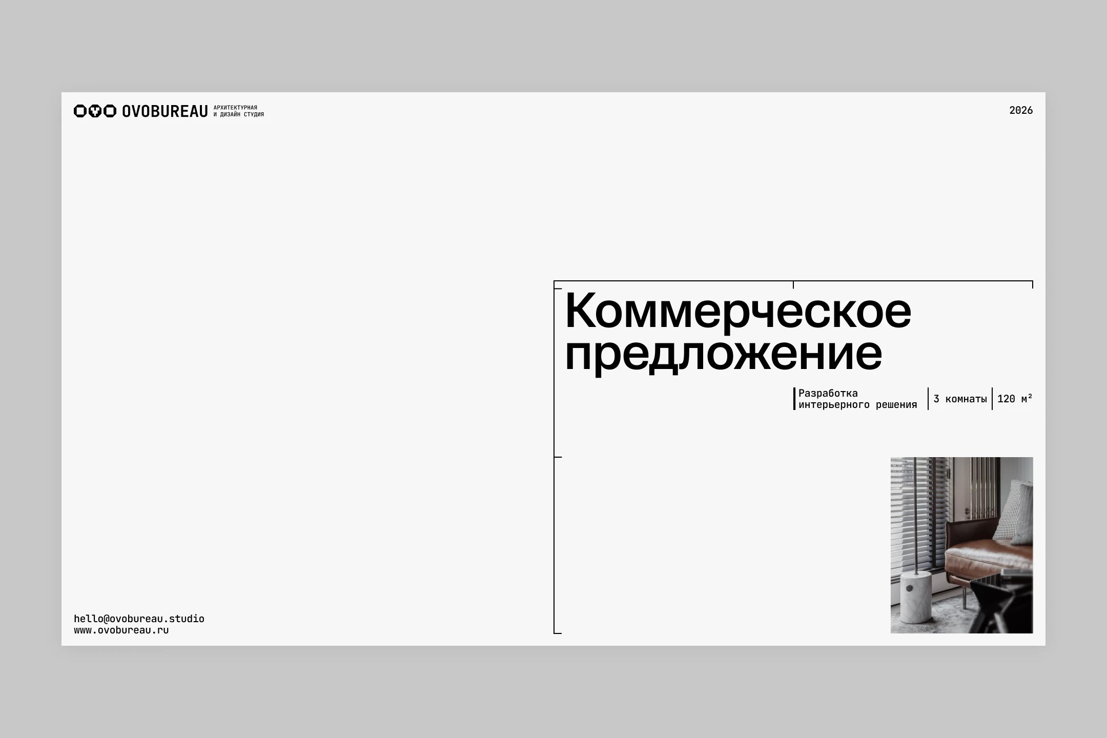
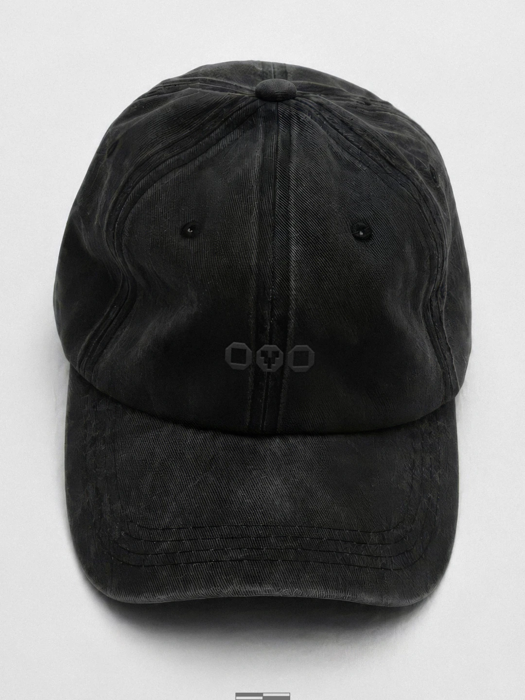
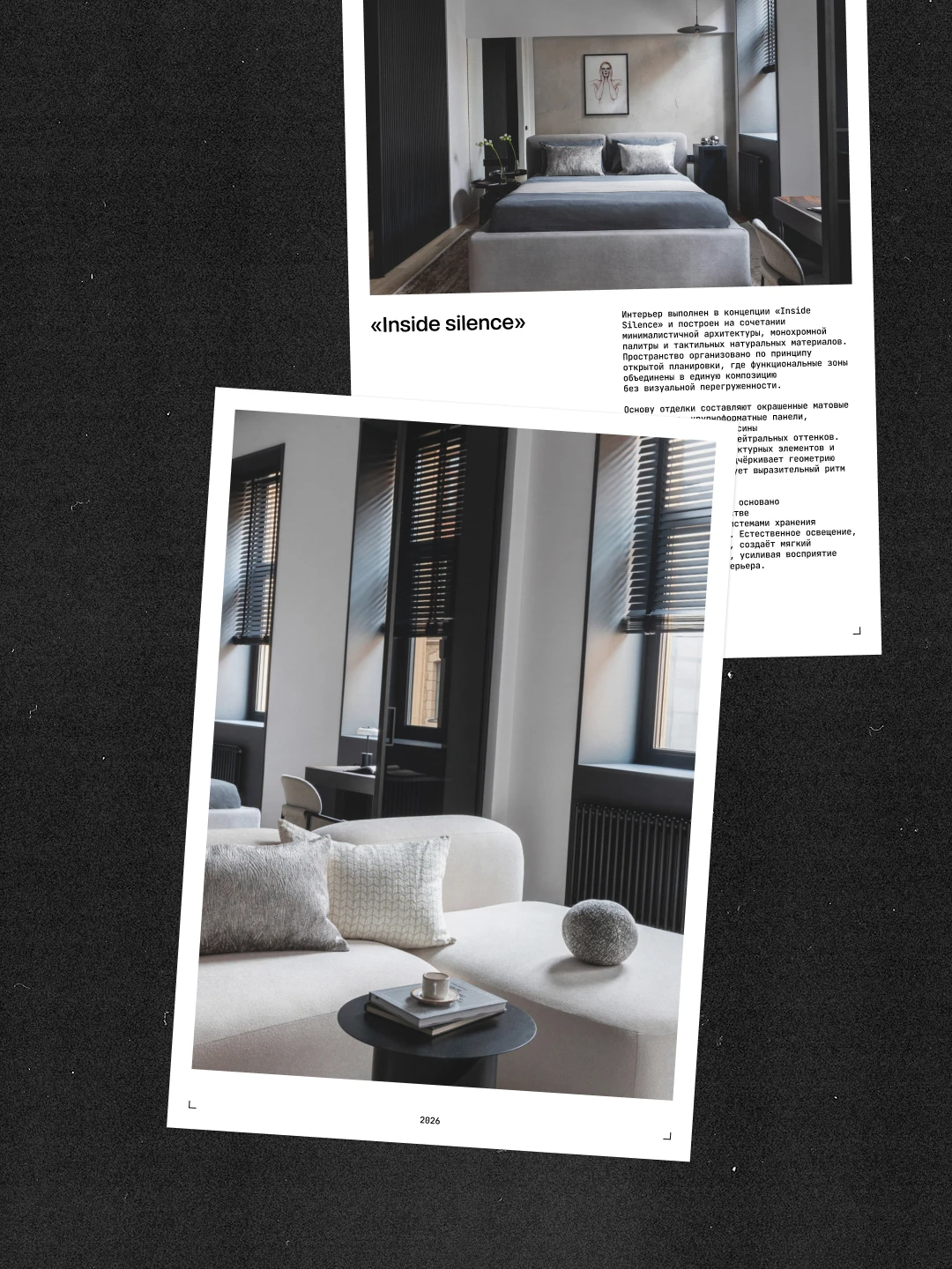
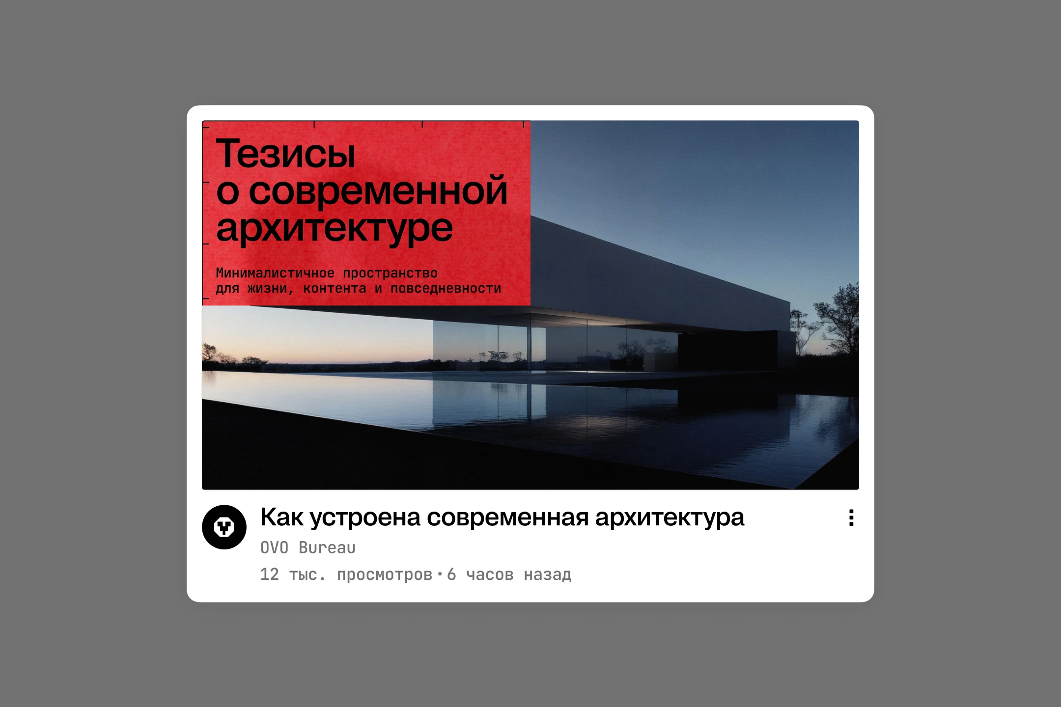
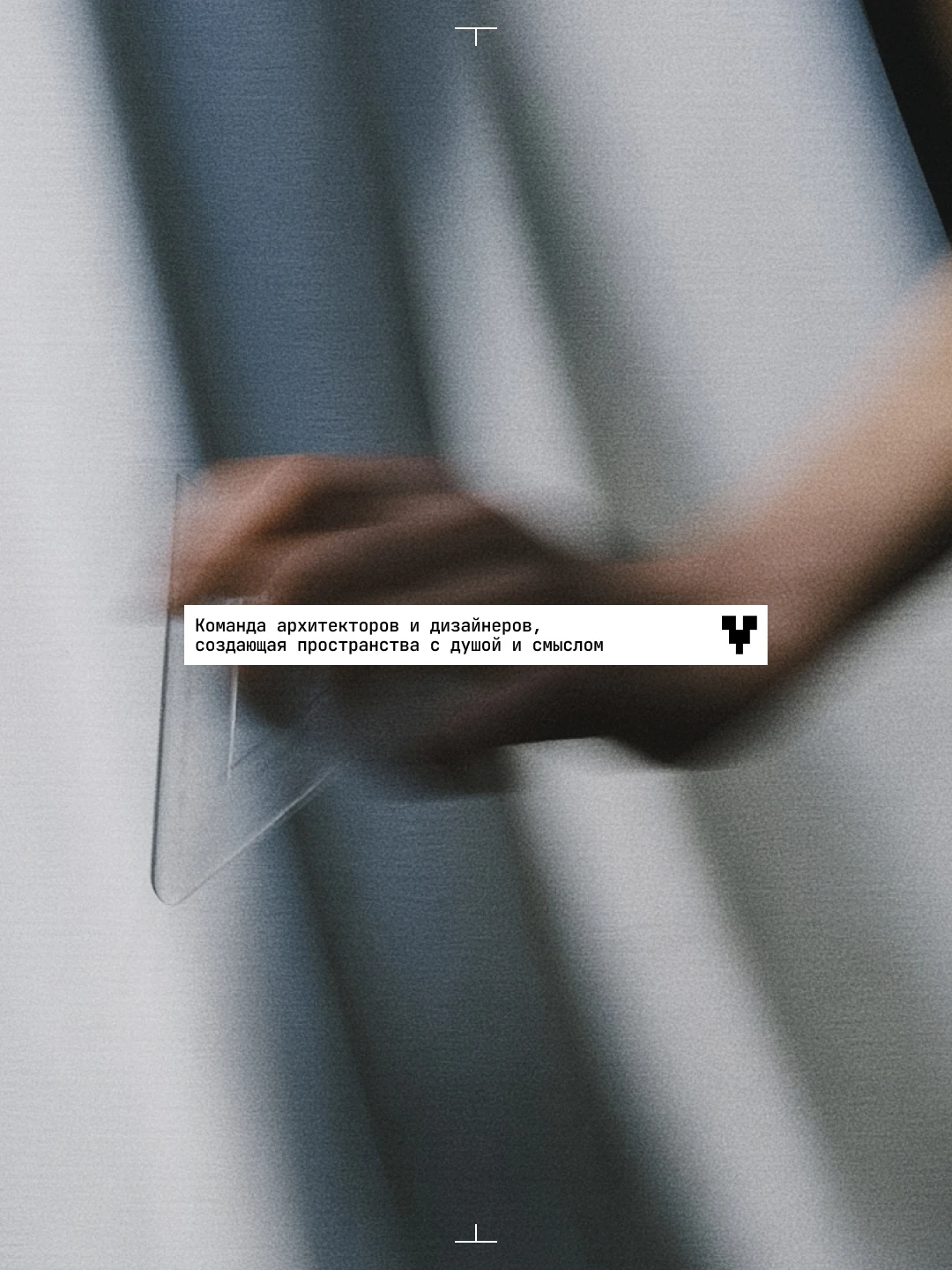
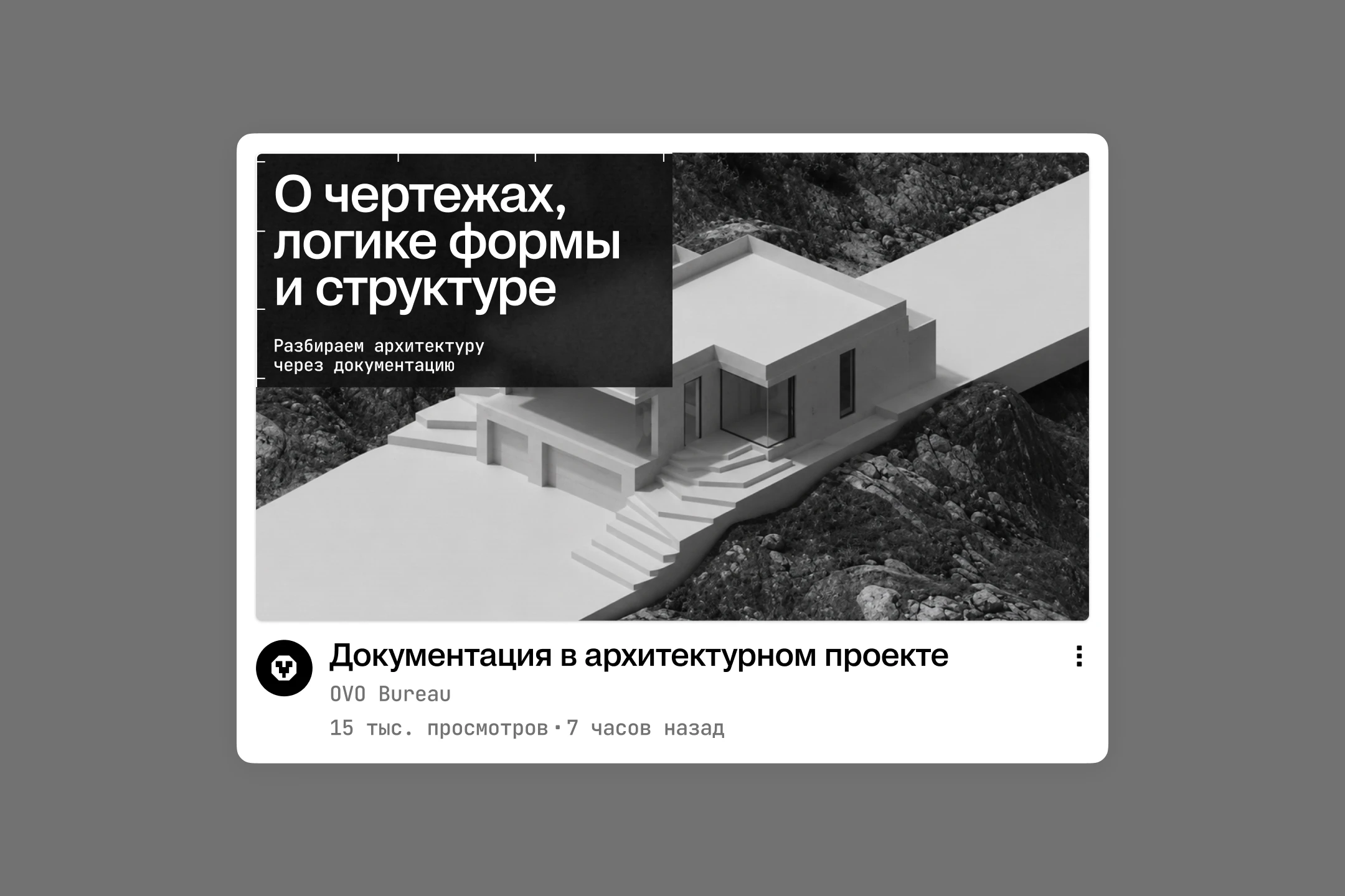
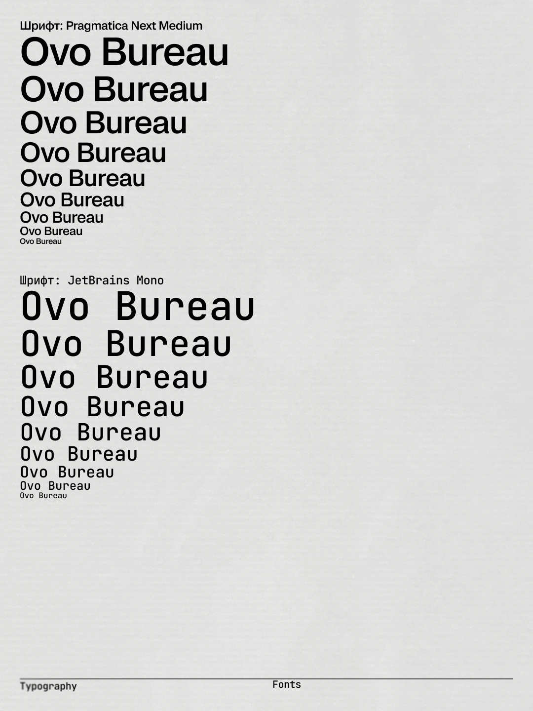
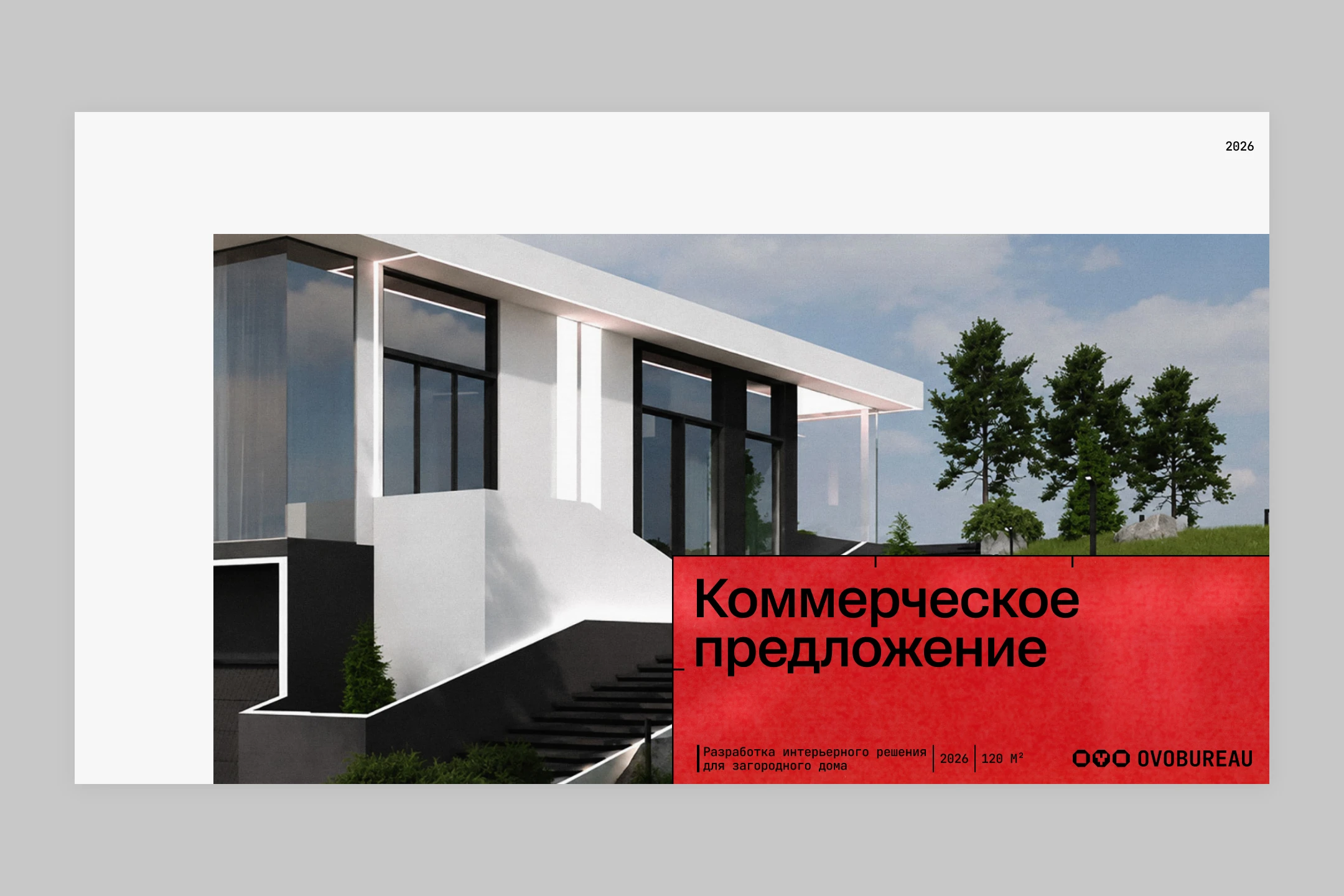
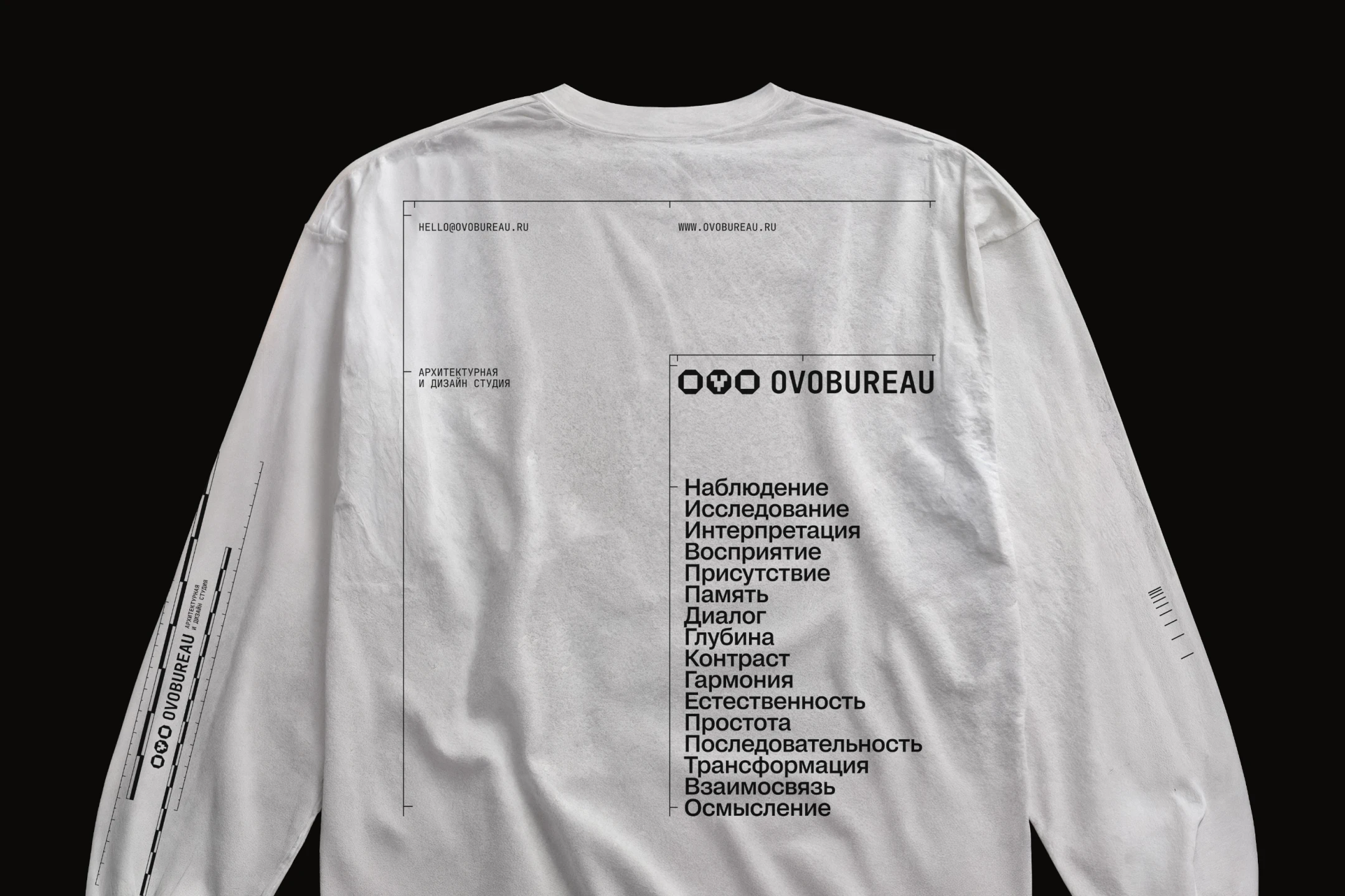
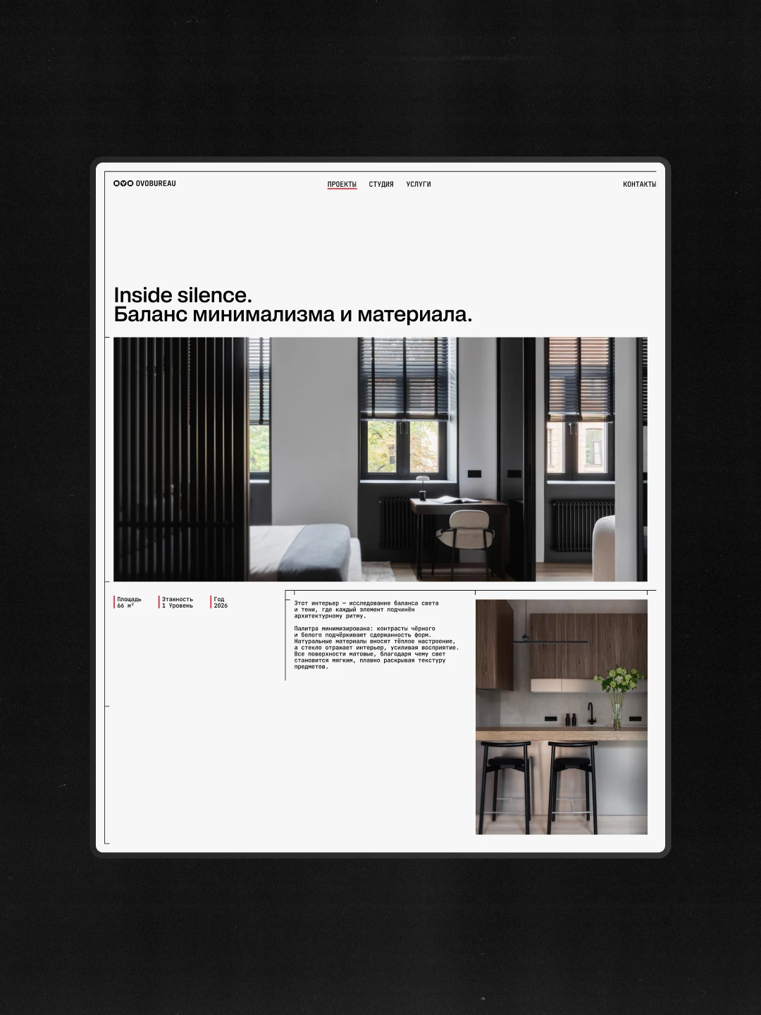
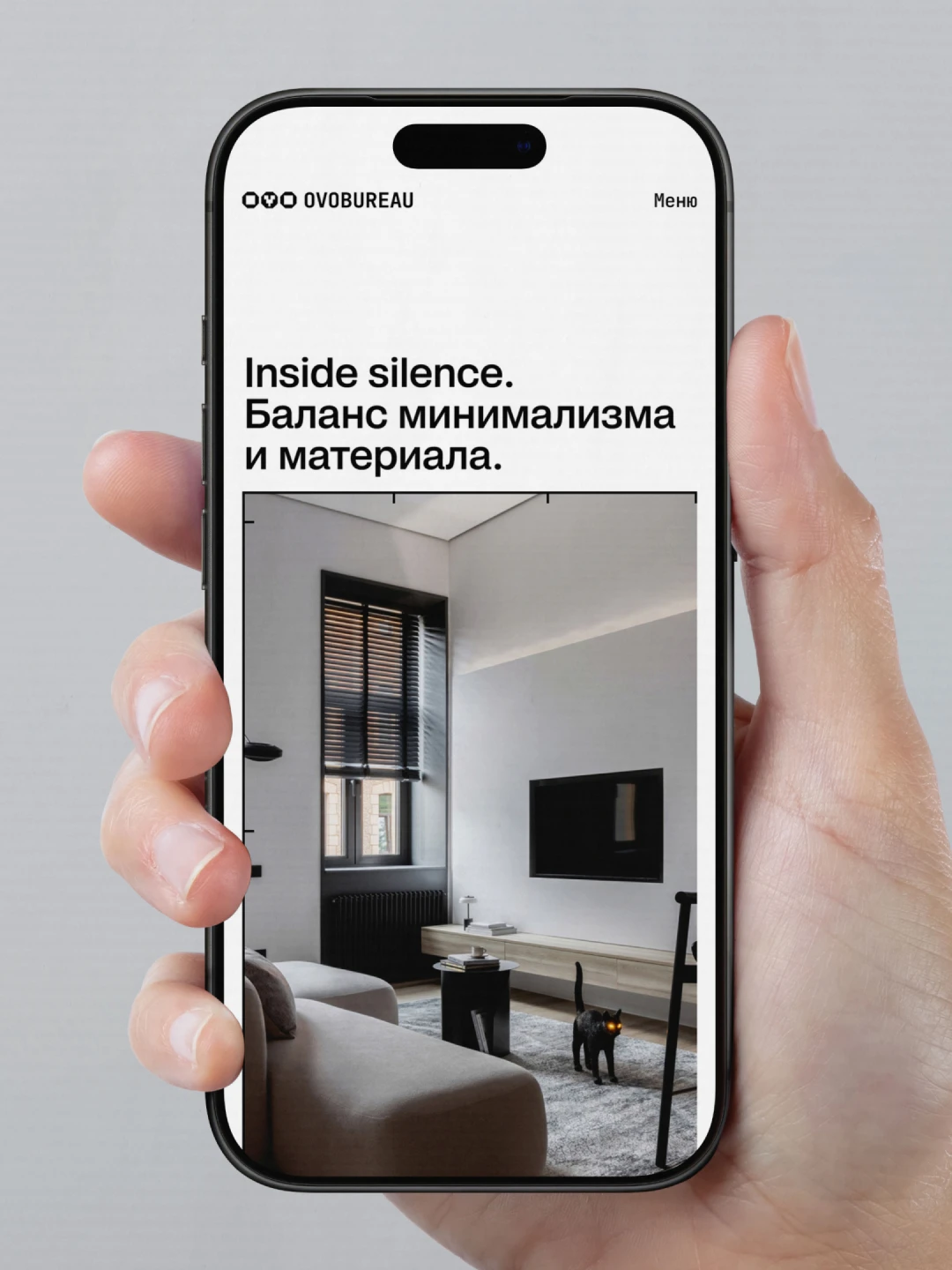
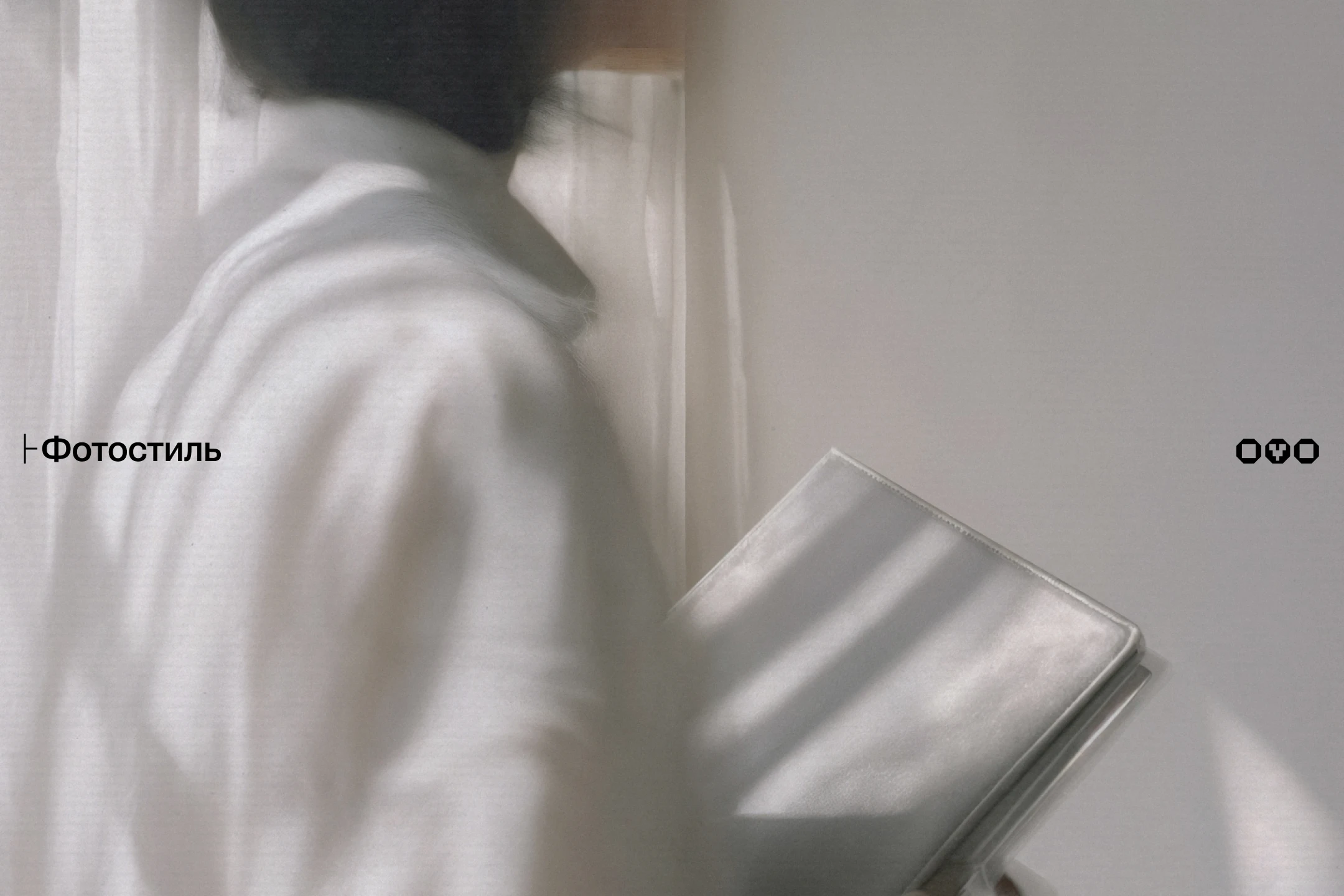
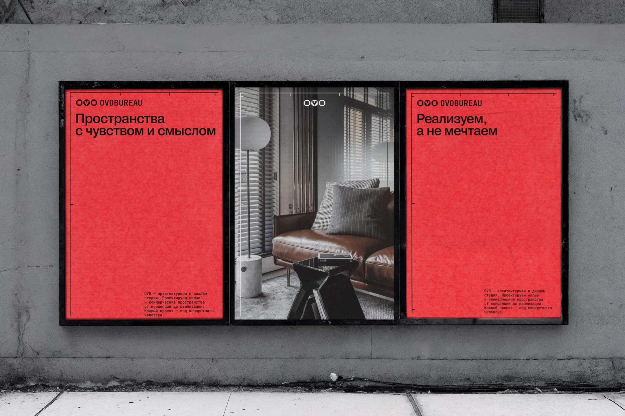
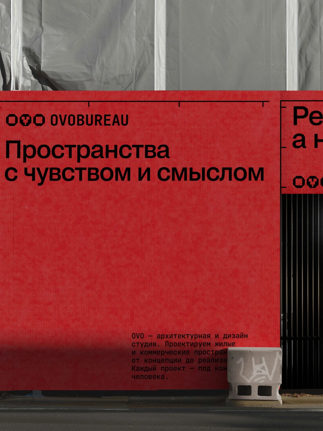
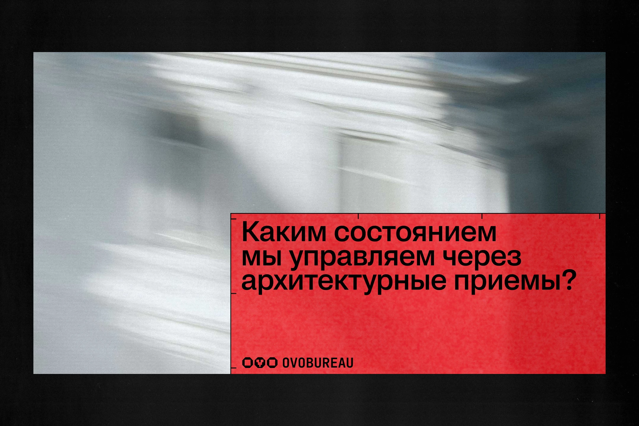
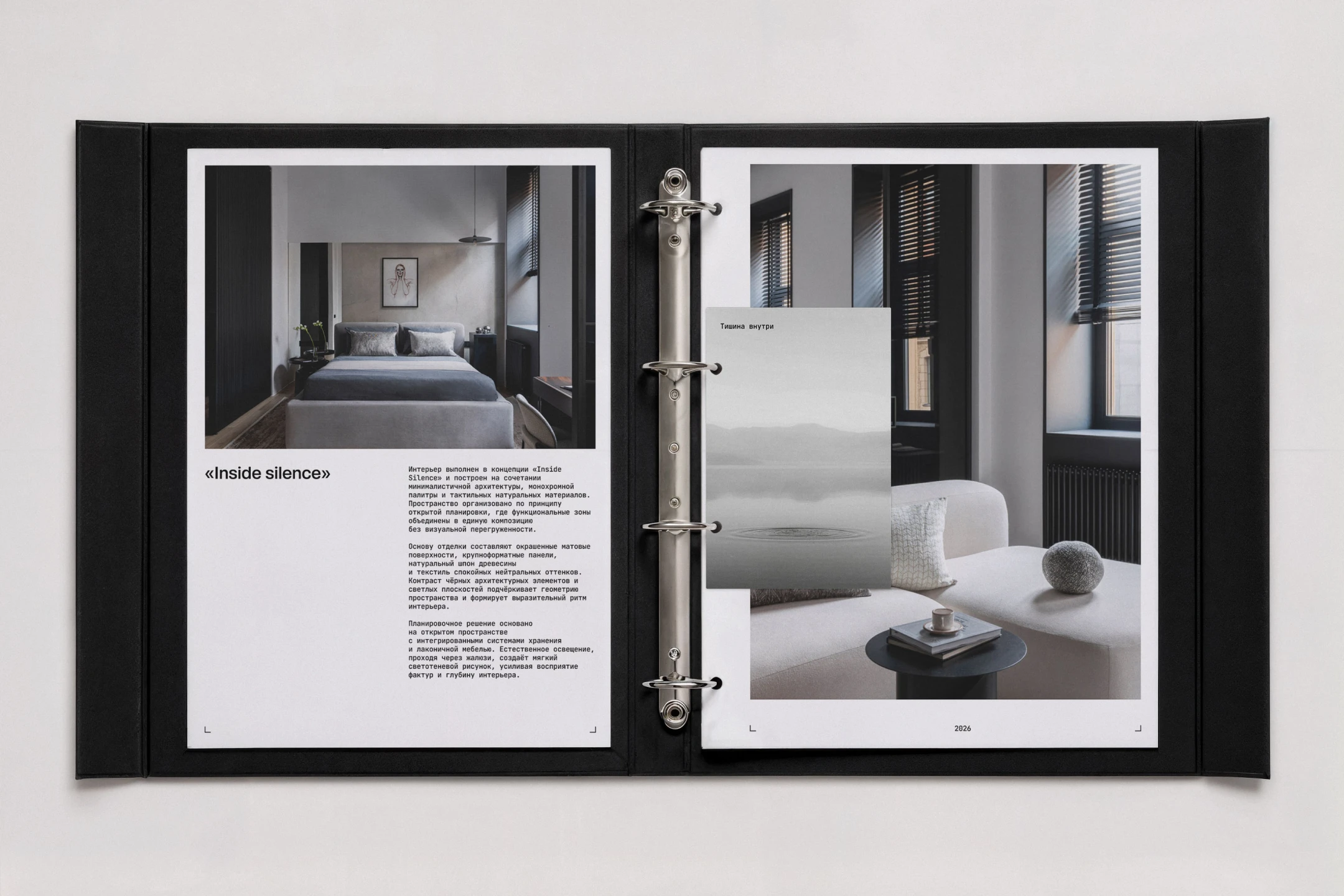
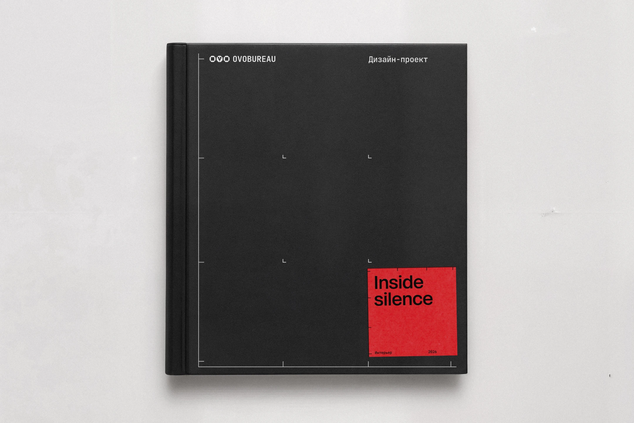
Architecture and design identities are a crowded field—most built on the same black-and-white rigor, modernist type, and dividing lines. OVO needed to stay inside that vocabulary: light, precise, unmistakably architectural—while carrying something the category doesn't usually show. Two in-depth interviews with the founder surfaced the real subject: depth—not surface attention to a brief, but a level of immersion into each client that borders on obsession. The challenge was translating that intangible depth into a visual system, without losing the lightness the industry demands.
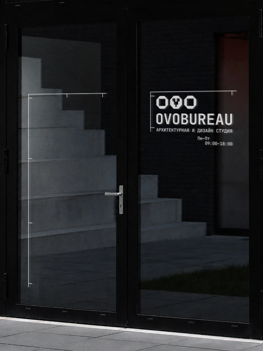
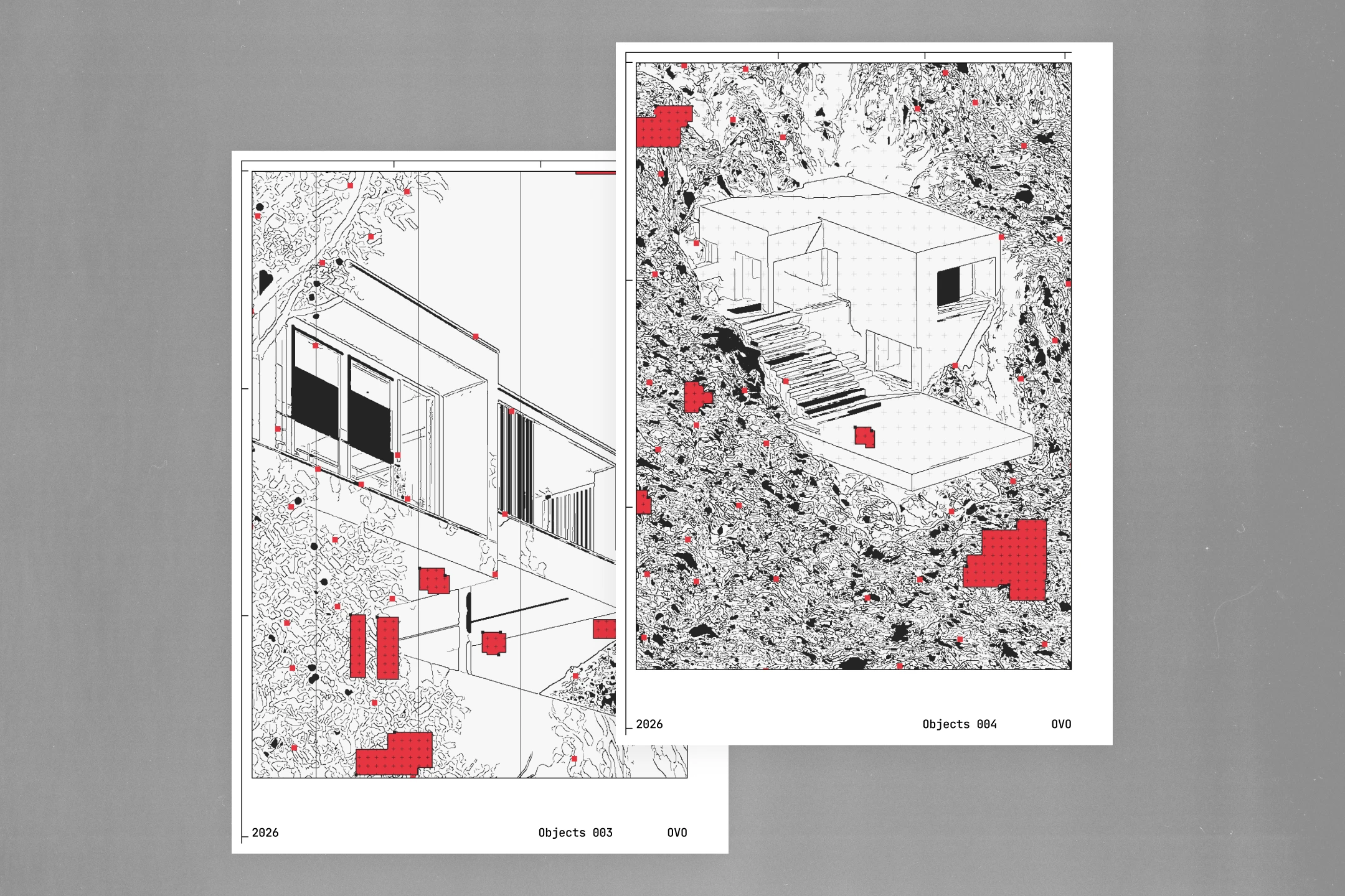
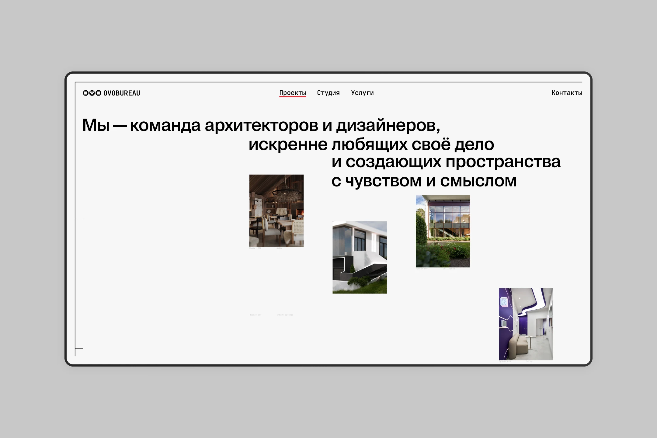
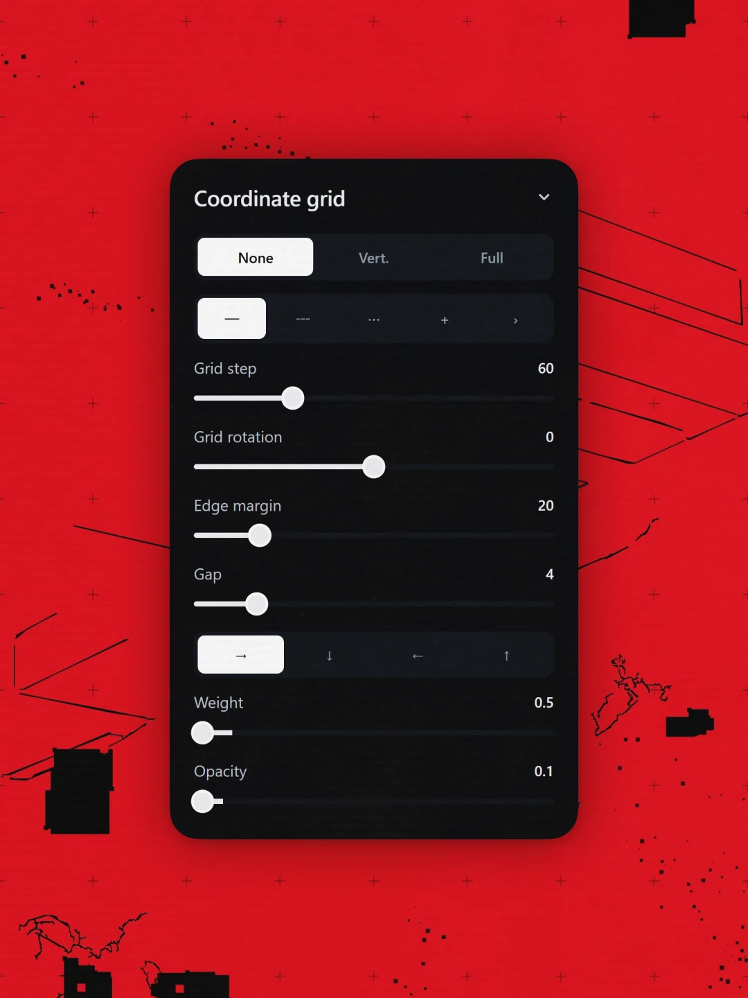
The core device became the ruler—a tool that measures not just a room, but the depth of the studio's immersion into it. Instead of plain dividing lines, the identity is built from rulers and their related marks and forms: technical, deliberate, precise. Worn scan textures and translucent tracing paper were layered in to carry the hand of the atelier—the craft behind every project. These elements resolve into three pillars—Depth, Level, Atelier—expressed through an editorial-leaning architectural identity, scalable ruler graphics, and one decisive accent: red. The result is a system precise enough to read as architecture, and expressive enough to read as character.