Independent identity projects I build for external clients ready to find a voice of their own.

Symbol of Saint Stickerburg

[x]
Symbol of Saint Stickerburg cover visual
About

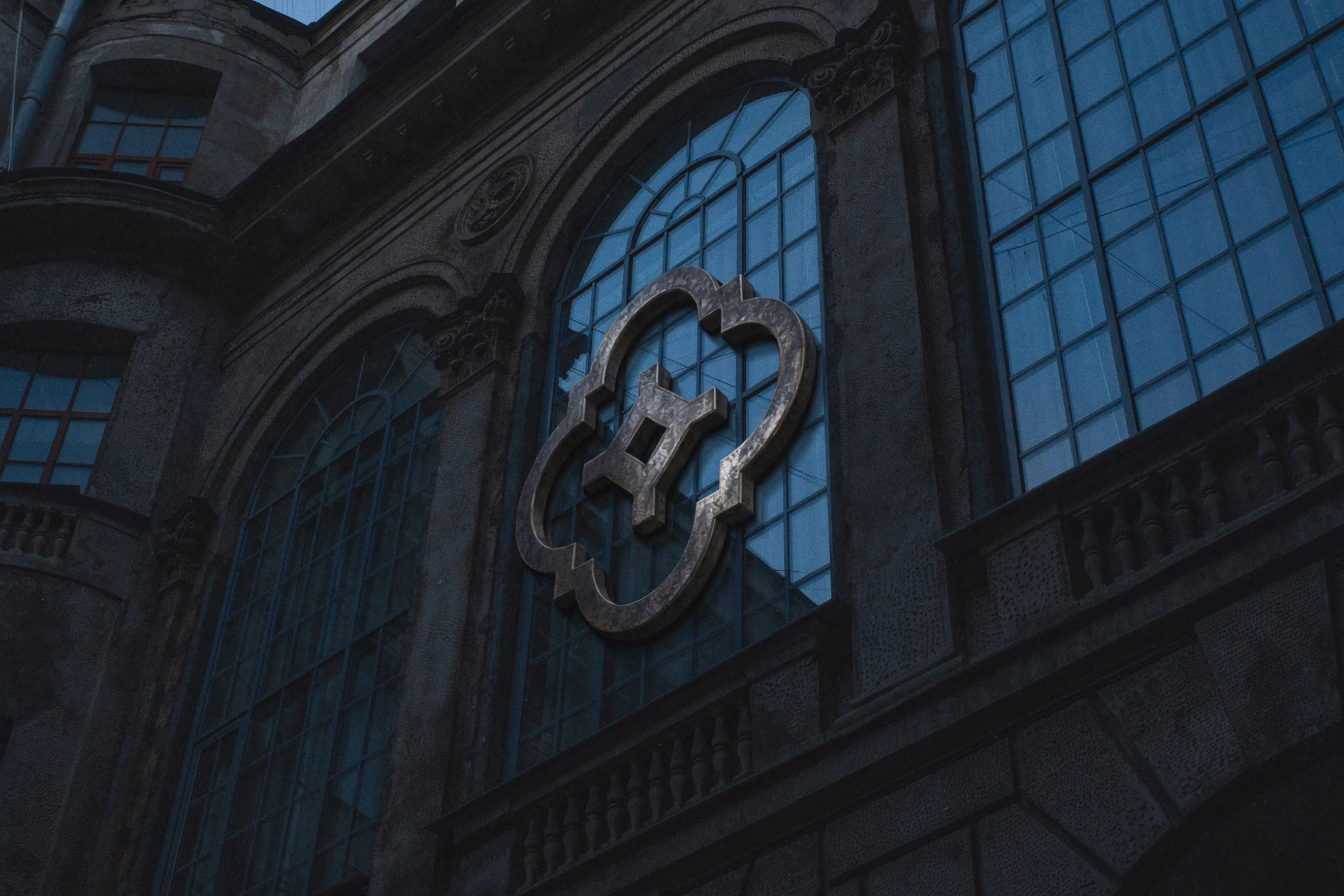
Stickers are usually seen as disposable. Competition in the industry comes down to price. Stickerburg has specialized in stickers for 15 years. Its business runs on expertise, not on following the brief literally. Printing there became a mark of quality among musicians and cultural figures, not just from St. Petersburg. For its next stage, the brand skipped the usual logo. Instead, it built a fictional city: Saint Stickerburg, with its own seal.


Symbol of Saint Stickerburg visual 01
Symbol of Saint Stickerburg visual 02
Symbol of Saint Stickerburg visual 03
Symbol of Saint Stickerburg visual 04
Symbol of Saint Stickerburg visual 05
Symbol of Saint Stickerburg visual 06
Symbol of Saint Stickerburg visual 07
Symbol of Saint Stickerburg visual 08
Symbol of Saint Stickerburg visual 09
Symbol of Saint Stickerburg visual 10
Symbol of Saint Stickerburg visual 11
Symbol of Saint Stickerburg visual 12
Symbol of Saint Stickerburg visual 13
Symbol of Saint Stickerburg visual 14
Symbol of Saint Stickerburg visual 15
Symbol of Saint Stickerburg visual 16
Symbol of Saint Stickerburg visual 17
Symbol of Saint Stickerburg visual 18
Symbol of Saint Stickerburg visual 19
Symbol of Saint Stickerburg visual 20
Symbol of Saint Stickerburg visual 21
Symbol of Saint Stickerburg visual 23
Symbol of Saint Stickerburg visual 24
Symbol of Saint Stickerburg visual 25
Challenge

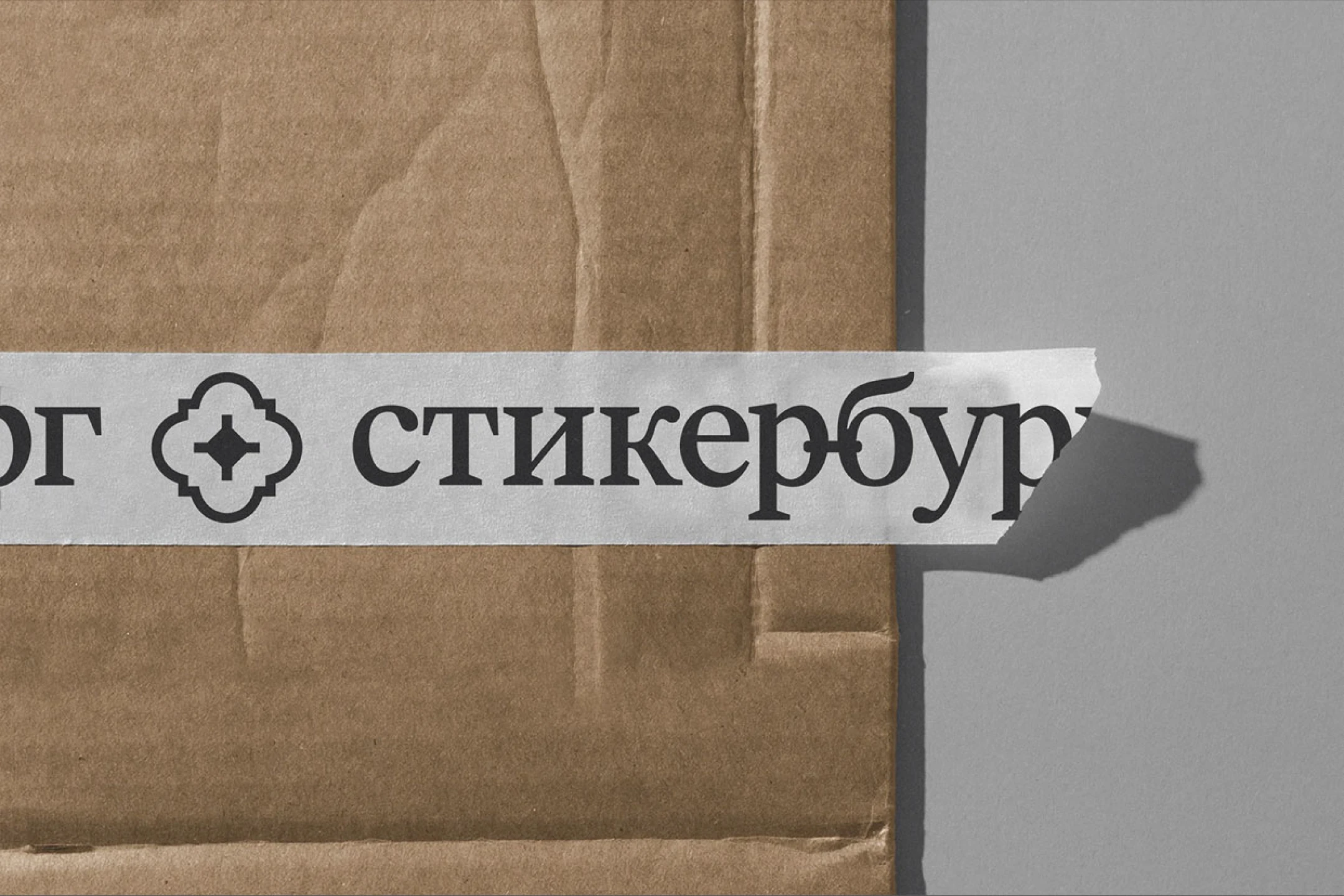
The brand already had a loved wordmark in Latin script. Trademark rules forced a switch to Cyrillic, without losing recognition. That was just the start. The real task was building a full identity around the mark—one that works on packaging, tape, merch, and the stickers themselves. It felt less like a logo redesign. More like inventing the visual code of an entire city. An unofficial, underground Petersburg, no postcard clichés. The scale called for a serious approach: a mark that stands alone, sparks curiosity without the company name, and carries the weight of a whole city's idea.

Solution

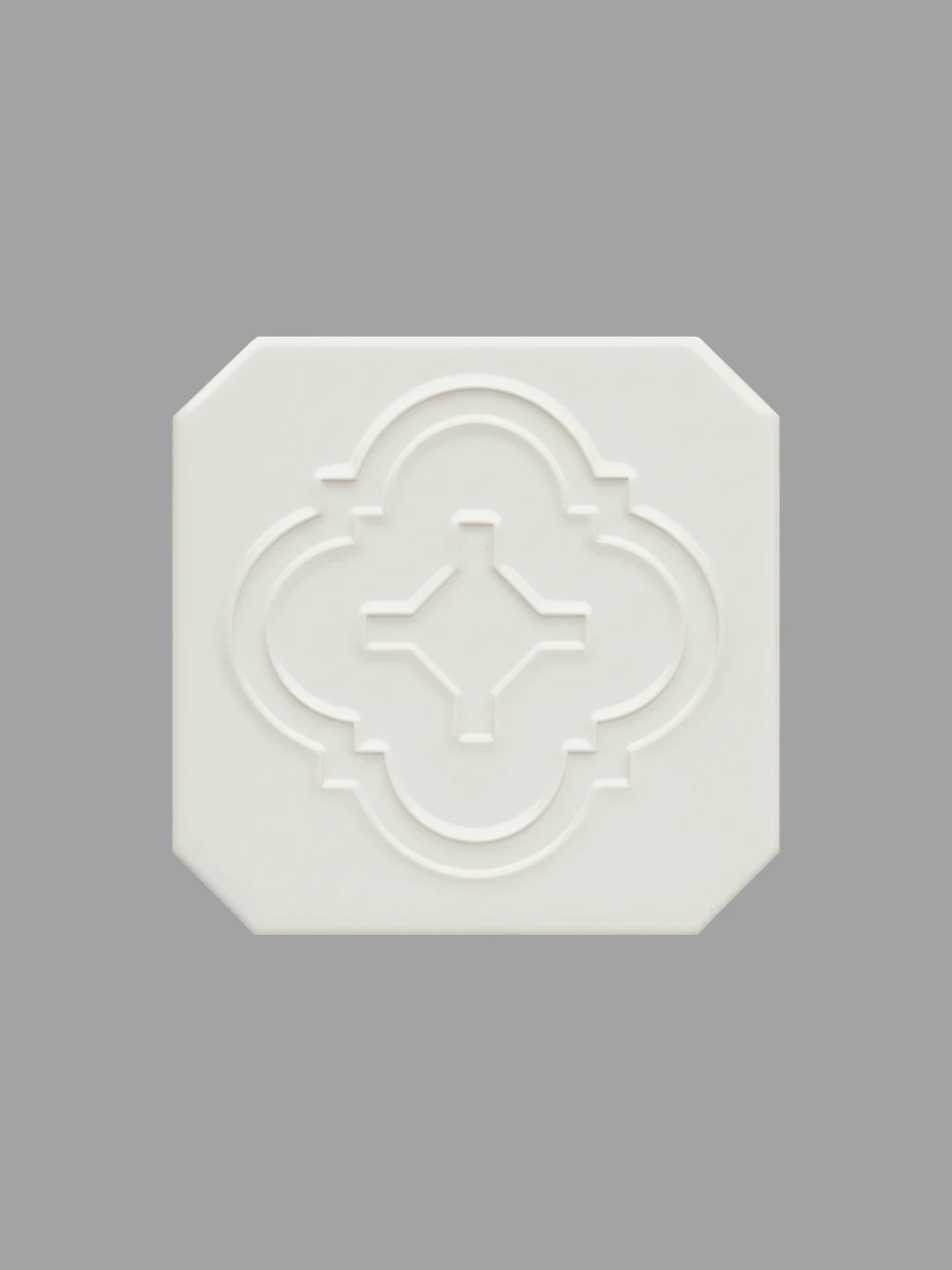
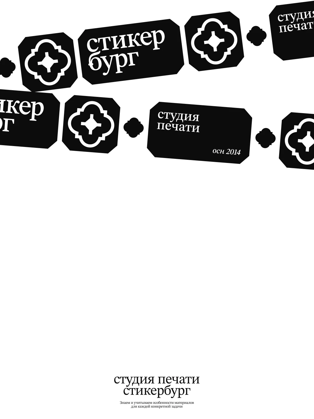
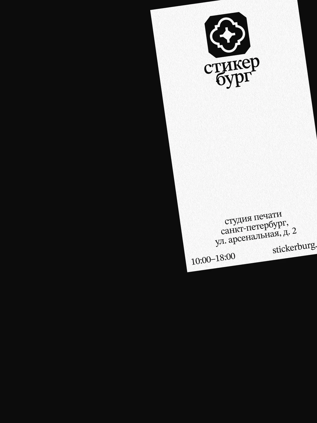
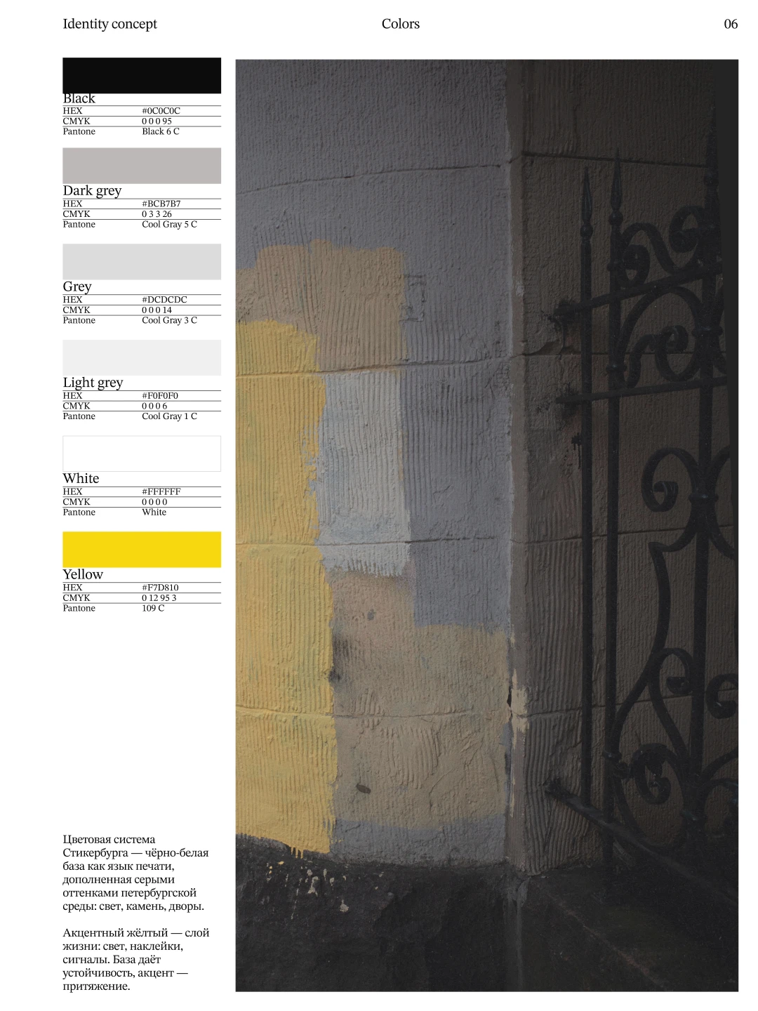
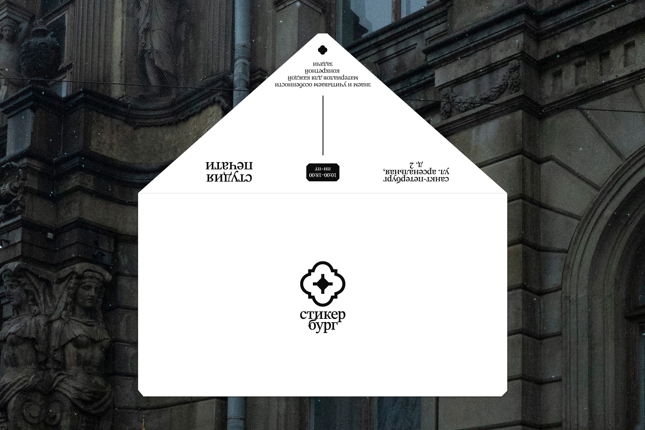
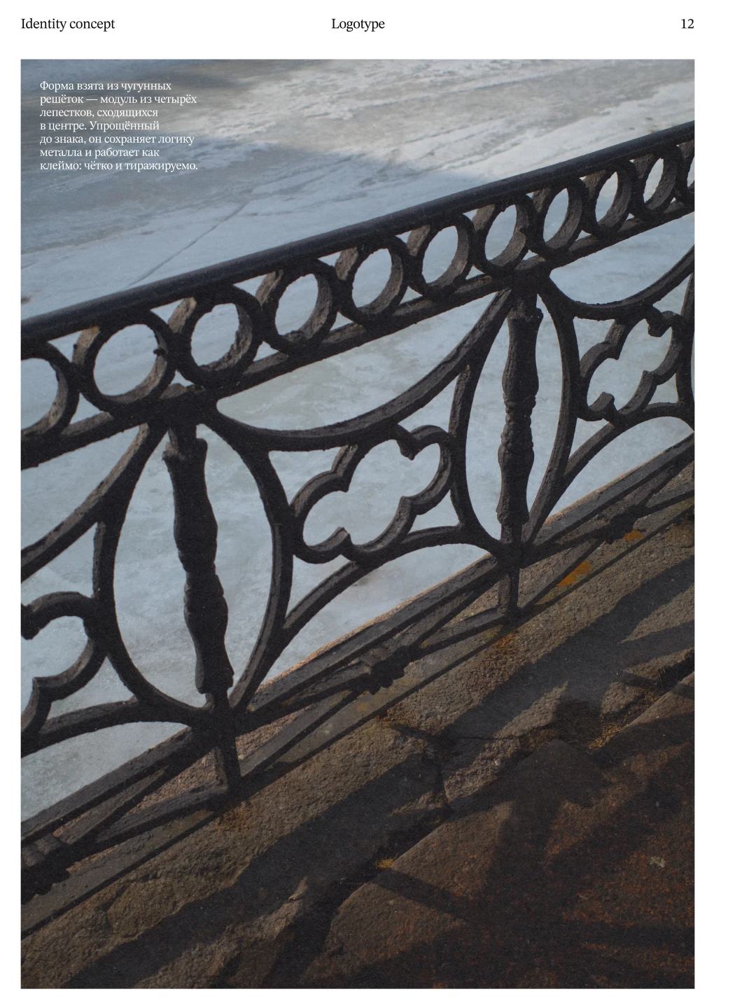
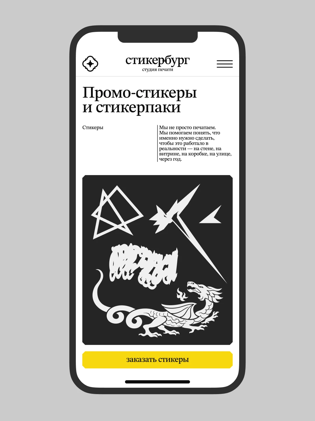
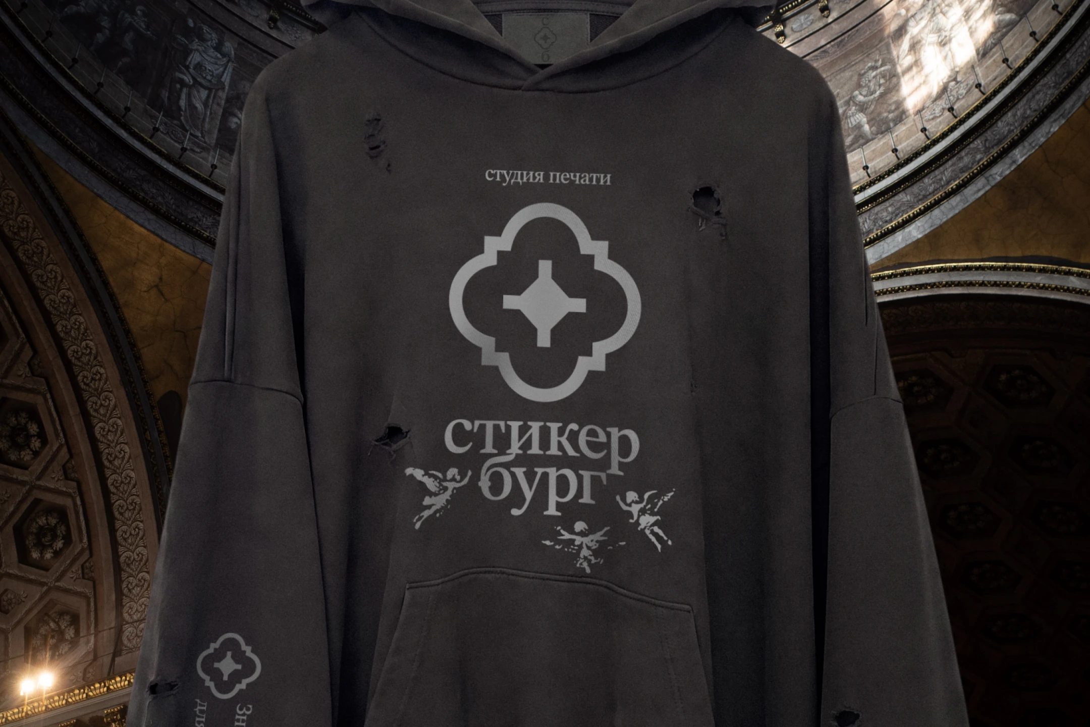
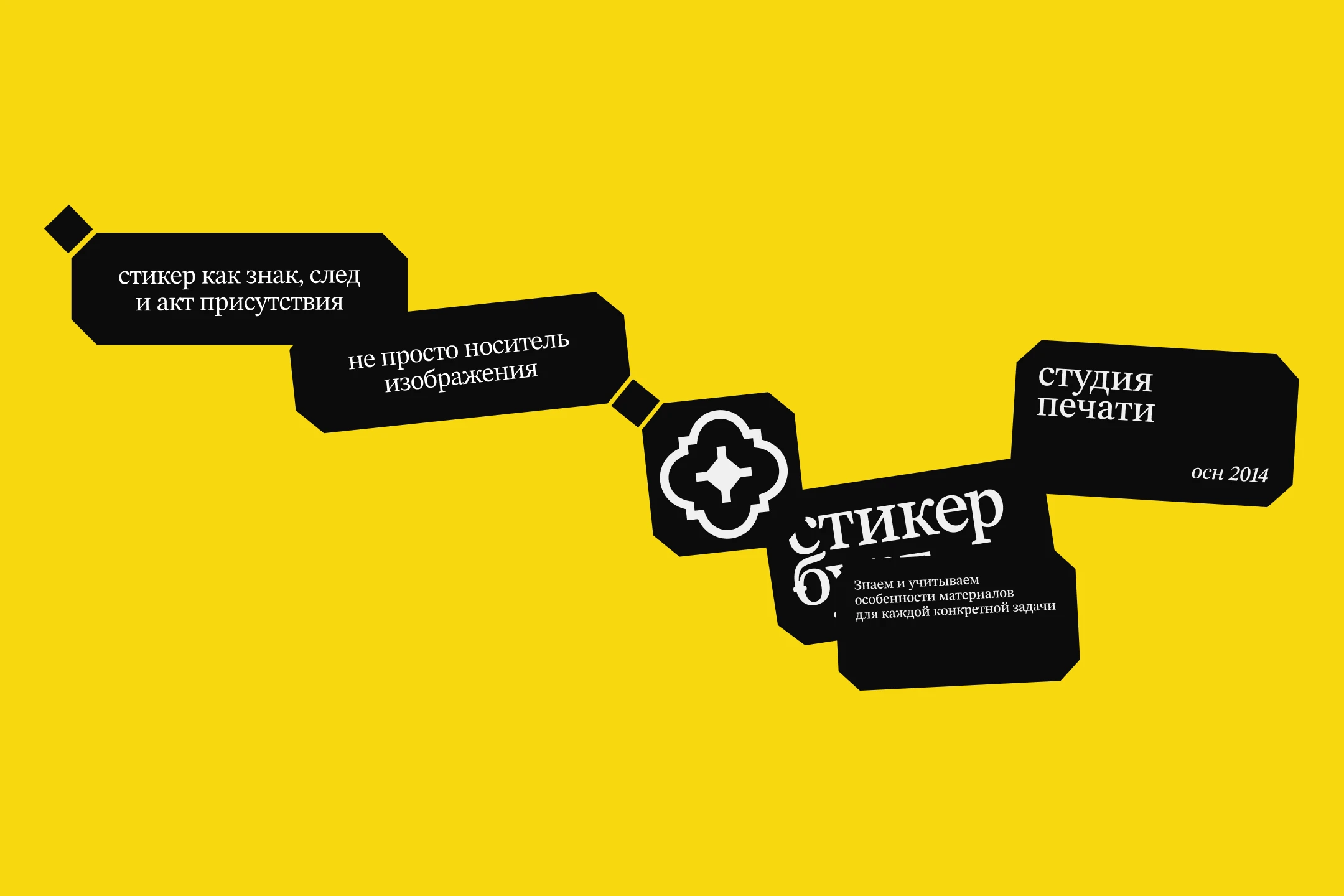
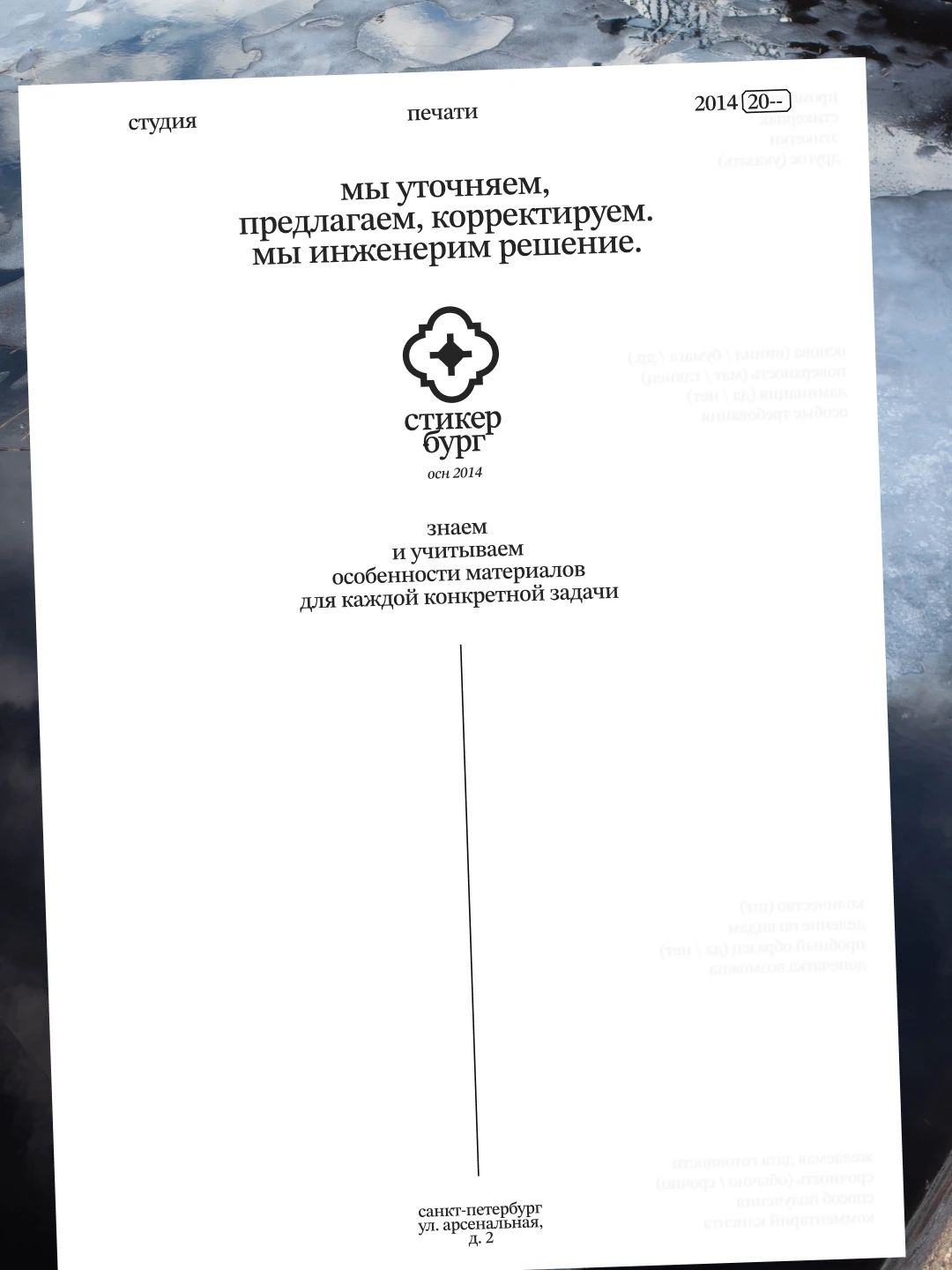
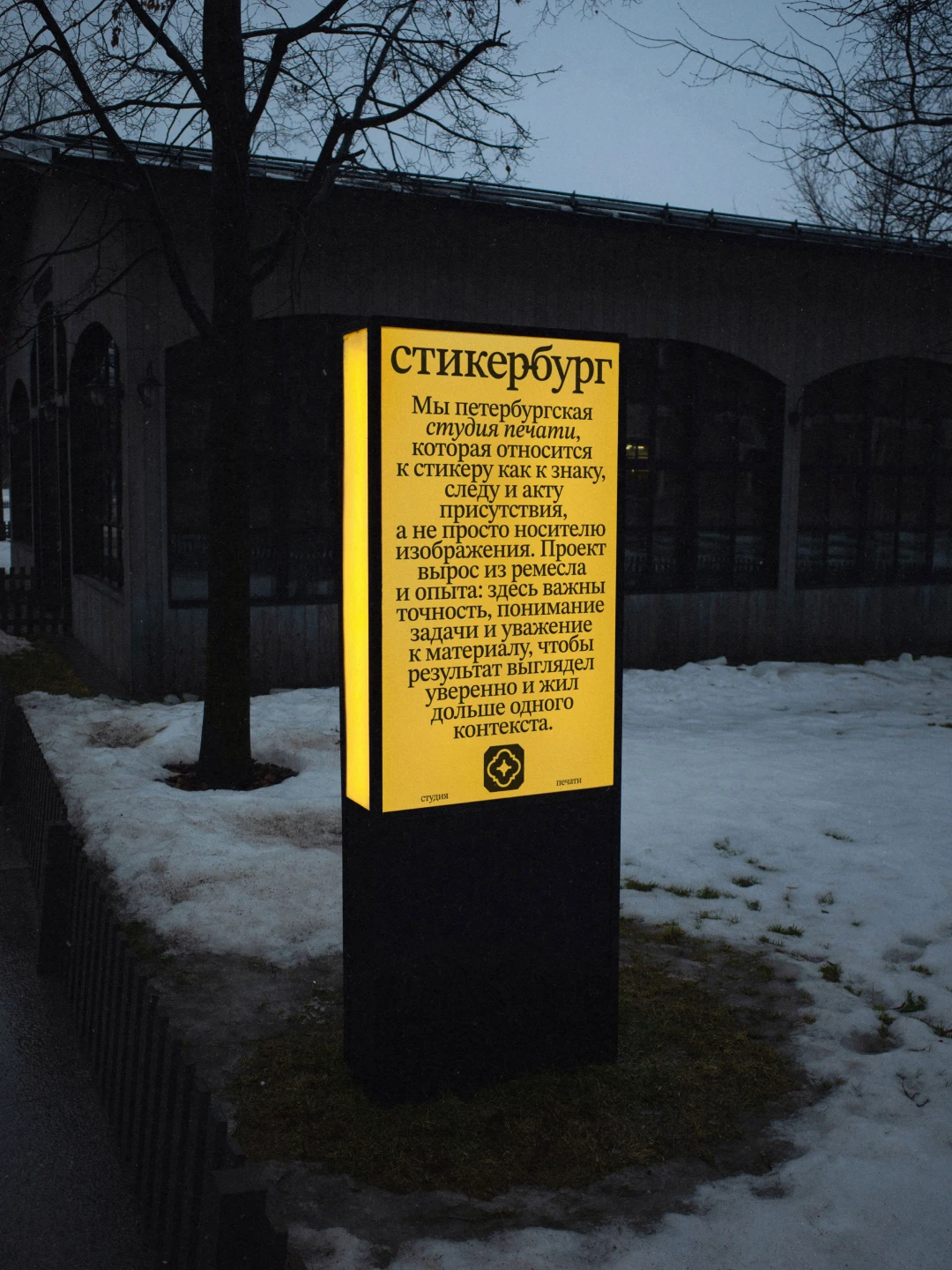
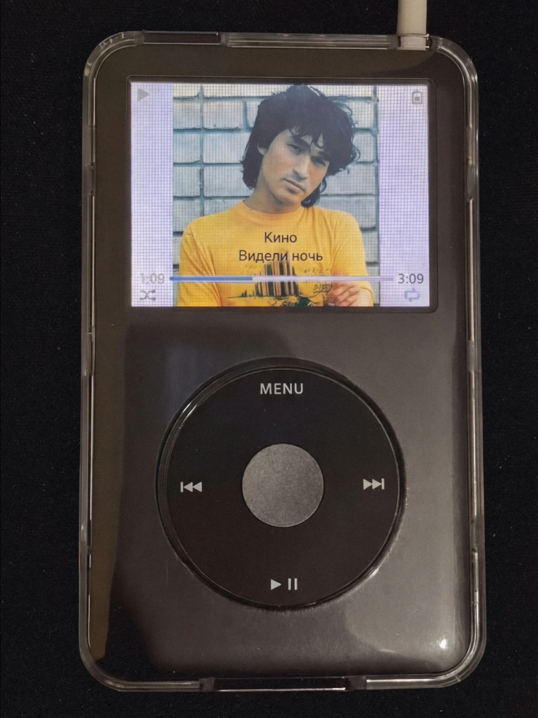
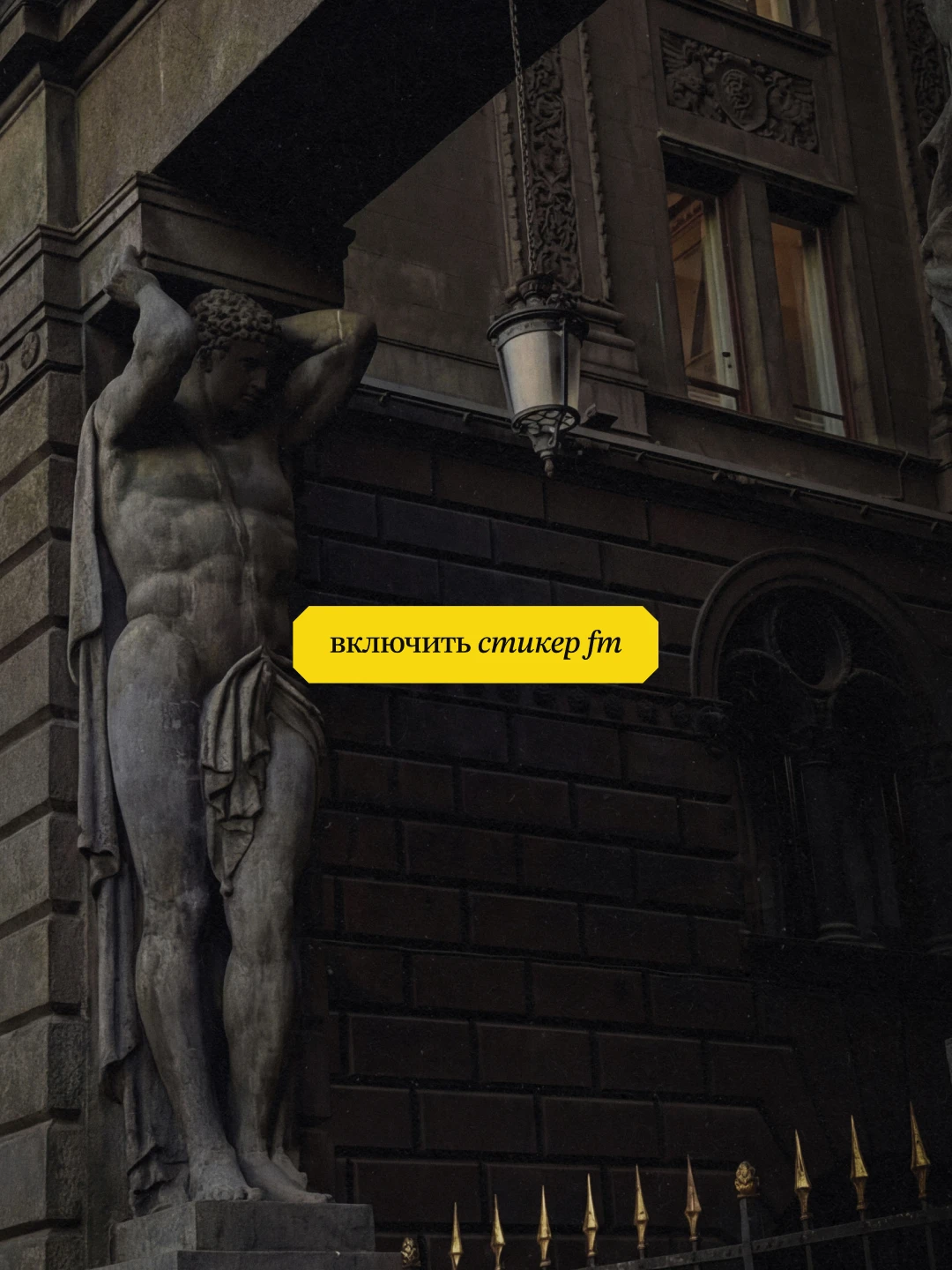
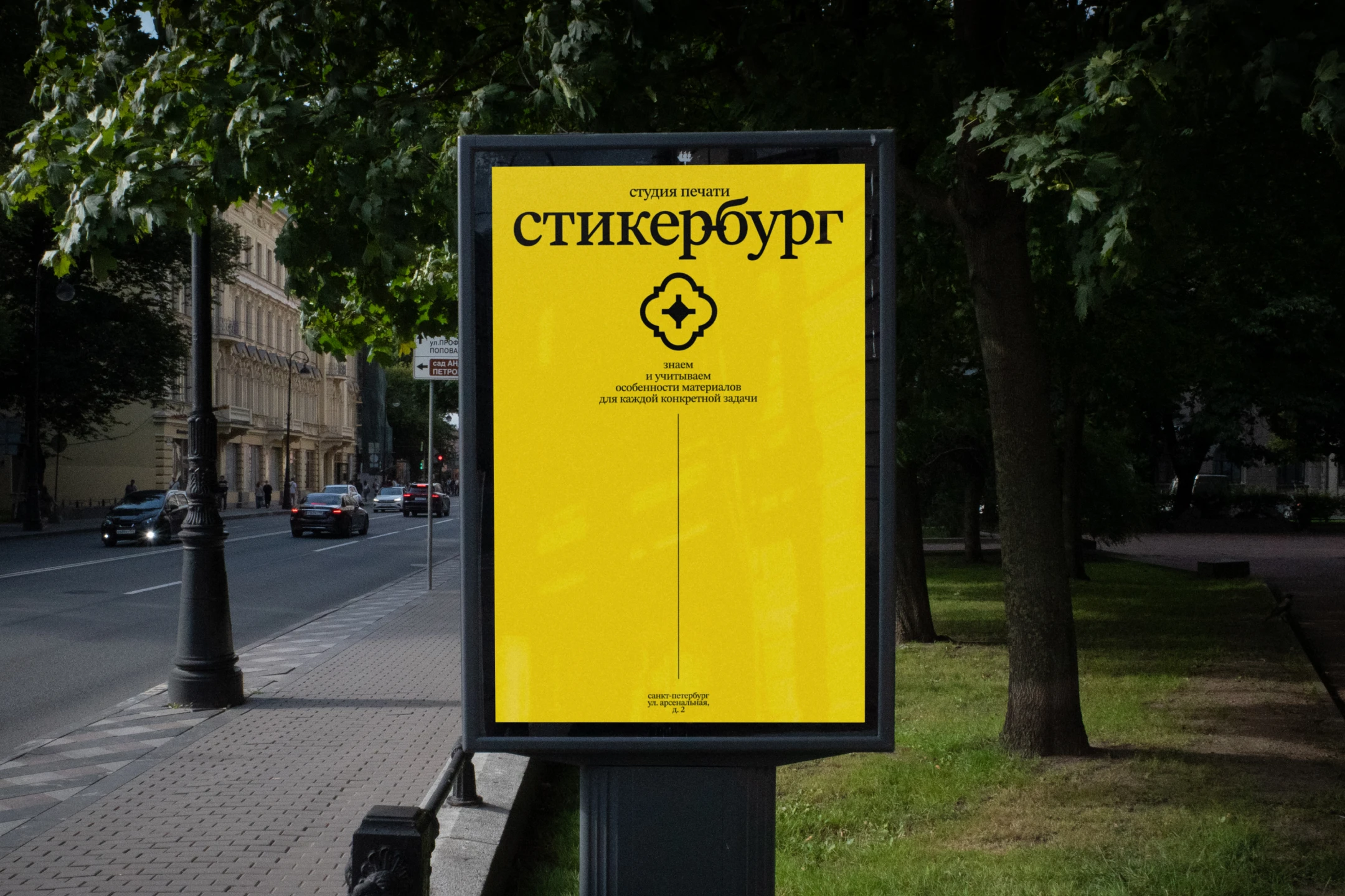
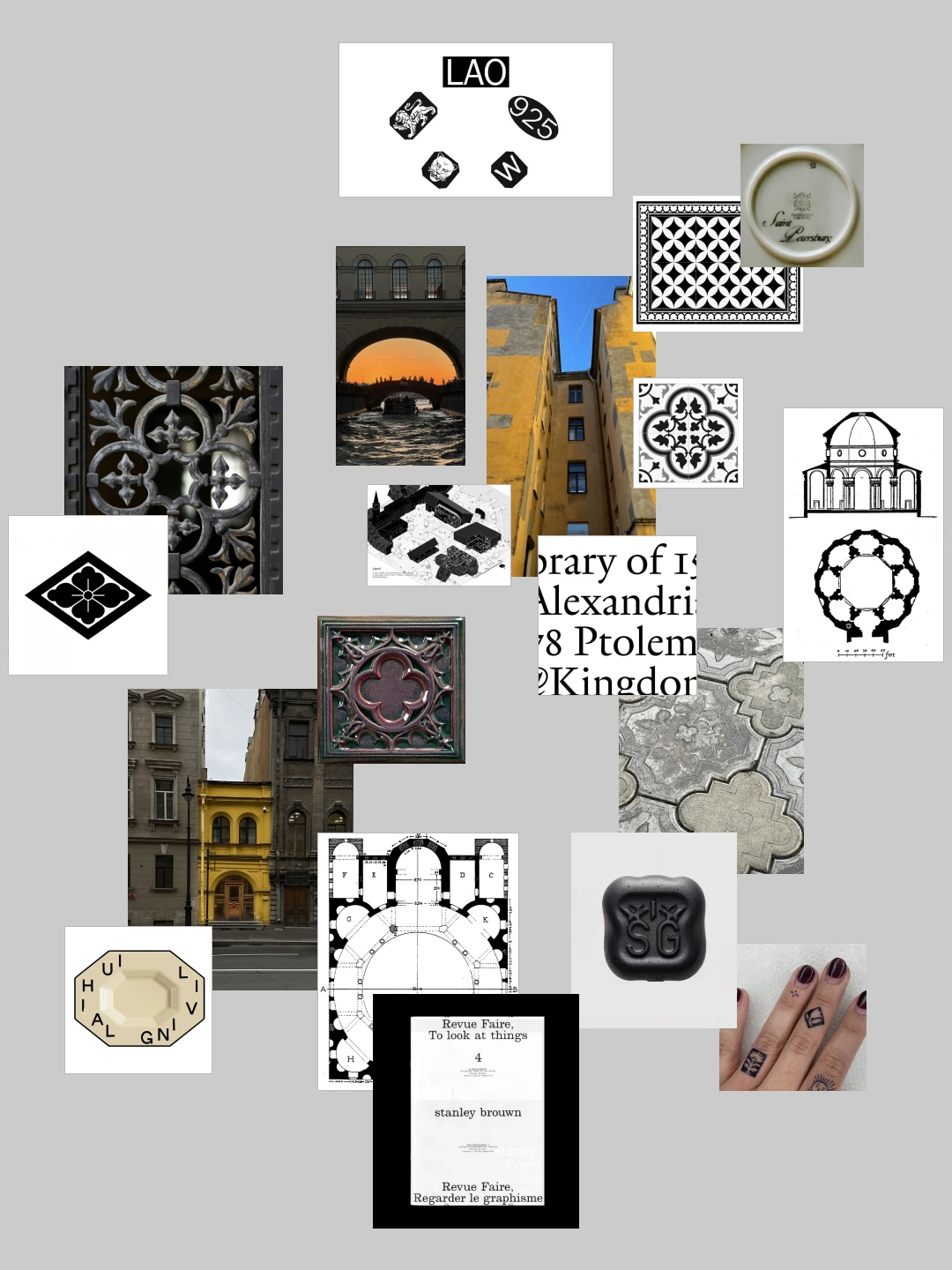
The foundation wasn't postcard Petersburg. It was courtyard Petersburg—bridges, sunsets, the feel of the film Piter FM. No Bronze Horseman, no military symbols. Around that, we built a fictional city: Saint Stickerburg, with a cathedral on its main square and a legend of its own. From that image came the mark: a fortress silhouette, a cathedral's blueprint, a sense of the sacred, fused into one imprint—like a master's stamp. The wordmark runs on STIX Two Text, an antique serif, hand-refined to match the mark's character. The shape of courtyard tiles—an underground symbol of Petersburg's gateways—carries into the mark's inverse version and into info-plates across the identity. Mystical ornaments and illustrations add the city's poetic edge. The palette stays monochrome, the color of a rainy city, lifted by a yellow accent: the color of Petersburg's courtyards and facades. The result isn't a logo. It's a seal at the crossing of Peter the Great's era, Tsoi's era, and today. It lives apart from the name—like a sticker pasted seven years ago, still visible under every layer on top.

Symbol of Saint Stickerburg [X]
Symbol of Saint Stickerburg cover visual
About

Stickers are usually seen as disposable. Competition in the industry comes down to price. Stickerburg has specialized in stickers for 15 years. Its business runs on expertise, not on following the brief literally. Printing there became a mark of quality among musicians and cultural figures, not just from St. Petersburg. For its next stage, the brand skipped the usual logo. Instead, it built a fictional city: Saint Stickerburg, with its own seal.
Symbol of Saint Stickerburg visual 01
Symbol of Saint Stickerburg visual 02
Symbol of Saint Stickerburg visual 03
Symbol of Saint Stickerburg visual 04
Symbol of Saint Stickerburg visual 05
Symbol of Saint Stickerburg visual 06
Symbol of Saint Stickerburg visual 07
Symbol of Saint Stickerburg visual 08
Symbol of Saint Stickerburg visual 09
Symbol of Saint Stickerburg visual 10
Symbol of Saint Stickerburg visual 11
Symbol of Saint Stickerburg visual 12
Symbol of Saint Stickerburg visual 13
Symbol of Saint Stickerburg visual 14
Symbol of Saint Stickerburg visual 15
Symbol of Saint Stickerburg visual 16
Symbol of Saint Stickerburg visual 17
Symbol of Saint Stickerburg visual 18
Symbol of Saint Stickerburg visual 19
Symbol of Saint Stickerburg visual 20
Symbol of Saint Stickerburg visual 21
Symbol of Saint Stickerburg visual 23
Symbol of Saint Stickerburg visual 24
Symbol of Saint Stickerburg visual 25
Challenge

The brand already had a loved wordmark in Latin script. Trademark rules forced a switch to Cyrillic, without losing recognition. That was just the start. The real task was building a full identity around the mark—one that works on packaging, tape, merch, and the stickers themselves. It felt less like a logo redesign. More like inventing the visual code of an entire city. An unofficial, underground Petersburg, no postcard clichés. The scale called for a serious approach: a mark that stands alone, sparks curiosity without the company name, and carries the weight of a whole city's idea.

Solution

The foundation wasn't postcard Petersburg. It was courtyard Petersburg—bridges, sunsets, the feel of the film Piter FM. No Bronze Horseman, no military symbols. Around that, we built a fictional city: Saint Stickerburg, with a cathedral on its main square and a legend of its own. From that image came the mark: a fortress silhouette, a cathedral's blueprint, a sense of the sacred, fused into one imprint—like a master's stamp. The wordmark runs on STIX Two Text, an antique serif, hand-refined to match the mark's character. The shape of courtyard tiles—an underground symbol of Petersburg's gateways—carries into the mark's inverse version and into info-plates across the identity. Mystical ornaments and illustrations add the city's poetic edge. The palette stays monochrome, the color of a rainy city, lifted by a yellow accent: the color of Petersburg's courtyards and facades. The result isn't a logo. It's a seal at the crossing of Peter the Great's era, Tsoi's era, and today. It lives apart from the name—like a sticker pasted seven years ago, still visible under every layer on top.

Scroll to top