
Crypto runs on trust without intermediaries, yet that trust is most often undermined by fraud and weak verification. We built a visual identity around "benchmark identity verification for crypto"—positioning the company as the industry's standard for anti-fraud and KYC, with people and community at its center. The core metaphor: a beam and a burst radiating from a single point—an expert center, and the people within it.



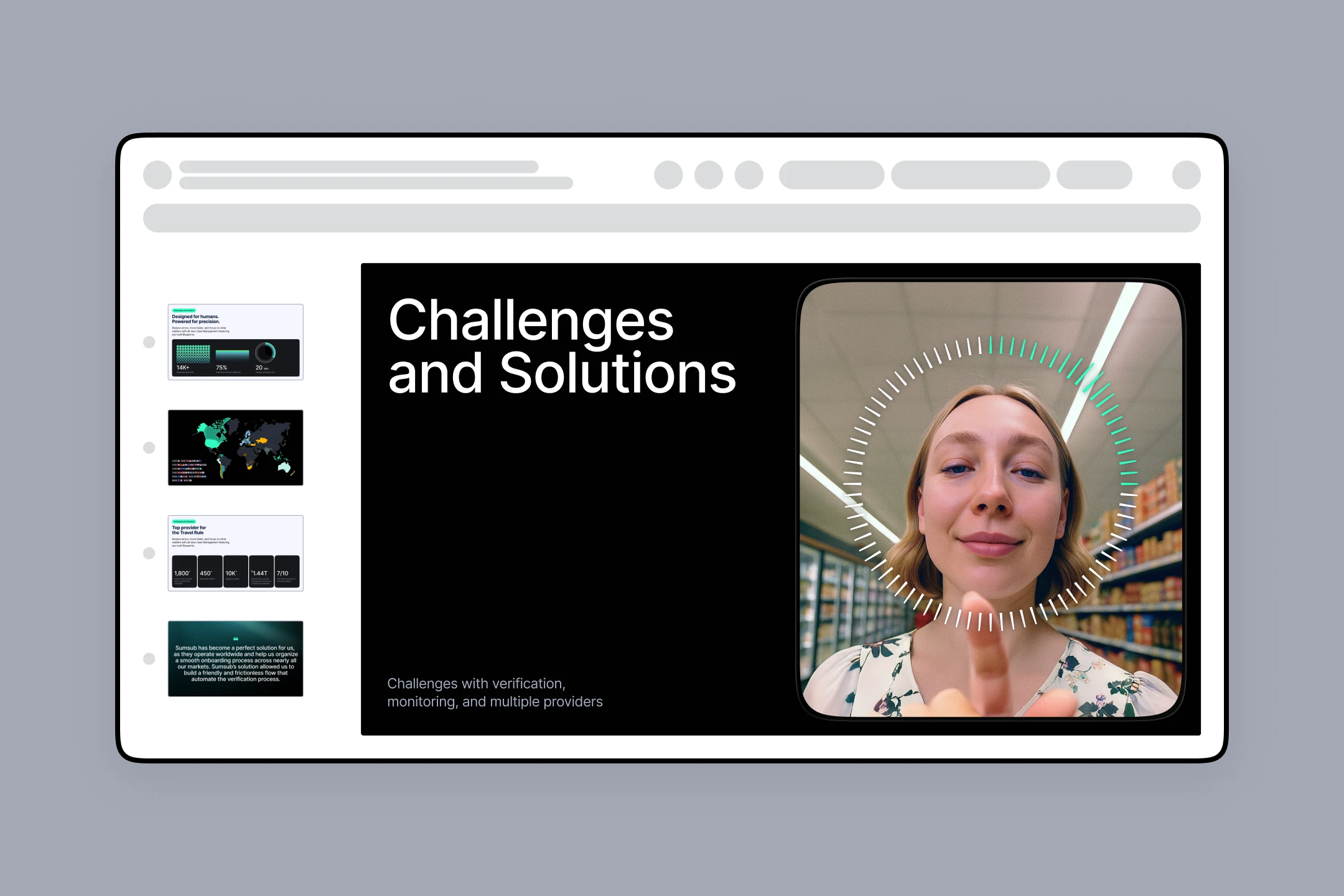
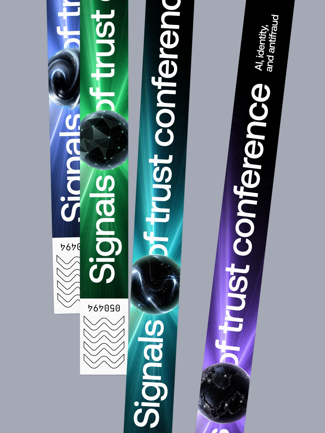

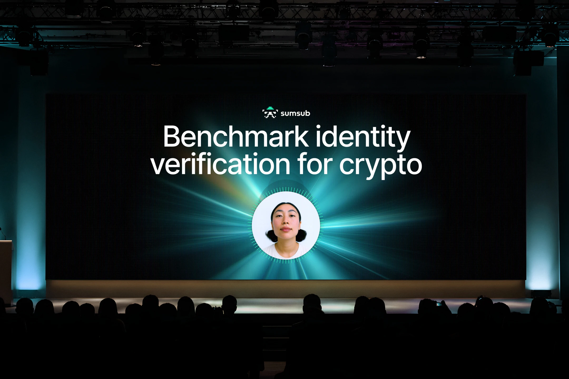


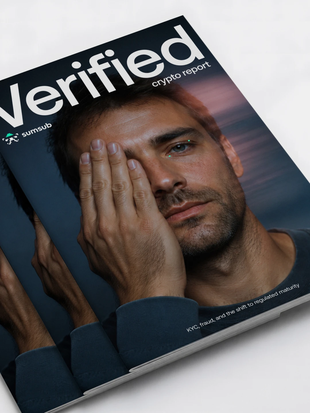




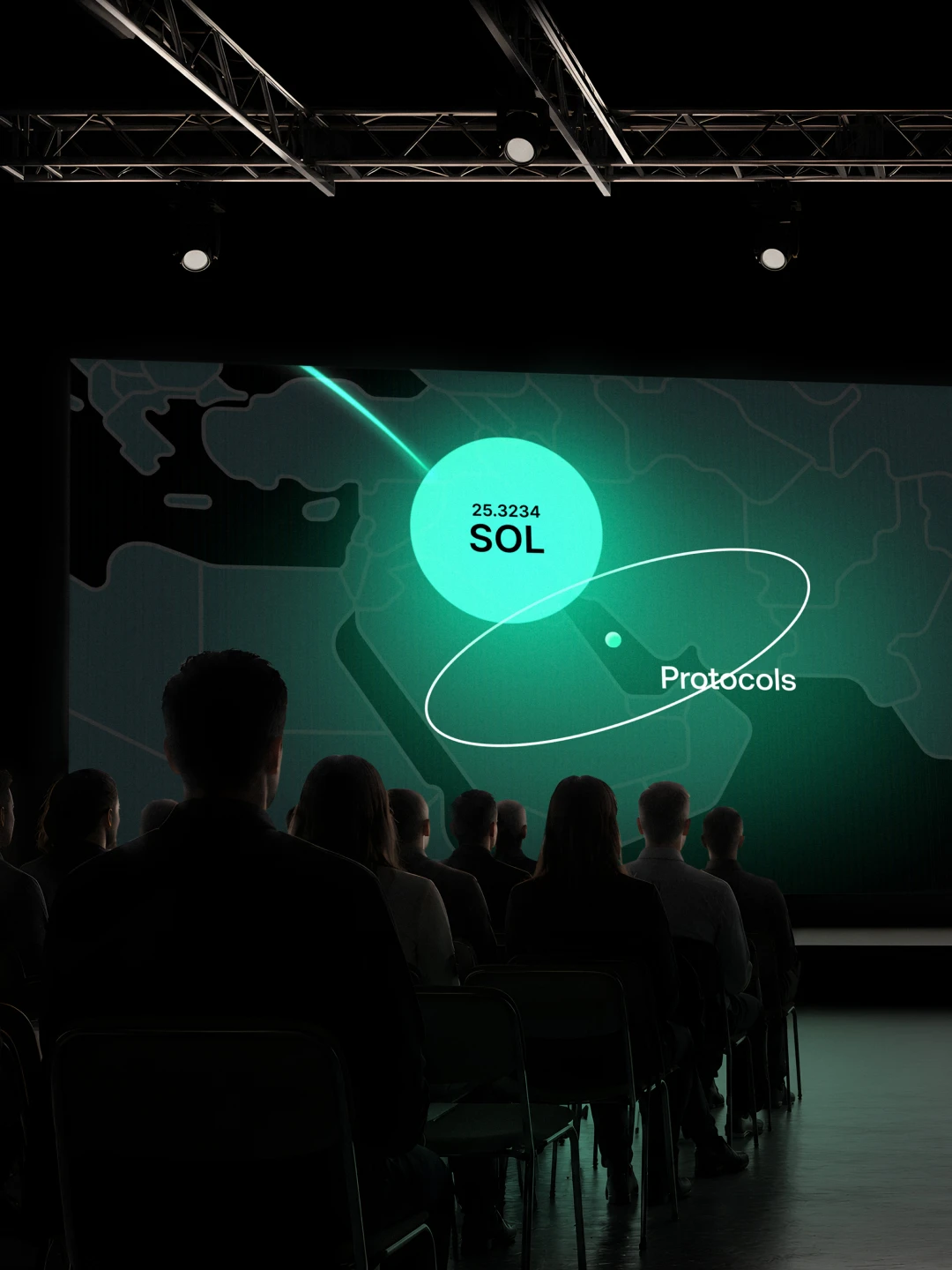
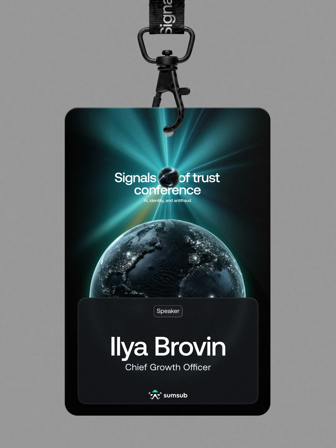
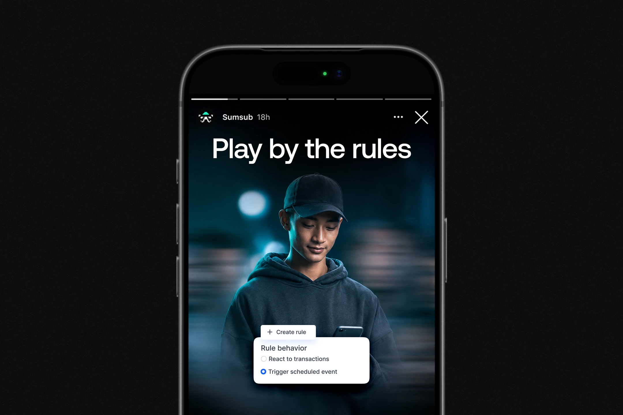

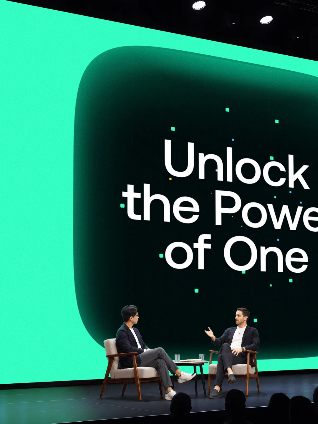




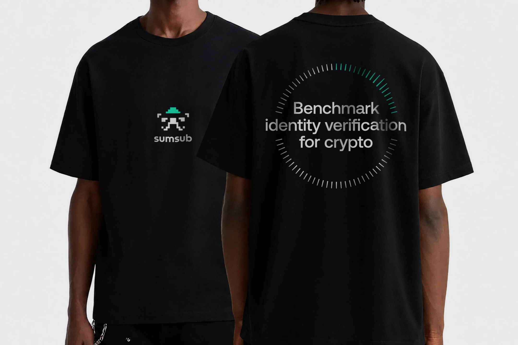

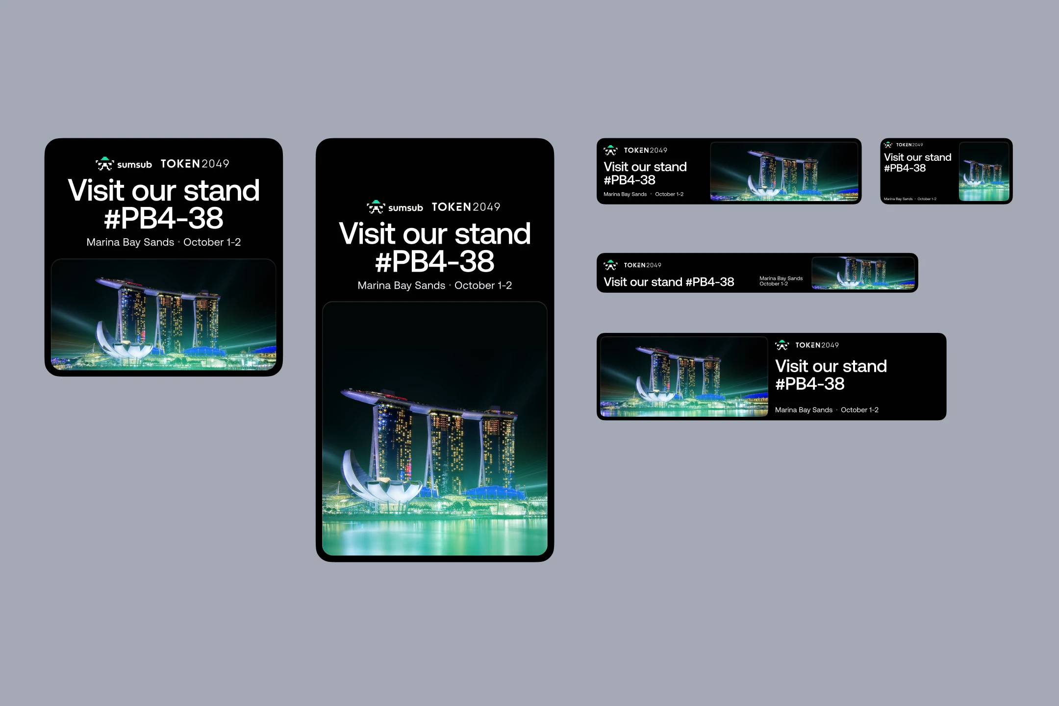






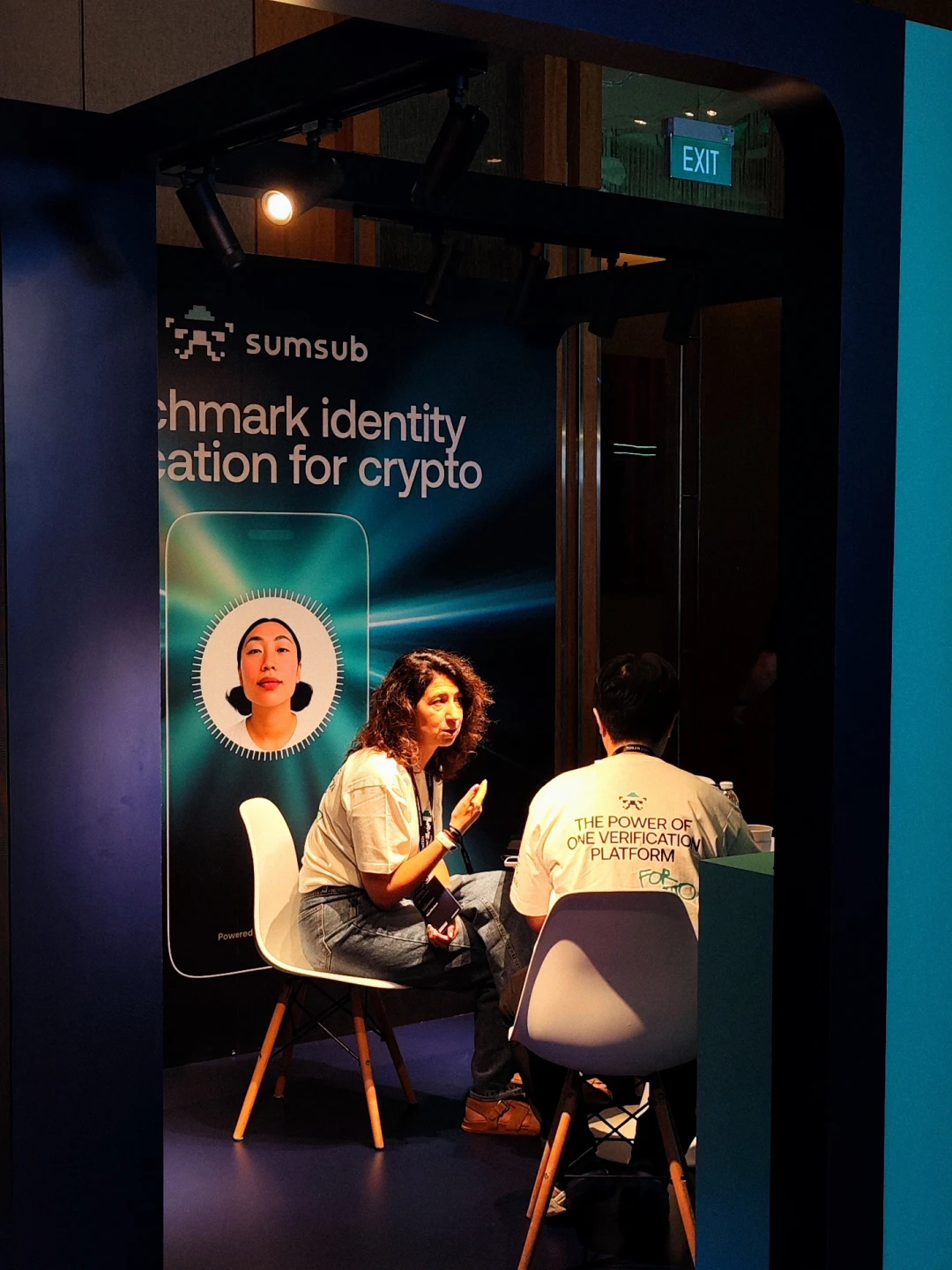


Crypto already has a familiar visual language—dark backgrounds, techno aesthetics, isometric data centers and blockchain blocks. Dropping that language risked making the brand unrecognizable to its own audience. But the design also had to say two things at once: "we are the industry's center of expertise" and "people are at the core of this story." And this wasn't a one-off campaign asset—it had to work as a full identity system for an entire industry, at scale, while still bringing its own point of view to a category that already looks fairly consistent across brands.
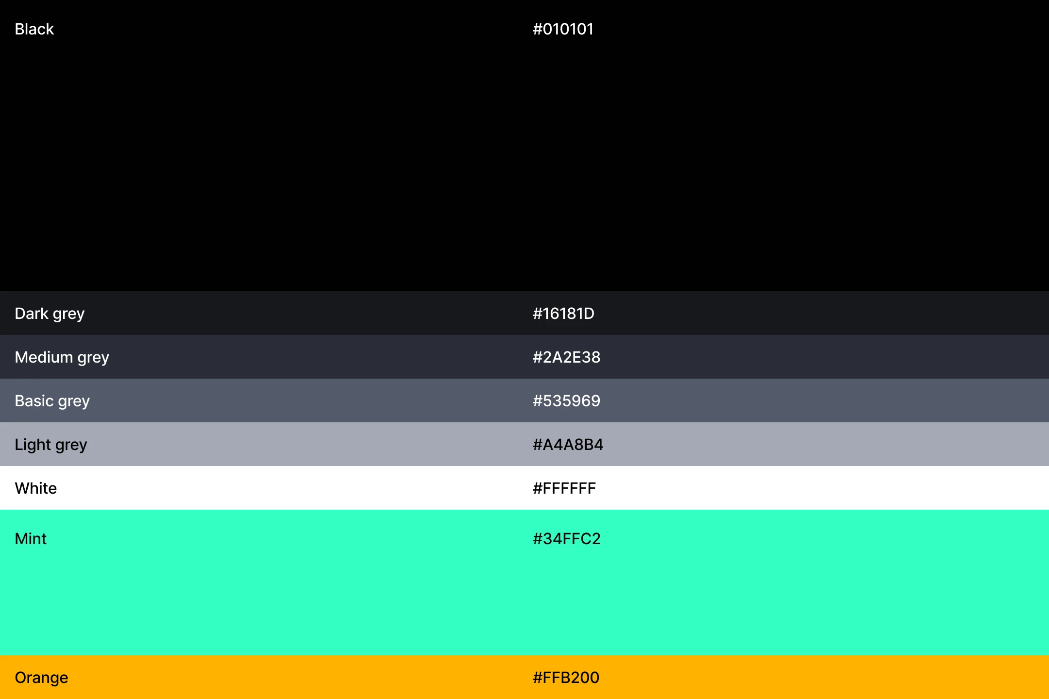
The central-point metaphor became a system, not a single device—beams, blurs, and patterns that flex across formats but stay recognizably one idea. For photography, we chose two directions: fisheye shots of real people, and digital figures in motion blur for more techno-driven stories. Nearly every image is AI-generated, built on its own visual signature. We built prompt templates and a clear production pipeline for photography and 3D, so the system scales fast. We added tactility through metallic gradients, reflections, and glass—material as a metaphor for the transparency of KYC. We kept the dark palette crypto audiences expect, but cut the isometric, data-center clichés. The result: a system that reads as crypto, breaks from the category's visual tropes, and is built to produce content fast, at scale.