Leading a design team. Visual systems and brand communications across every medium.

The Future of Finance

[x]
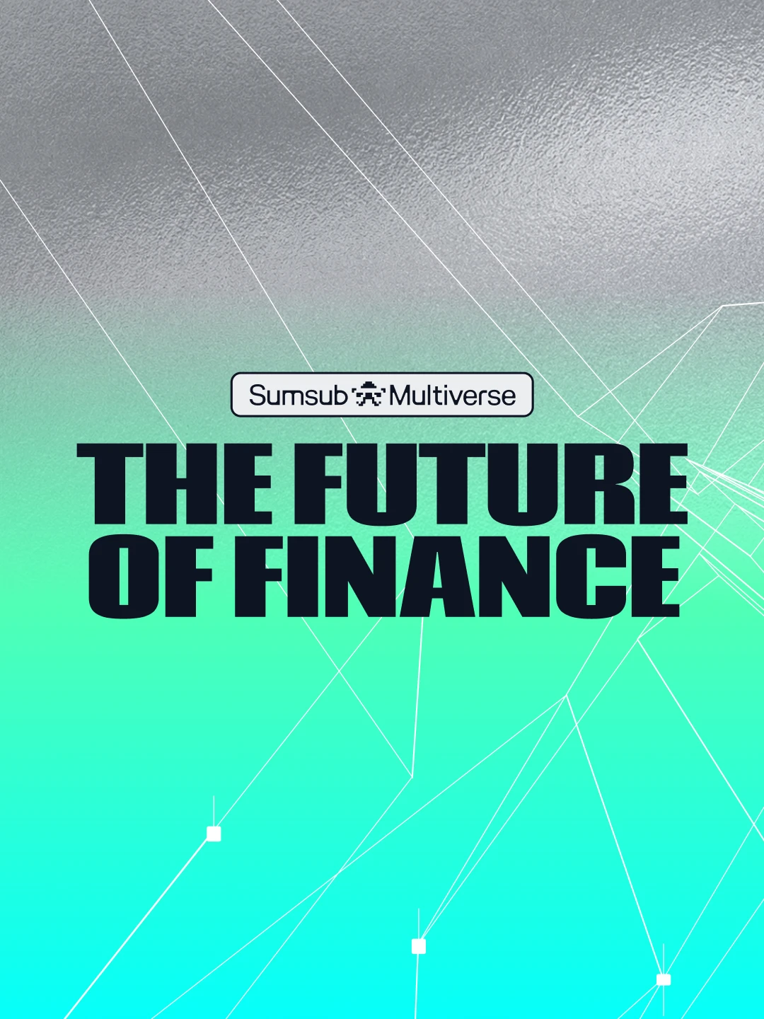
The Future of Finance cover visual
About

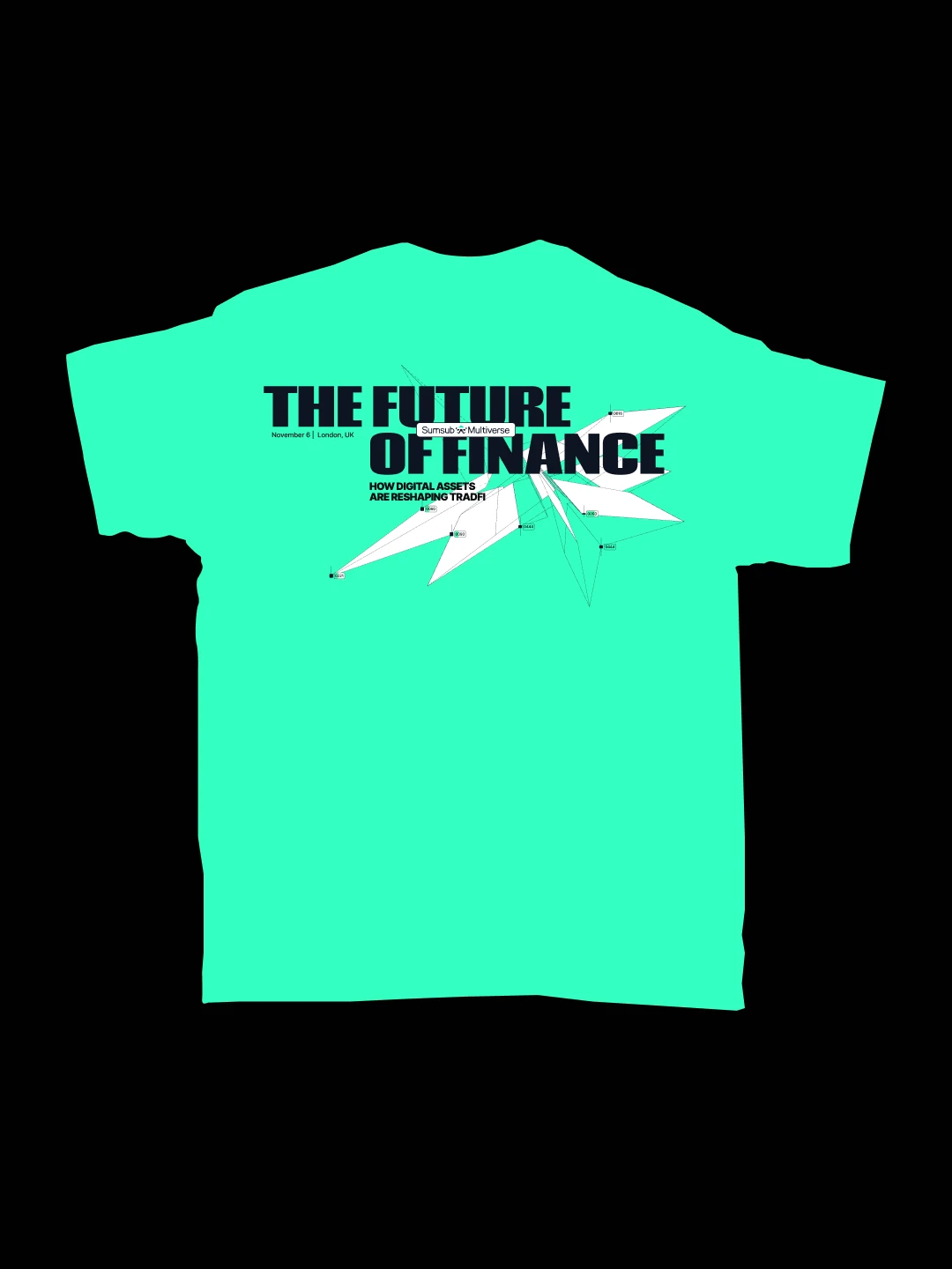
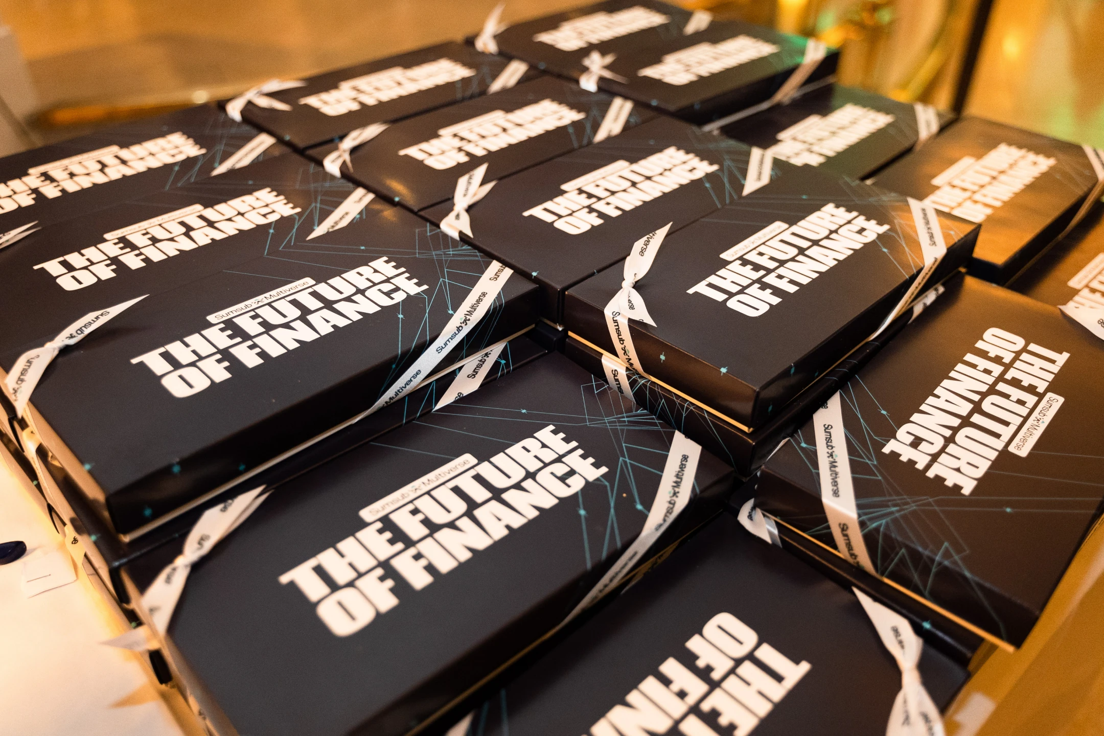
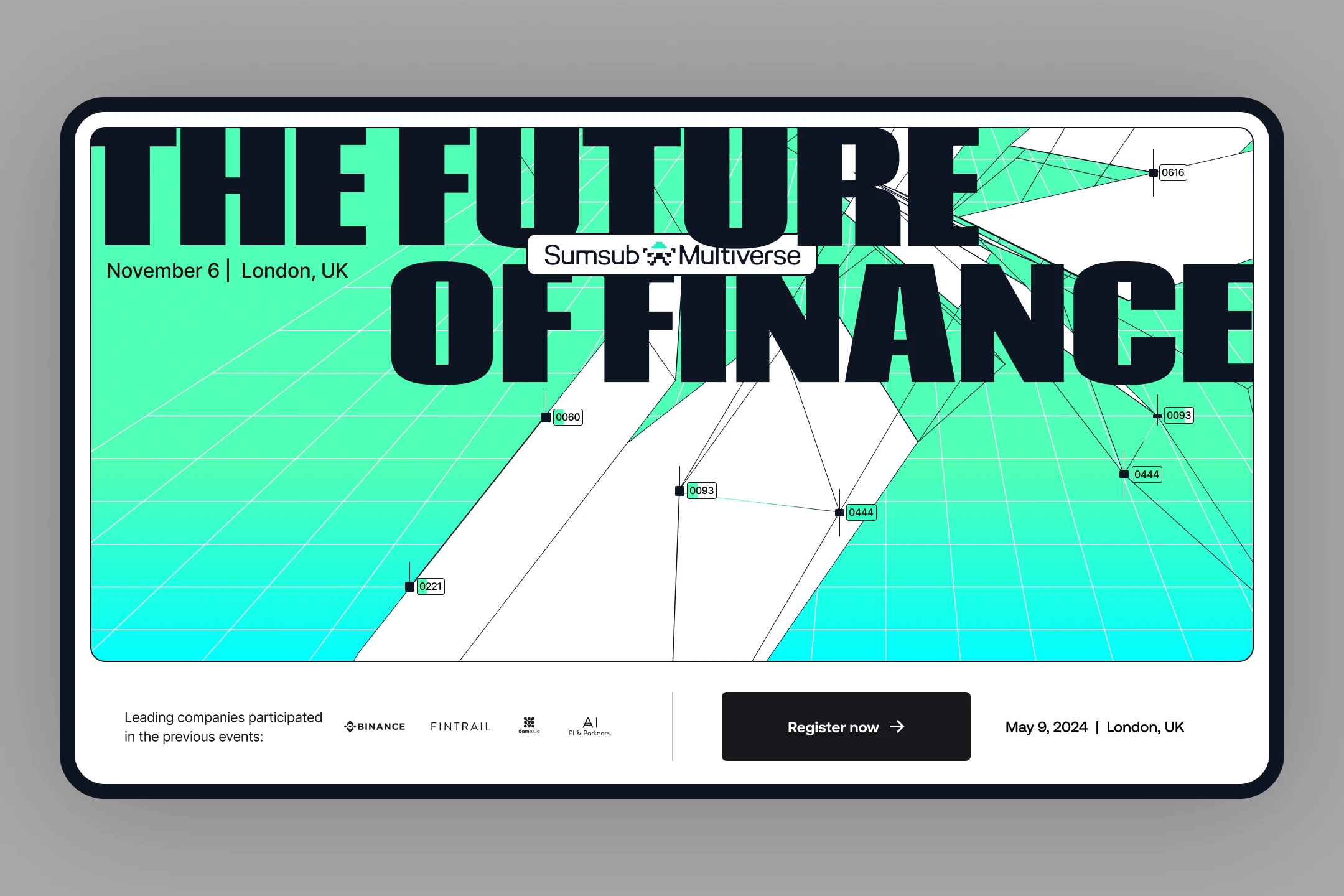
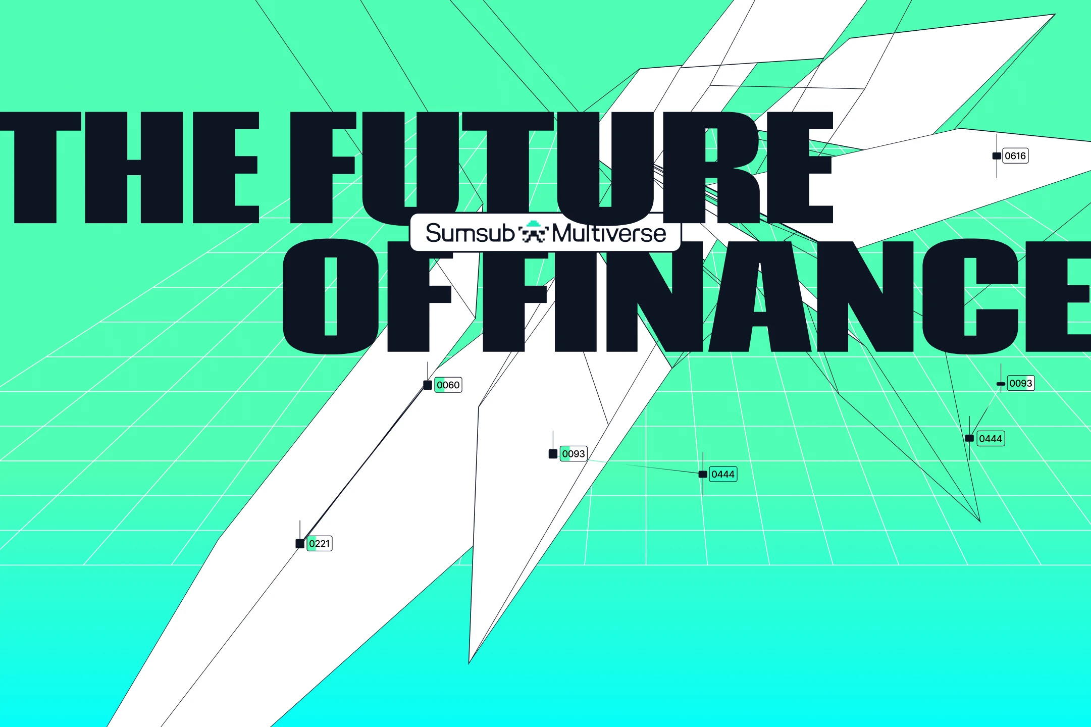
Finance is entering a phase it doesn't yet have language for. Digital assets are pushing traditional systems toward something structurally new—not simply "crypto meets banking," but a genuine reorganization of how value itself moves, is verified, and is trusted. For The Future of Finance, this raised a real design question: if this is a new form of money, a new digital money machine, what does it actually look like—not as an interface, but as a mechanism? The visual identity had to hold that open question rather than resolve it prematurely.

Finance identity visual 02
Finance identity visual 03
Finance identity visual 04
Finance identity visual 05
Finance identity visual 06
Finance identity visual 07
Finance identity visual 08
Finance identity visual 10
Finance identity visual 11
Finance identity visual 12
Finance identity visual 13
Finance identity visual 14
Finance identity visual 15
Finance identity visual 16
Finance identity visual 17
Finance identity visual 18
Finance identity visual 19
Finance identity visual 20
Finance identity visual 21
Finance identity visual 22
Finance identity visual 23
Finance identity visual 24
Challenge

Fintech visual language has a default: trustworthy blues, coin iconography, clean corporate restraint—a palette built to reassure, not to provoke thought. That default was exactly what this event needed to avoid. The challenge was to surprise an audience that has seen every version of "digital trust" visual cliché, while still reading unmistakably as belonging to finance—not drifting into generic tech or sci-fi with no connection to the industry it's actually about.

Solution

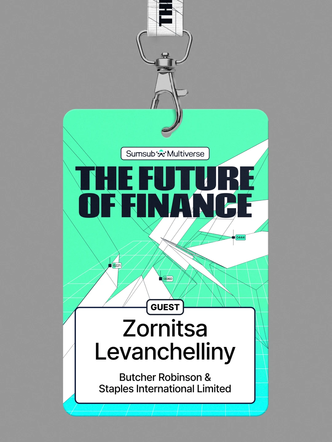
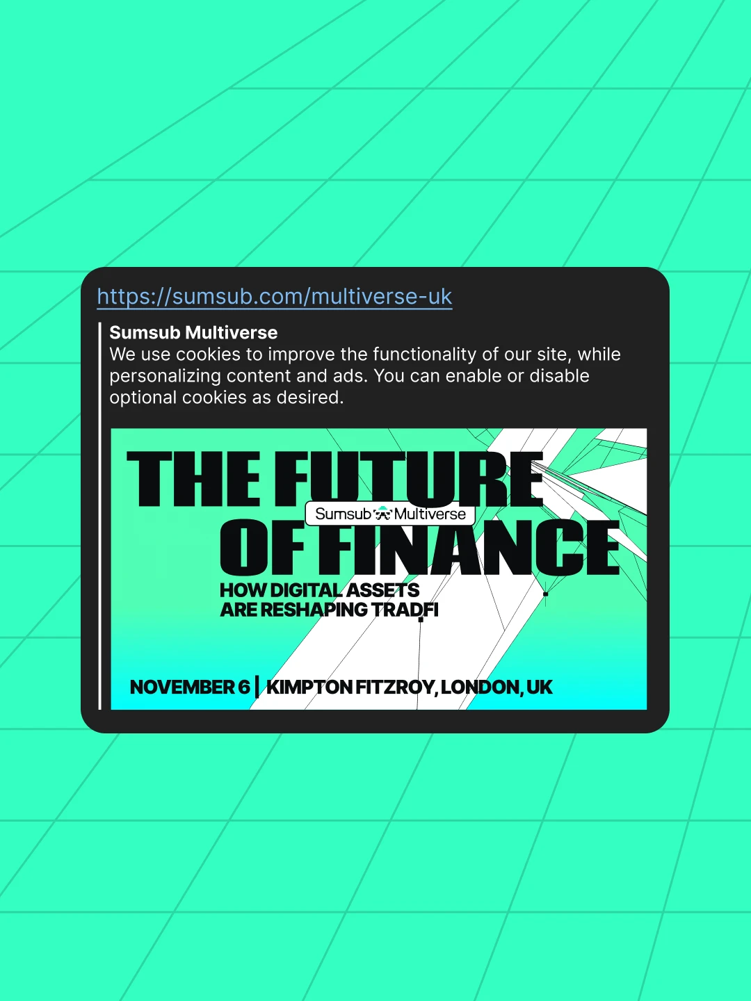
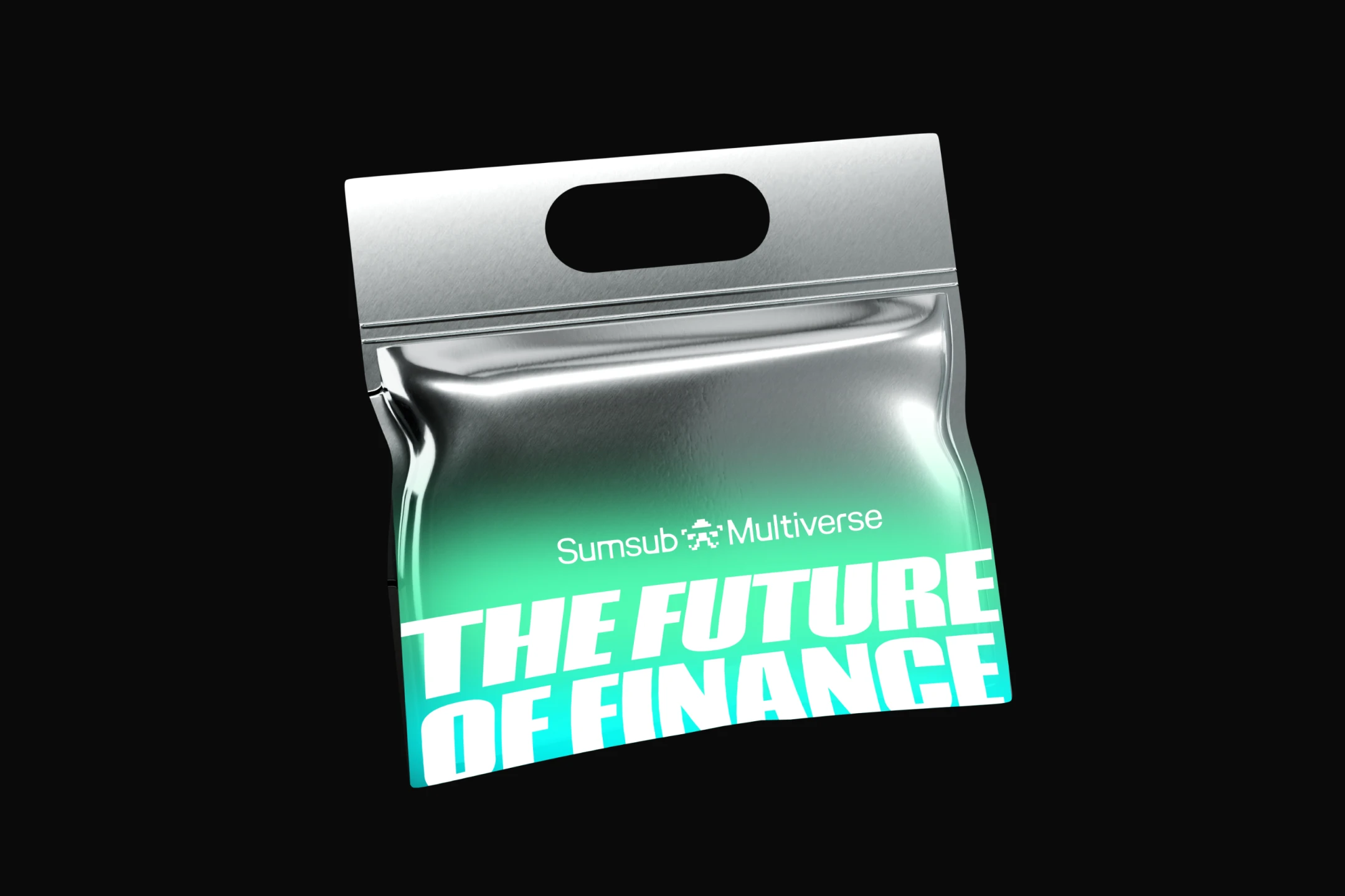
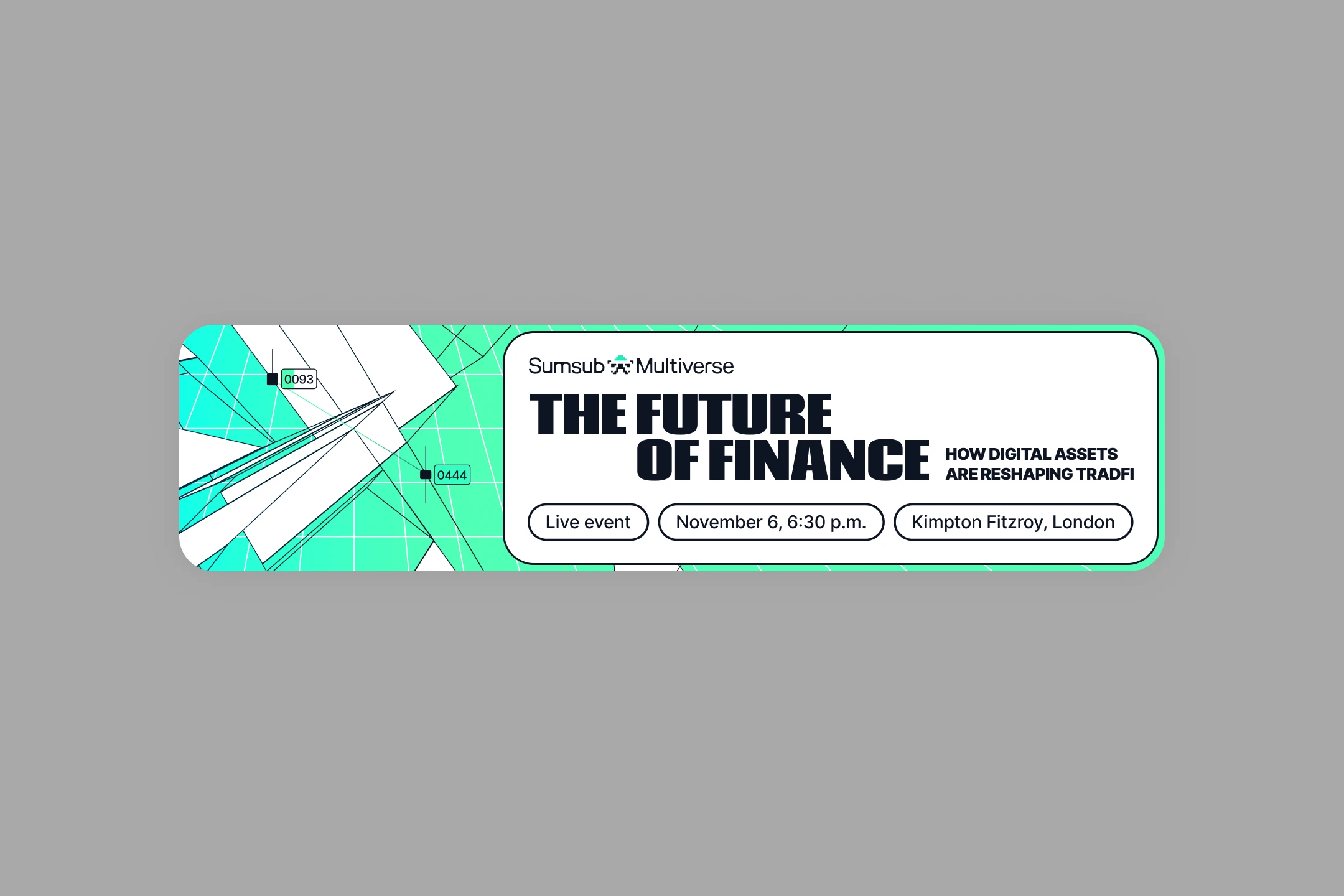
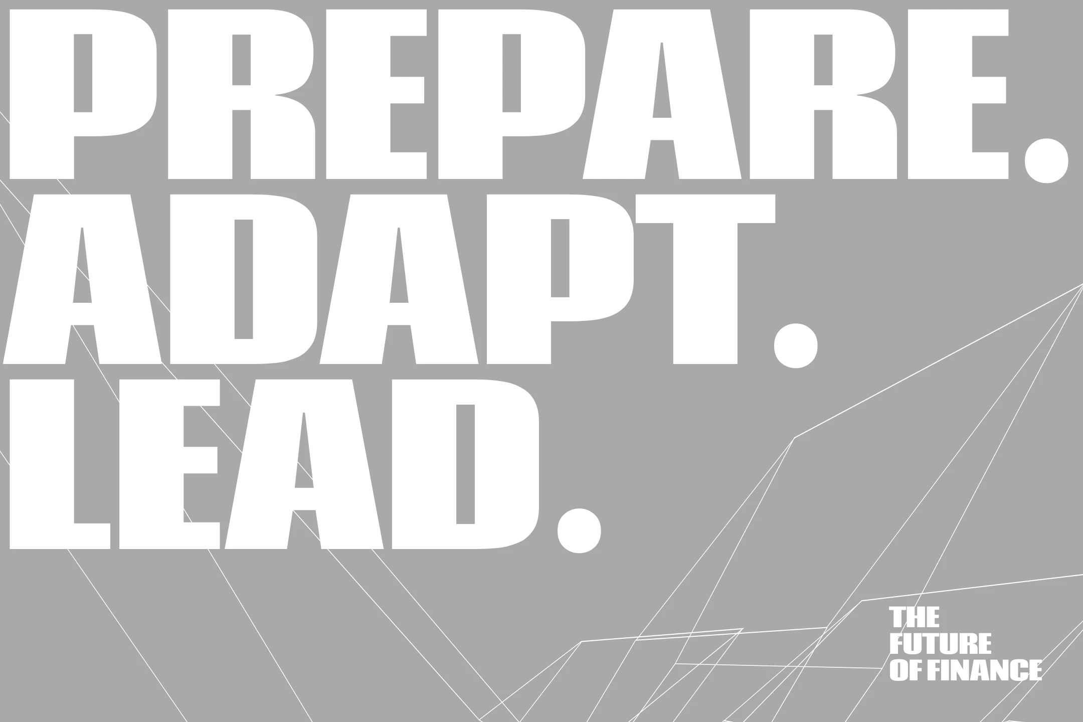
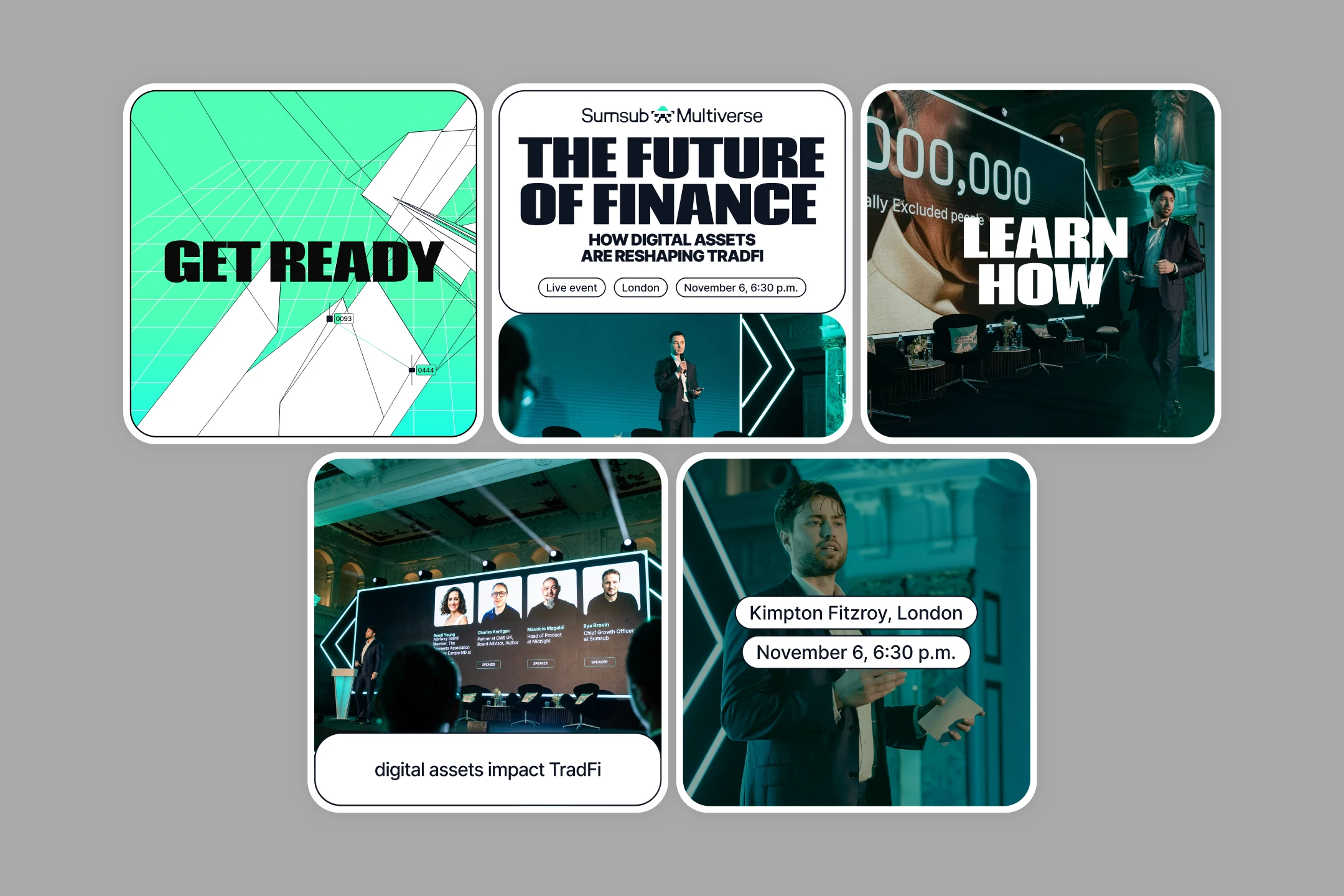
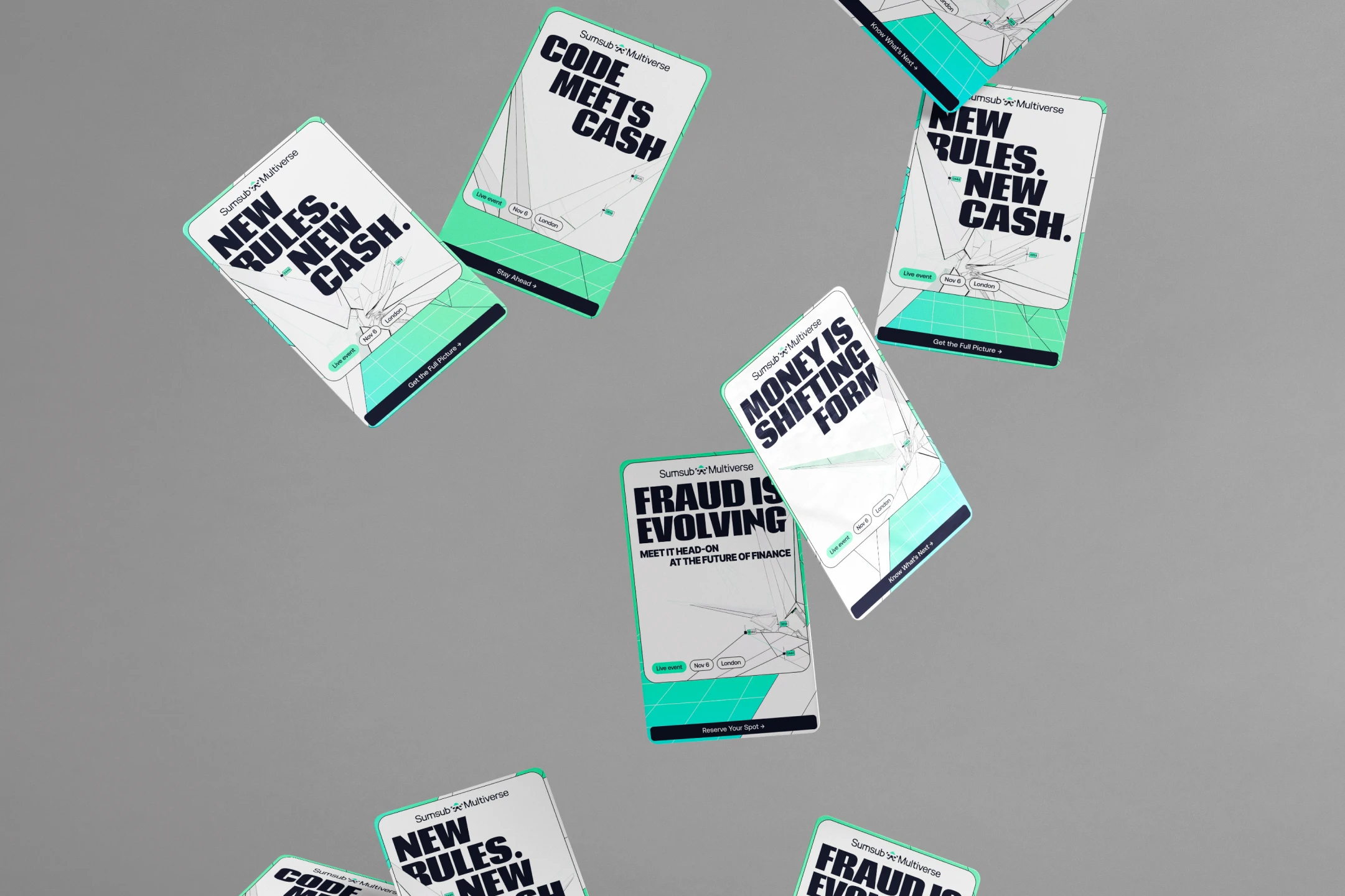
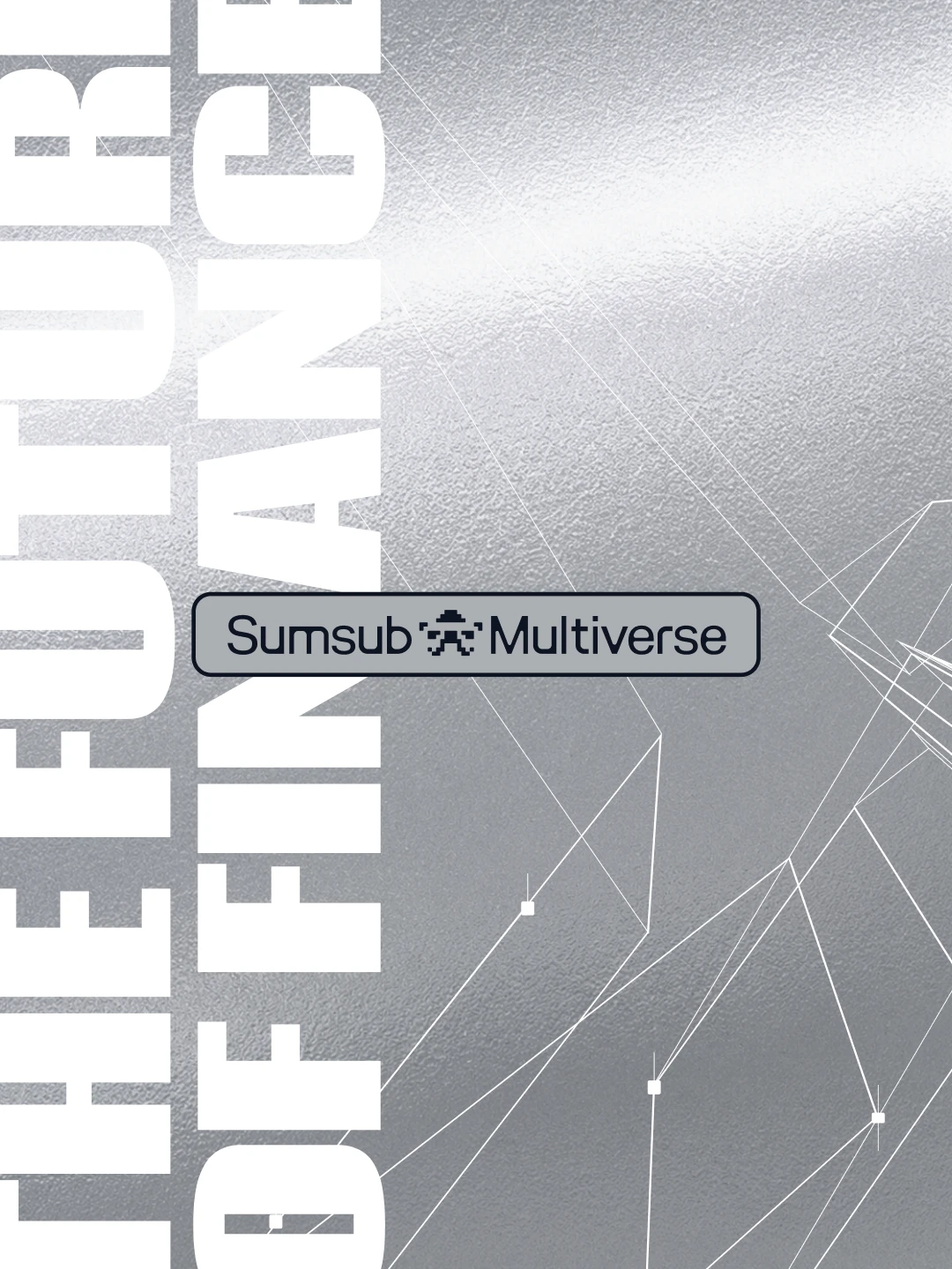
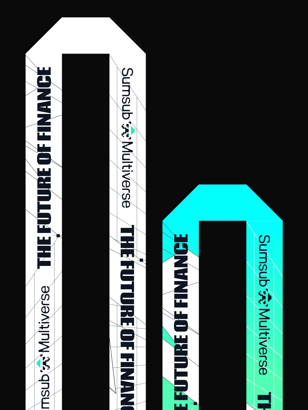
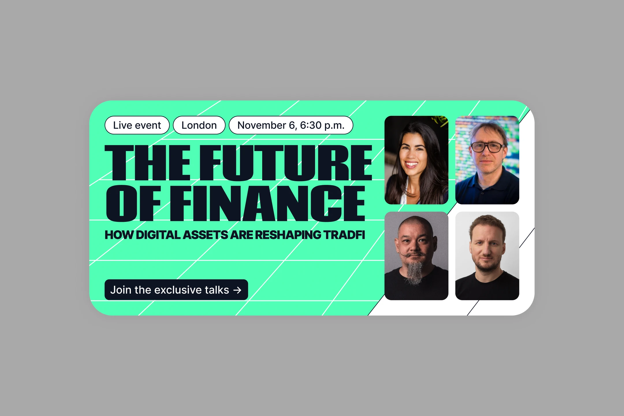
The identity draws from cyberpunk and futurism—mechanical forms with the presence of gundams and robotics. Crypto-candles stay sharp and structural, but between them, thread-like lines carry money as flowing gradients. Sums move through regulated, architectural channels, shown from shifting angles to keep the system visually alive. The palette starts from Sumsub's mint and standard fintech blue. But instead of flat brand colors, they bleed and flow into each other—echoing the interconnection the mechanism itself represents. A grid runs underneath as a recurring pattern, giving the system structure, perspective, and depth. The result is finance as an unnamed cybernetic mechanism: technical, precise, not yet fully legible. A future already in motion—just not yet understood.

The Future of Finance [X]
The Future of Finance cover visual
About

Finance is entering a phase it doesn't yet have language for. Digital assets are pushing traditional systems toward something structurally new—not simply "crypto meets banking," but a genuine reorganization of how value itself moves, is verified, and is trusted. For The Future of Finance, this raised a real design question: if this is a new form of money, a new digital money machine, what does it actually look like—not as an interface, but as a mechanism? The visual identity had to hold that open question rather than resolve it prematurely.
Finance identity visual 02
Finance identity visual 03
Finance identity visual 04
Finance identity visual 05
Finance identity visual 06
Finance identity visual 07
Finance identity visual 08
Finance identity visual 10
Finance identity visual 11
Finance identity visual 12
Finance identity visual 13
Finance identity visual 14
Finance identity visual 15
Finance identity visual 16
Finance identity visual 17
Finance identity visual 18
Finance identity visual 19
Finance identity visual 20
Finance identity visual 21
Finance identity visual 22
Finance identity visual 23
Finance identity visual 24
Challenge

Fintech visual language has a default: trustworthy blues, coin iconography, clean corporate restraint—a palette built to reassure, not to provoke thought. That default was exactly what this event needed to avoid. The challenge was to surprise an audience that has seen every version of "digital trust" visual cliché, while still reading unmistakably as belonging to finance—not drifting into generic tech or sci-fi with no connection to the industry it's actually about.

Solution

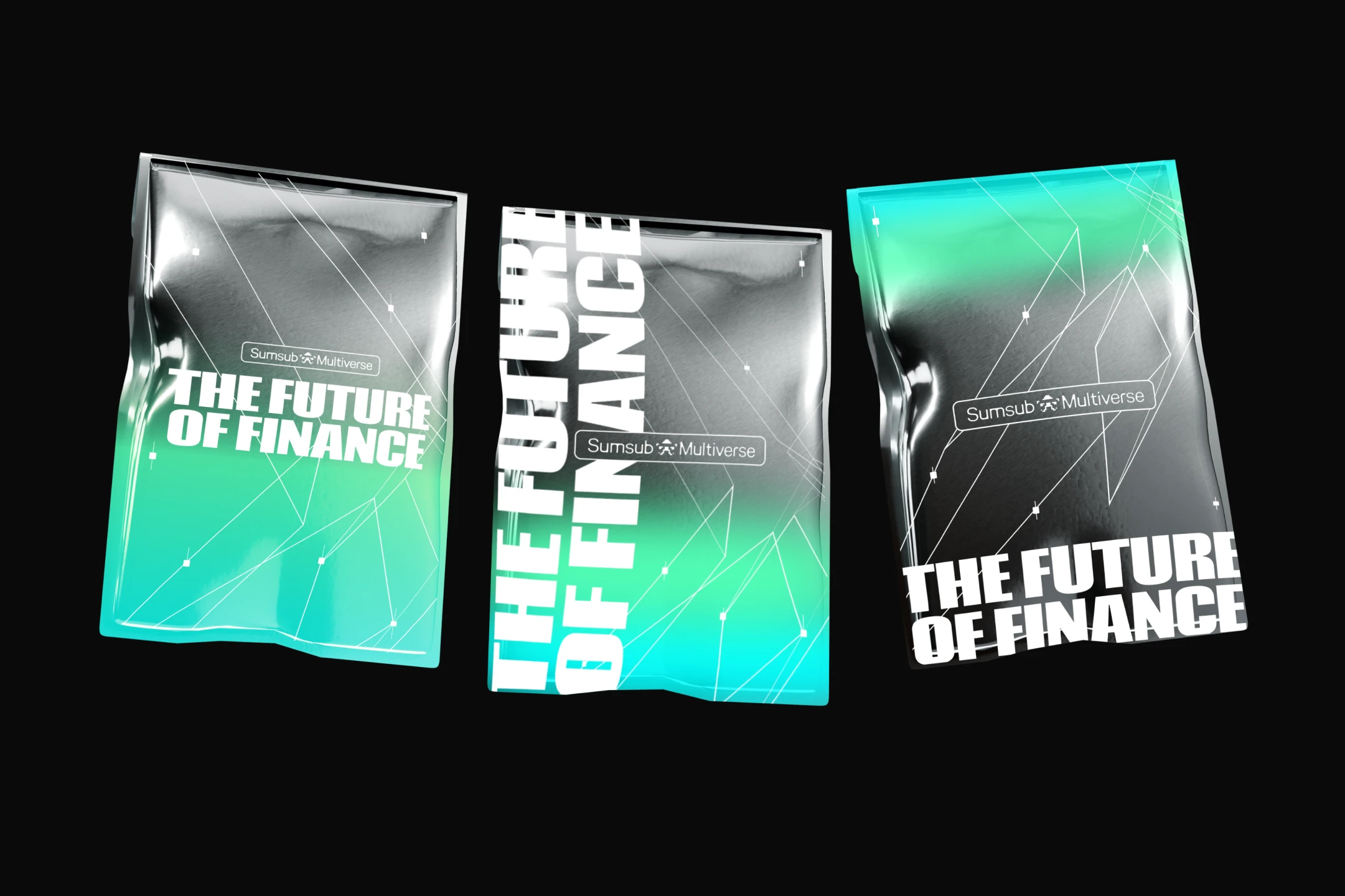
The identity draws from cyberpunk and futurism—mechanical forms with the presence of gundams and robotics. Crypto-candles stay sharp and structural, but between them, thread-like lines carry money as flowing gradients. Sums move through regulated, architectural channels, shown from shifting angles to keep the system visually alive. The palette starts from Sumsub's mint and standard fintech blue. But instead of flat brand colors, they bleed and flow into each other—echoing the interconnection the mechanism itself represents. A grid runs underneath as a recurring pattern, giving the system structure, perspective, and depth. The result is finance as an unnamed cybernetic mechanism: technical, precise, not yet fully legible. A future already in motion—just not yet understood.

Scroll to top