To top ↑

Leading a design team. Visual systems and brand communications across every medium.

Sumsub rebranding

[X]
Sumsub rebranding
About

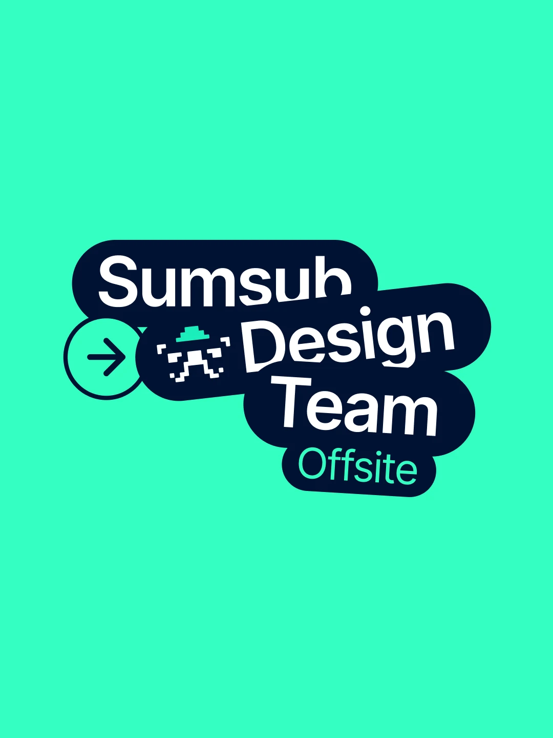
Sumsub is an international AI-powered platform for identity verification and compliance (KYC, KYB, AML), trusted by global leaders like Binance, Bybit, and Duolingo. When I joined, the company was in the middle of rapid growth—400+ employees, international expansion, an enterprise-level client base—while the brand team had just three people and no visual identity system in place. The task was to build everything from the ground up: hire strong talent, establish a visual language, and make it ready to scale for years ahead.
Impact

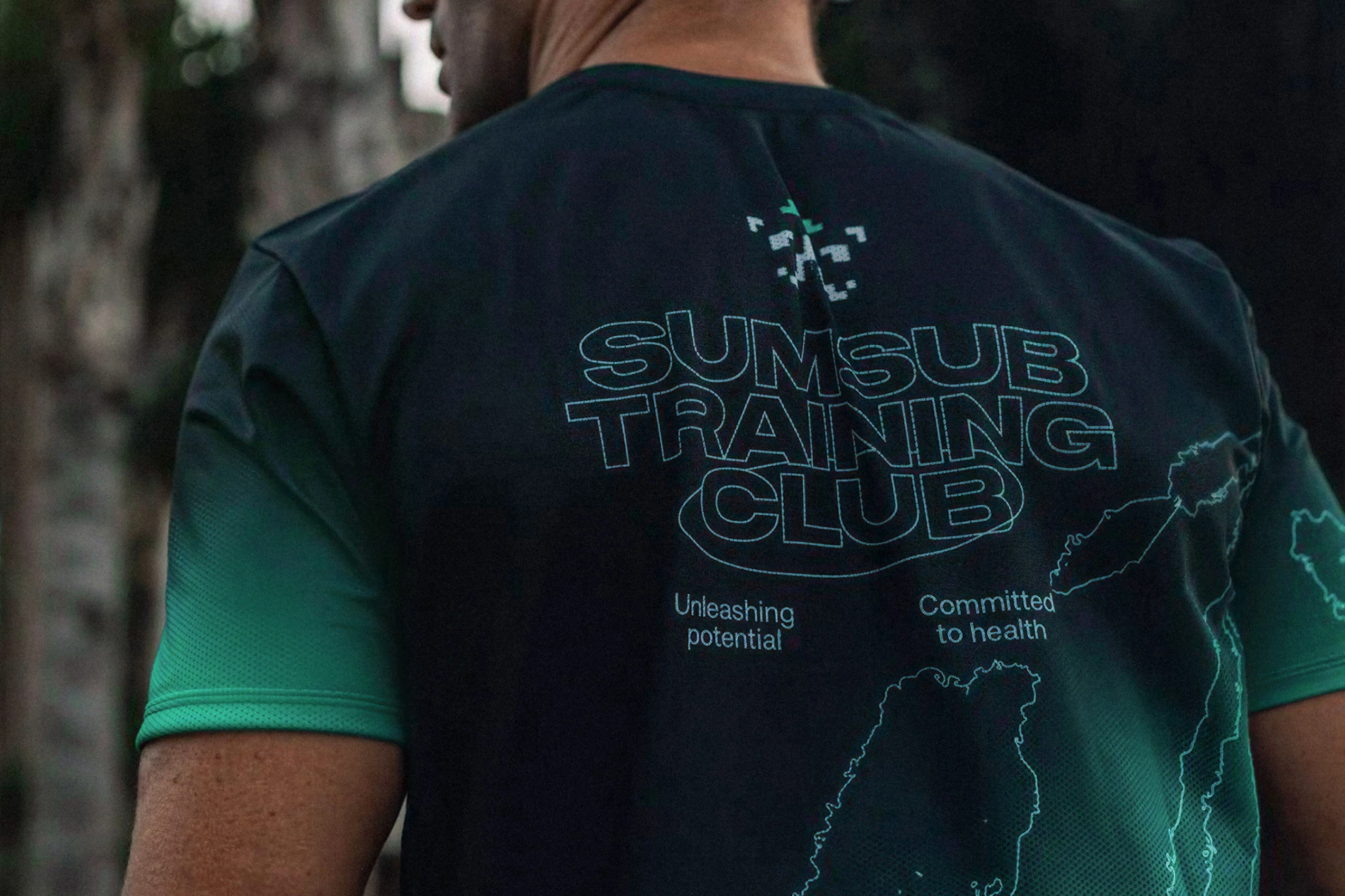
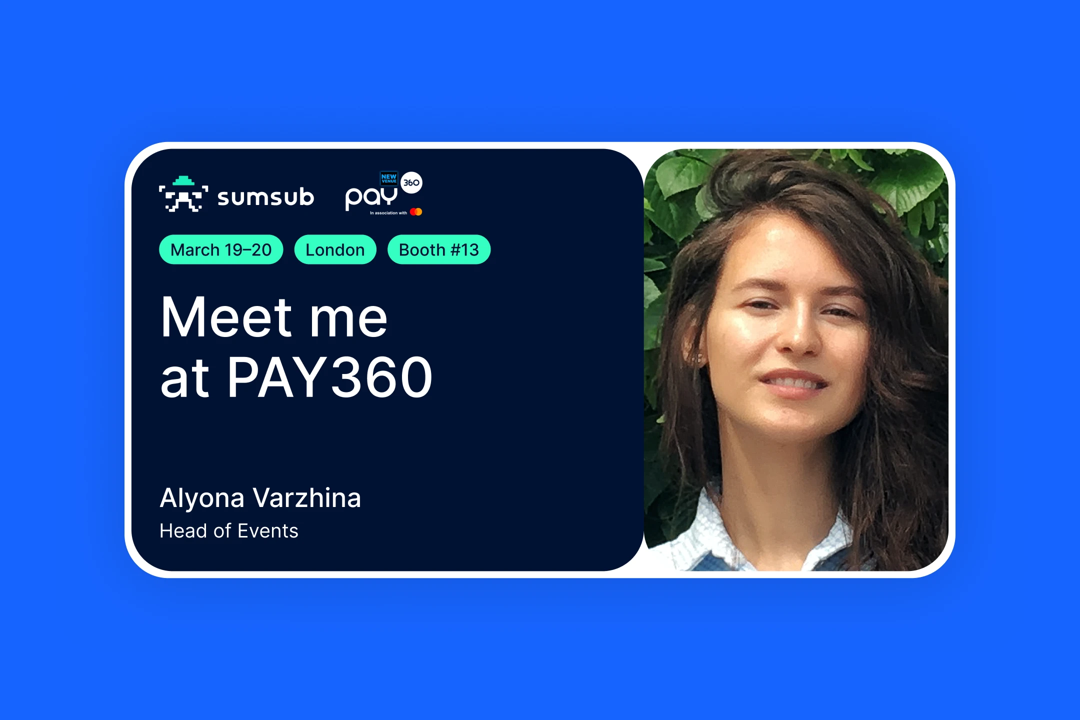
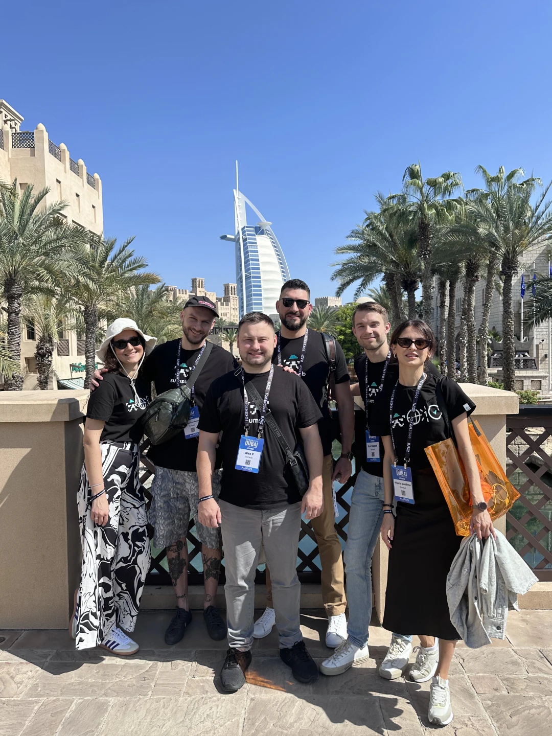
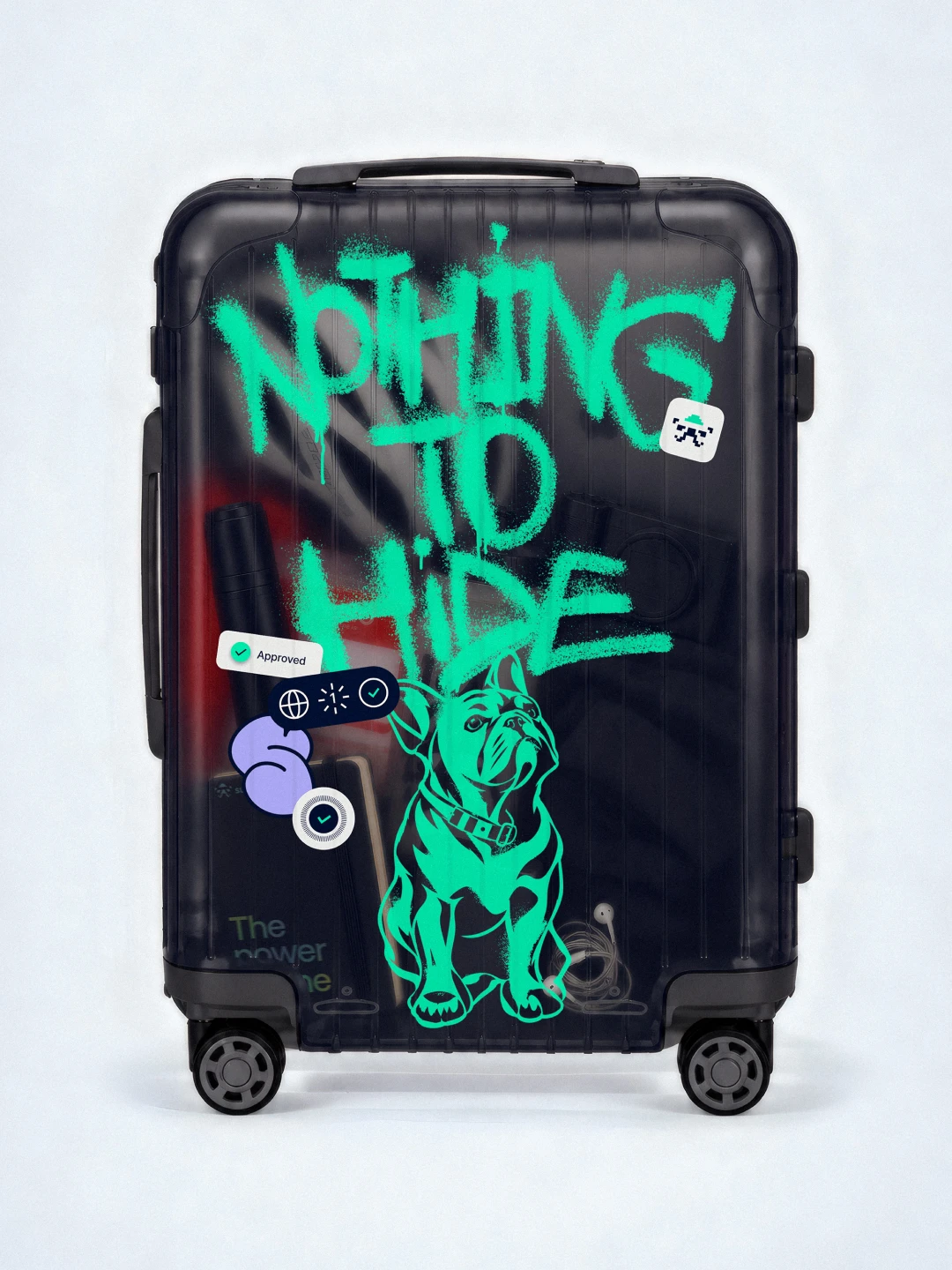
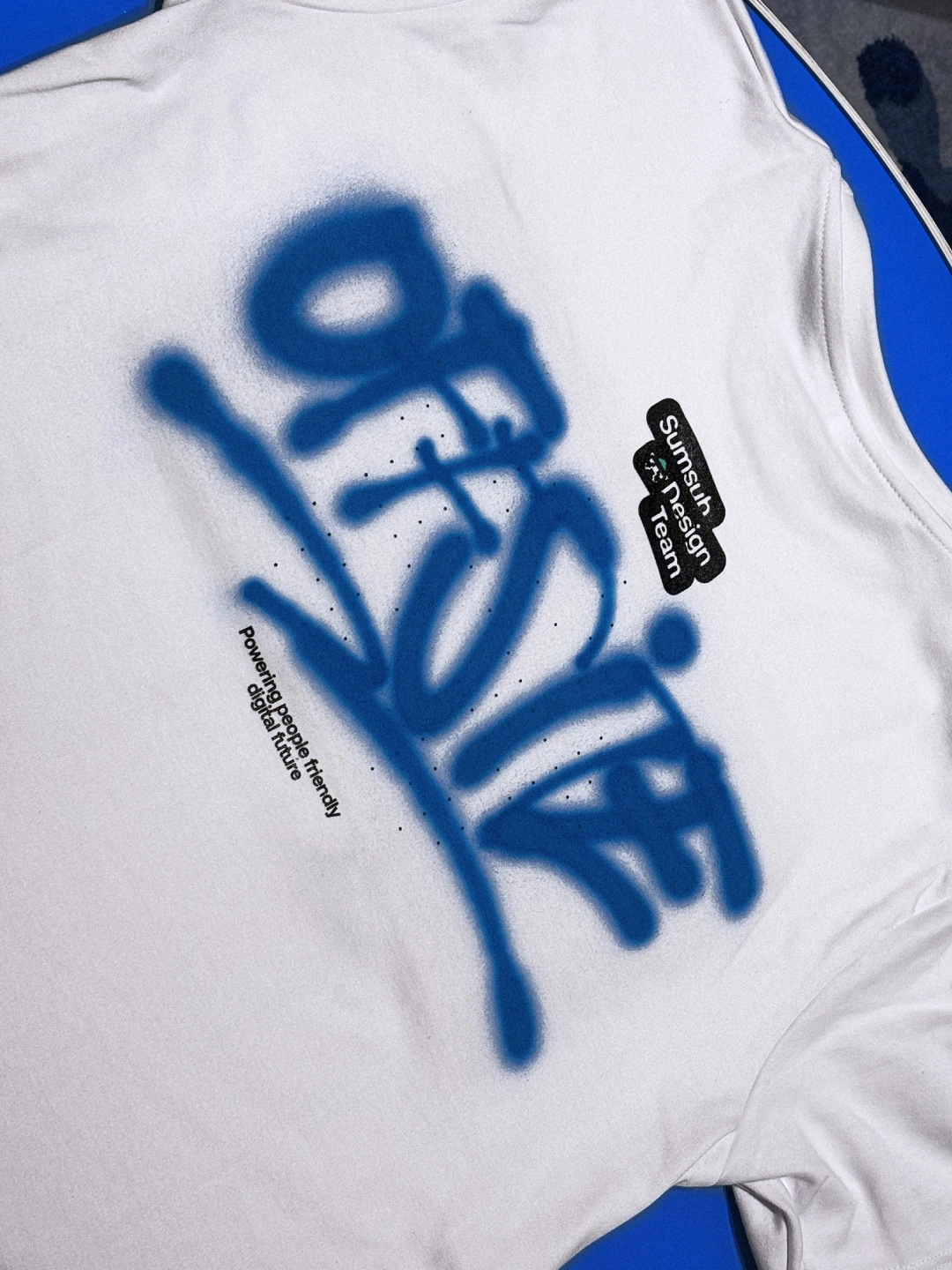
The brand grew with the company from 400 to 1000+ employees. Clients responded positively, social channels gained real traction, conferences filled venues, and the work earned international recognition. The Greenflag project is one I’m proud to have shaped visually—the brand packaging was my work, and it went on to win significant international awards. Instagram grew from zero to 30–40K followers, built together with the social and marketing team through consistent content and a strong visual identity that made every post immediately recognizable. Special projects like the Multiverse and Roadshow conferences ran at least twice a year each—each time filling the room and generating strong community engagement around Sumsub’s anti-fraud mission. Each required a full production cycle: booth design, screen content, presentations, merch. At live crypto conferences in Dubai and Singapore I worked hands-on—preparing booth materials for print, producing video for screens, and creating custom merch on-site. Hand-painted t-shirts and tote bags drew queues, sparked social buzz, and opened direct conversations with clients. The identity became distinctive enough that competing startups began copying it. That’s the clearest measure of visual trust a brand can earn.

Team

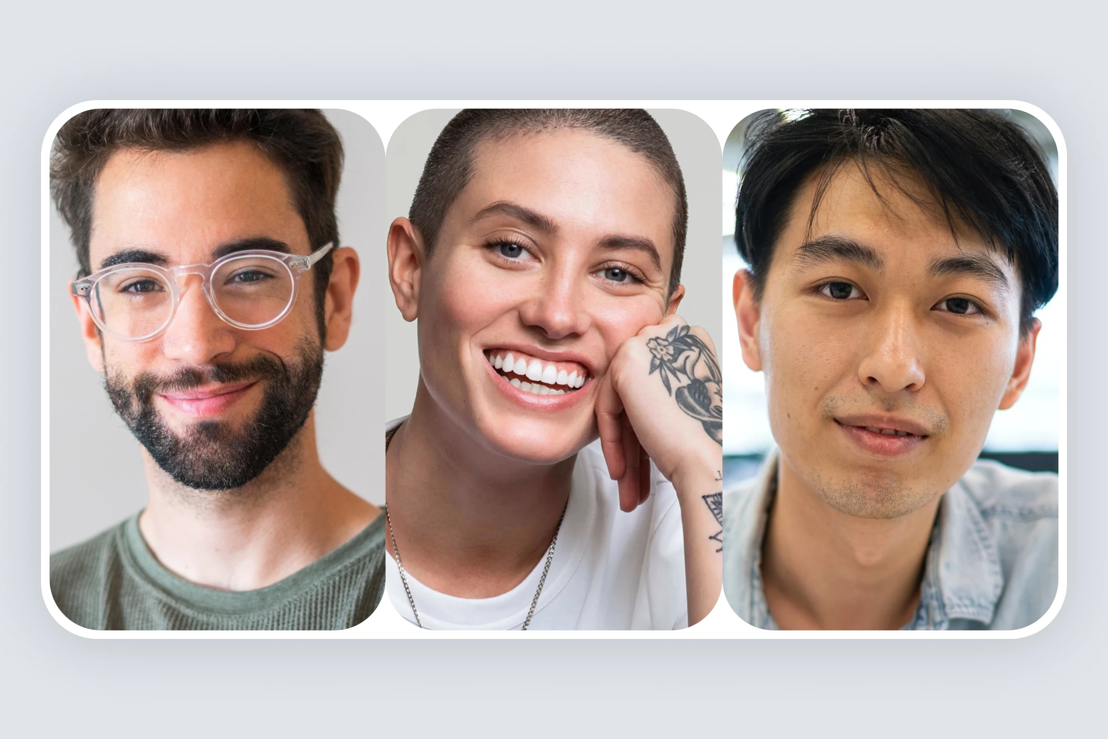
I led the brand team at different stages of the company’s growth—both a larger brand team and a smaller, focused creative unit at different points. At peak the brand team reached up to 10 people, covering visual and motion design. The team was international; mentoring and cross-departmental communication happened in English. My approach was consistent: thorough portfolio reviews with defined growth goals, craft-focused design mentoring, task planning, and inter-team coordination. I ran internal brand surveys to map perception and identify improvement areas. The designers I hired became the reliable core of the brand team—highly agentic, proactive, and capable of owning the most complex challenges. I’m genuinely grateful to each of them for the trust and the work we did side by side—never dropping the quality bar, regardless of deadlines or the challenge at hand.

Challenge

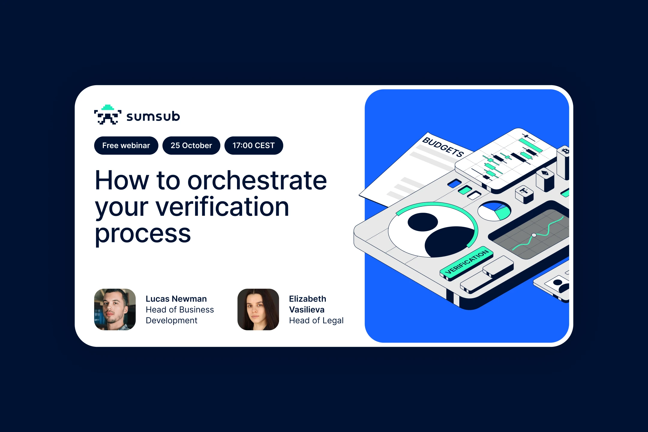
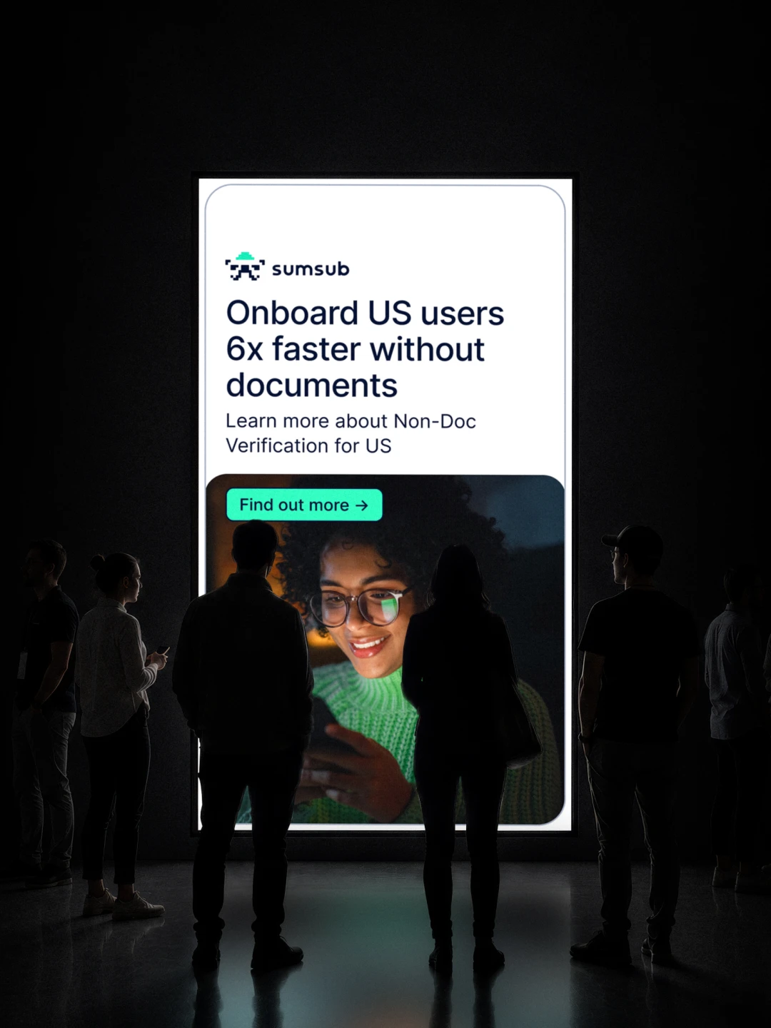
B2B compliance platforms tend to default to the same visual register: corporate blue, banking-grade seriousness, templated type. Sumsub already had one recognizable asset—a pixel-based logo—but nothing existed around it. No color logic, no layout principles, no unified approach across channels. The identity needed to work across dozens of contexts—conference booths, ad banners, sub-brands, special projects. It had to sustain the pace of a marketing team producing assets at high velocity. And it had to remain instantly recognizable as Sumsub, whether on a trade show wall in Dubai or a 300px social banner.

Solution

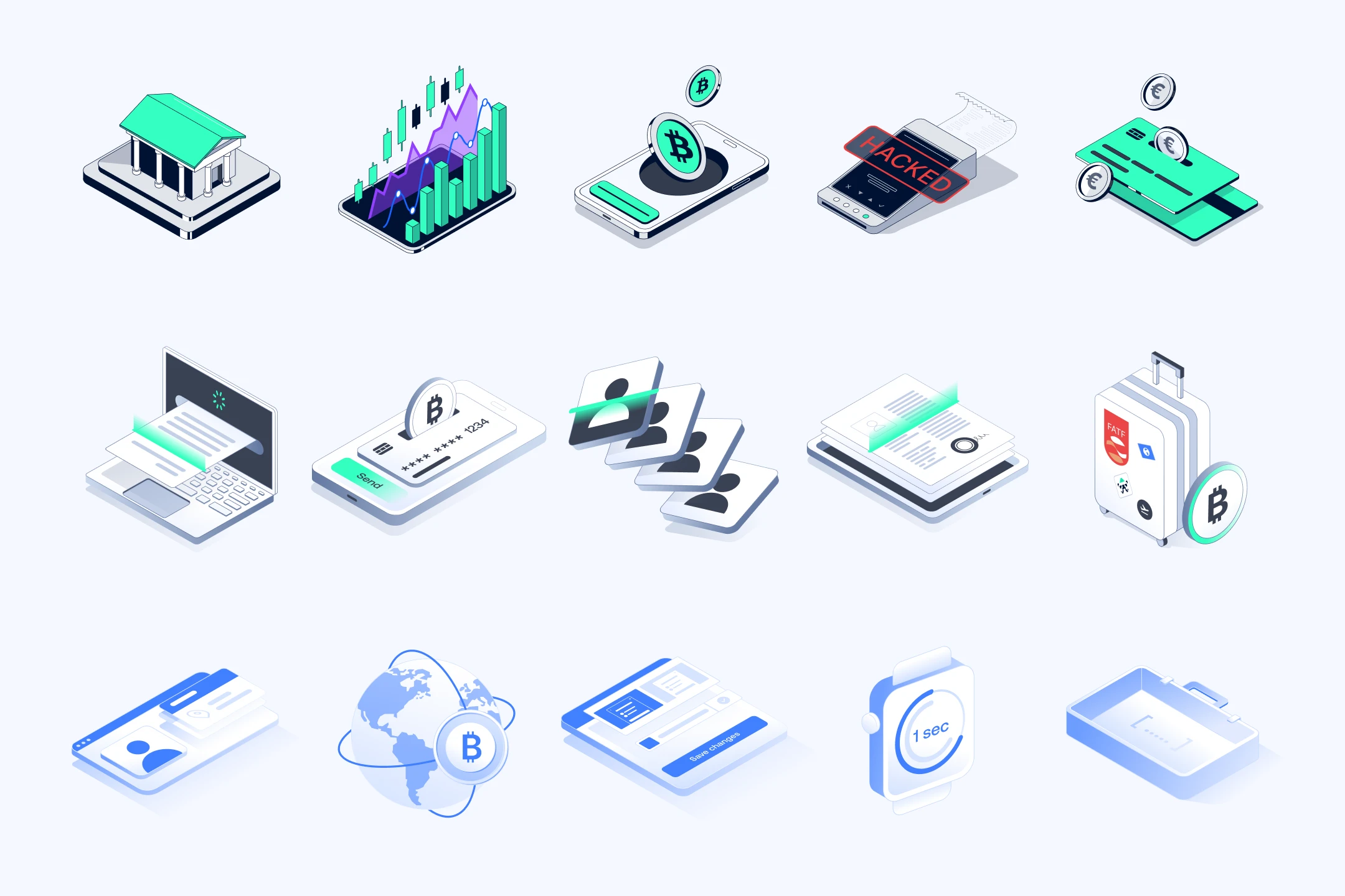
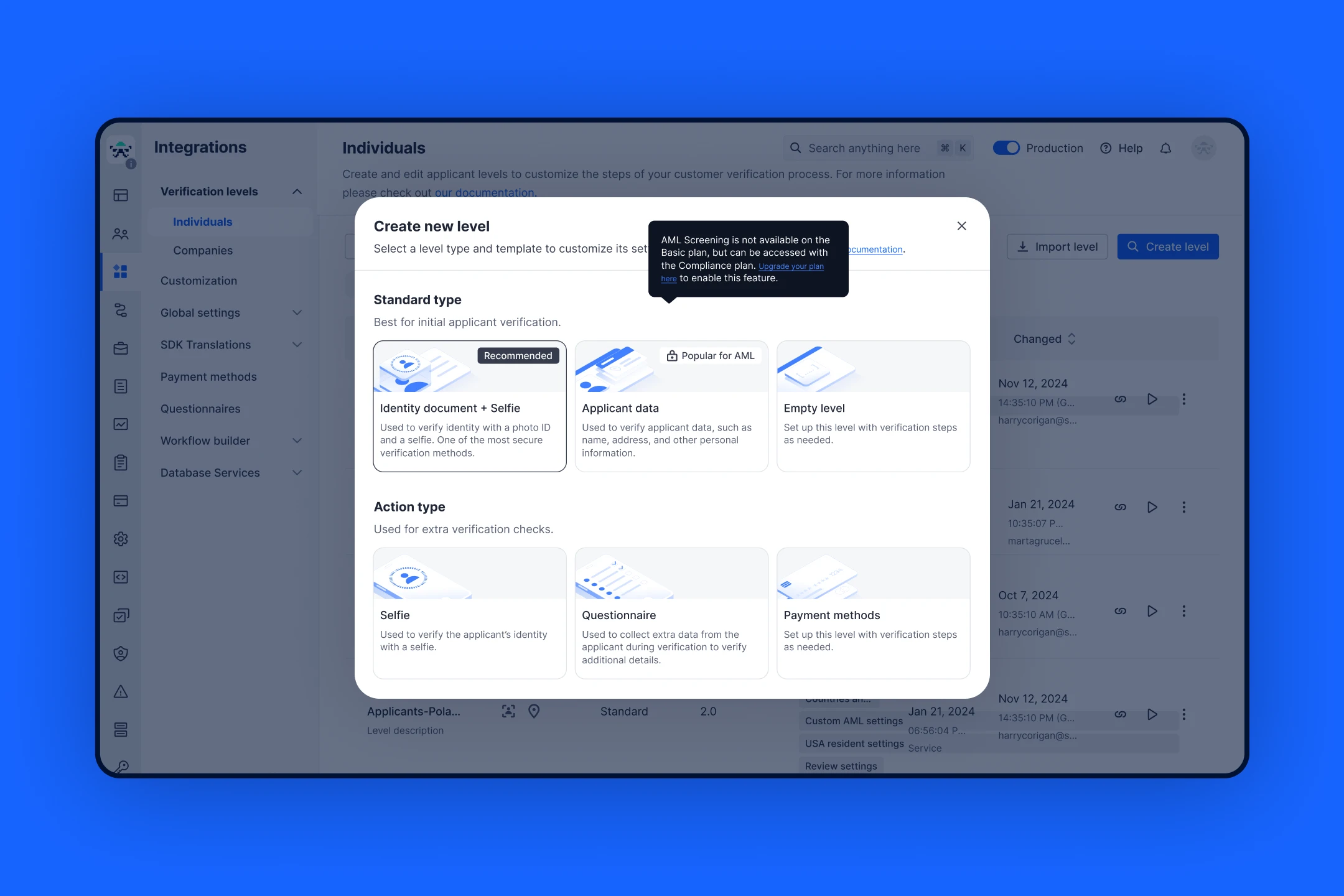
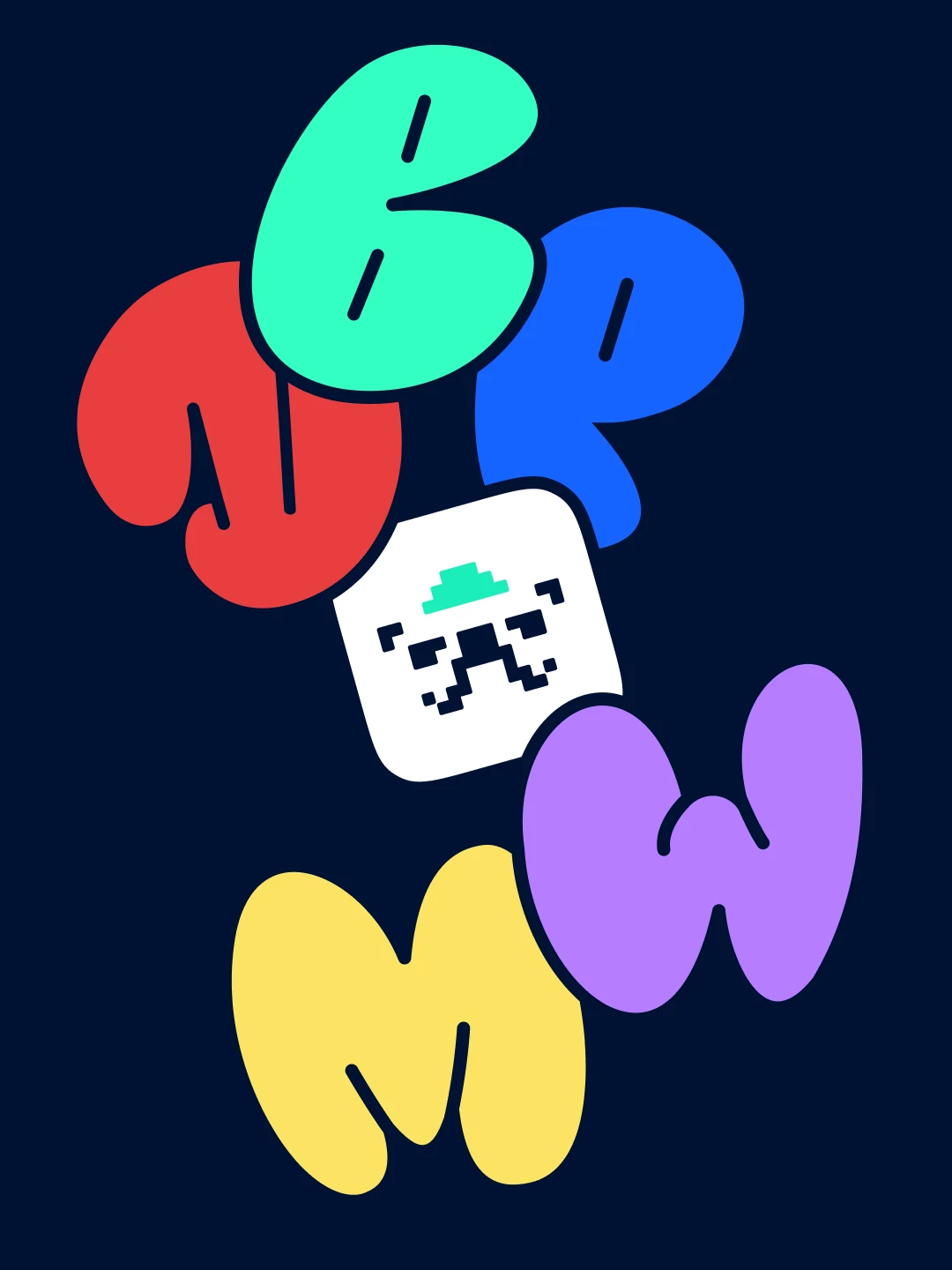
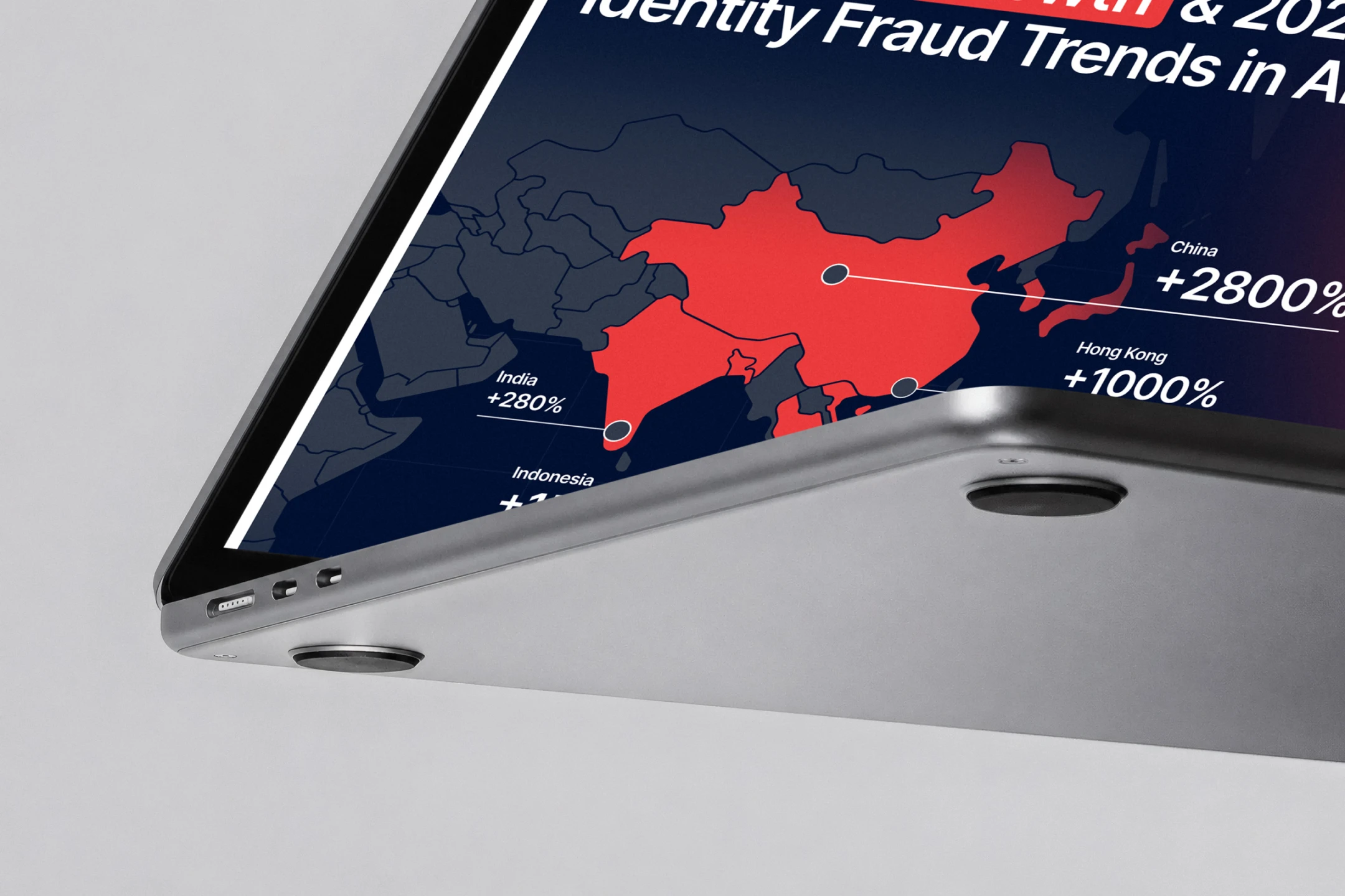
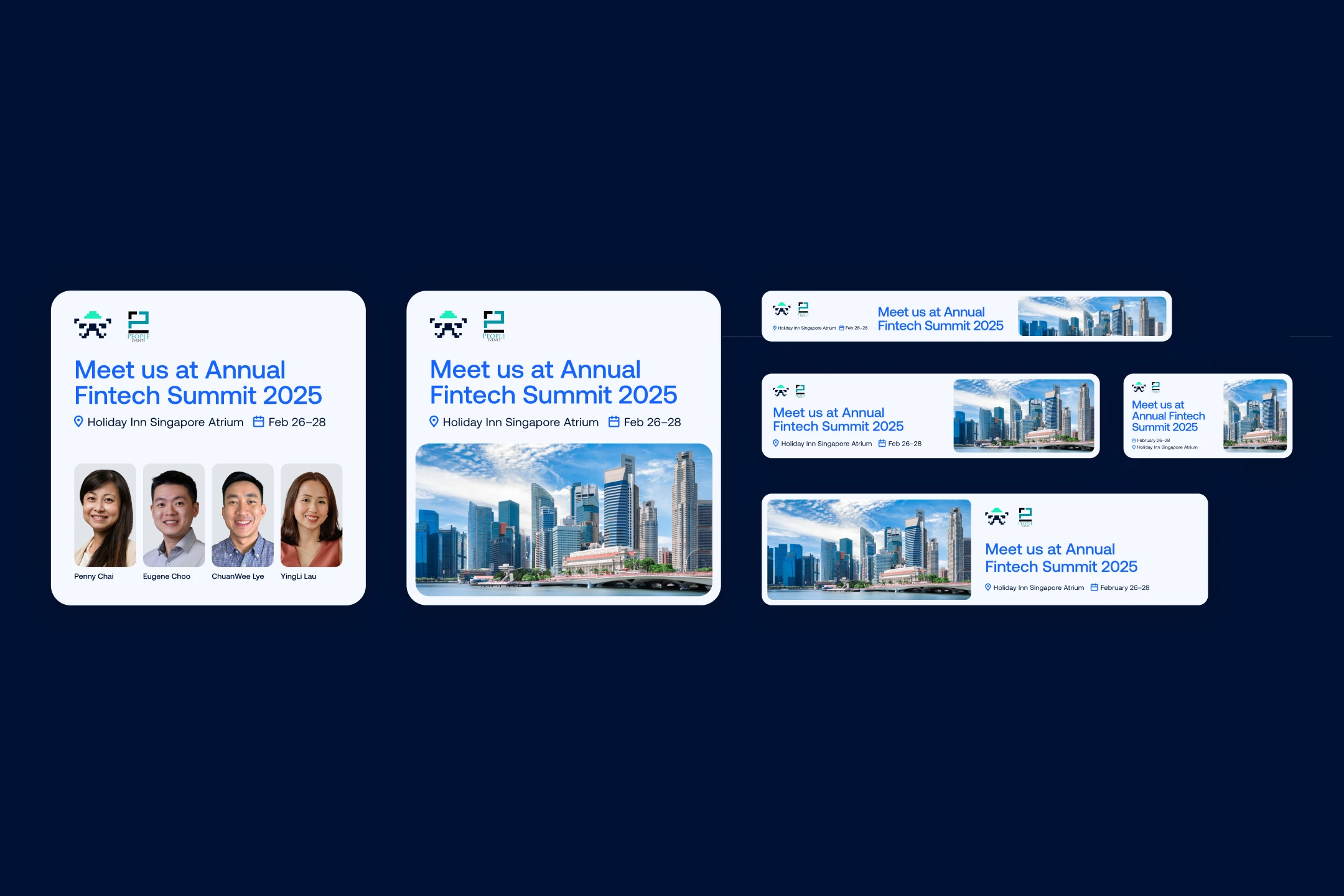
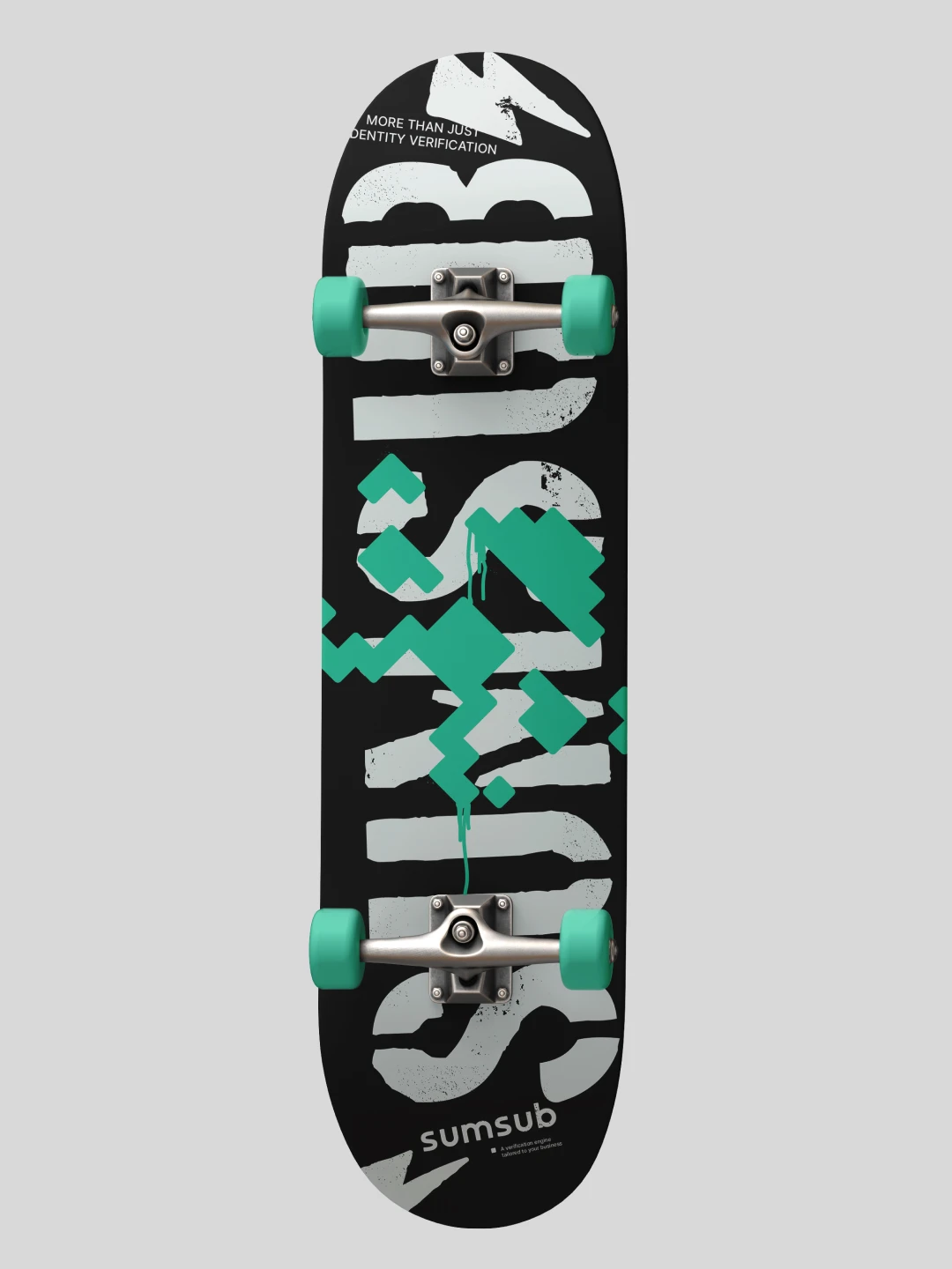
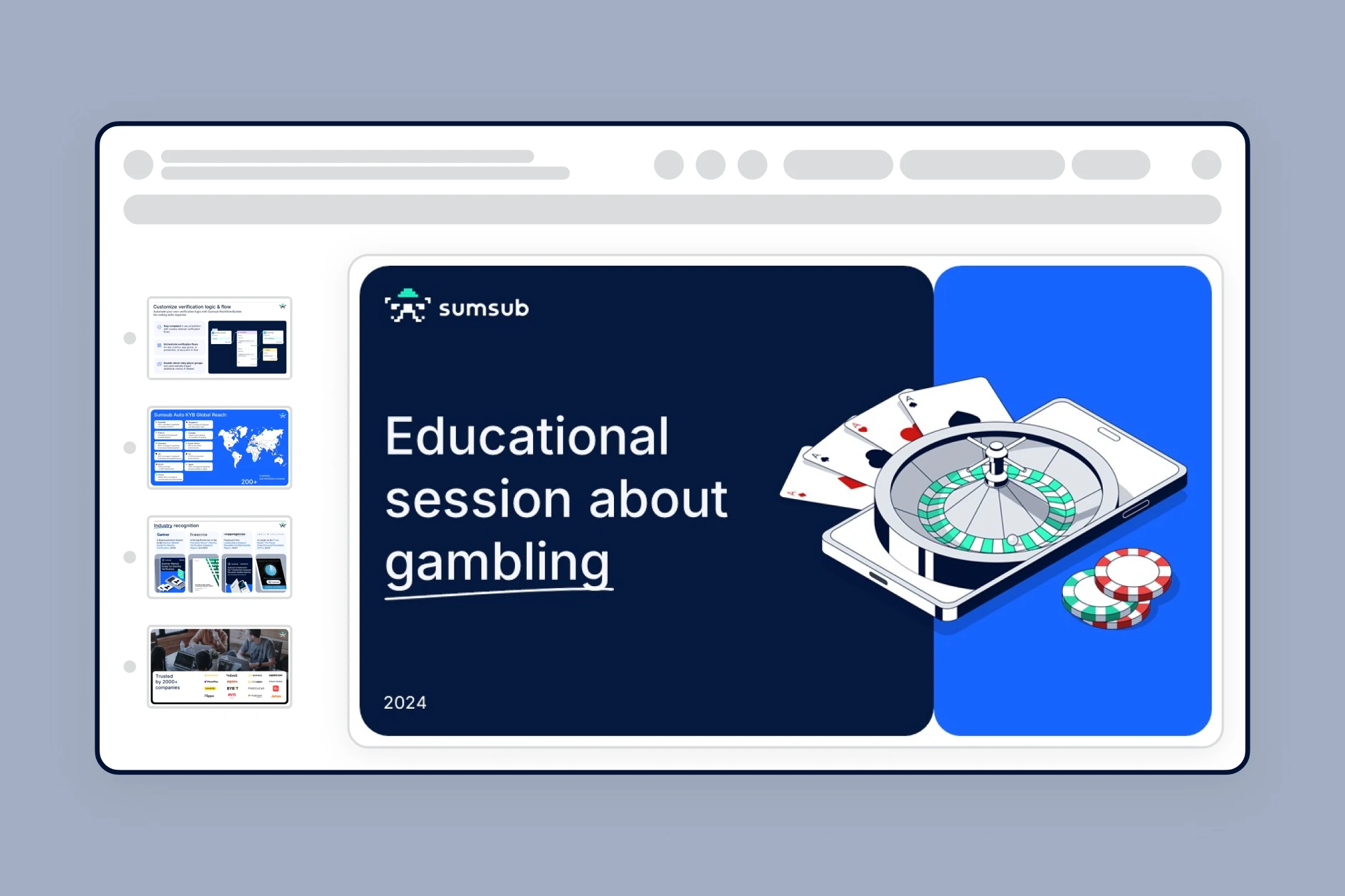
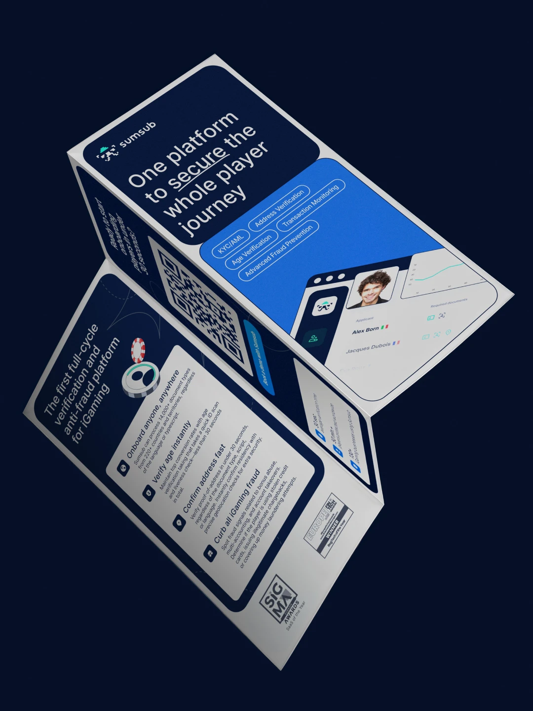
The pixel logo became the anchor. Its structure gave the brand its core idea—an identity built on digital pixels and bento blocks, a modular visual language reflecting the nature of the product: an all-in-one compliance platform you can configure to fit. The block-based grid scaled from a single banner to a full exhibition booth without breaking. The existing color palette was refined into a clear system. The bento blocks acted as a frame—consistent enough to be recognized, open enough to hold any creative content inside. This is easy to see across the marketing banner archive: the visual style is immediately coherent, yet no two campaigns look identical. For every sub-brand or product launch, we packaged the identity into concise Identity Passports—compact reference files that gave any team member an instant, clear understanding of how to work with that project visually. As the brand matured, AI became part of the creative process—as a collaborator for generating visual directions and analyzing briefs before strategy was set. In iGaming system it produced the 3D cubes, animation, and a consistent character style; in Crypto identity, nearly every image and 3D object. The system stayed open to evolution, and the brand grew with that openness. A huge thank you to every colleague and designer I built this with.

Sumsub rebranding[X]
Sumsub rebranding
About

Sumsub is an international AI-powered platform for identity verification and compliance (KYC, KYB, AML), trusted by global leaders like Binance, Bybit, and Duolingo. When I joined, the company was in the middle of rapid growth—400+ employees, international expansion, an enterprise-level client base—while the brand team had just three people and no visual identity system in place. The task was to build everything from the ground up: hire strong talent, establish a visual language, and make it ready to scale for years ahead.
Impact

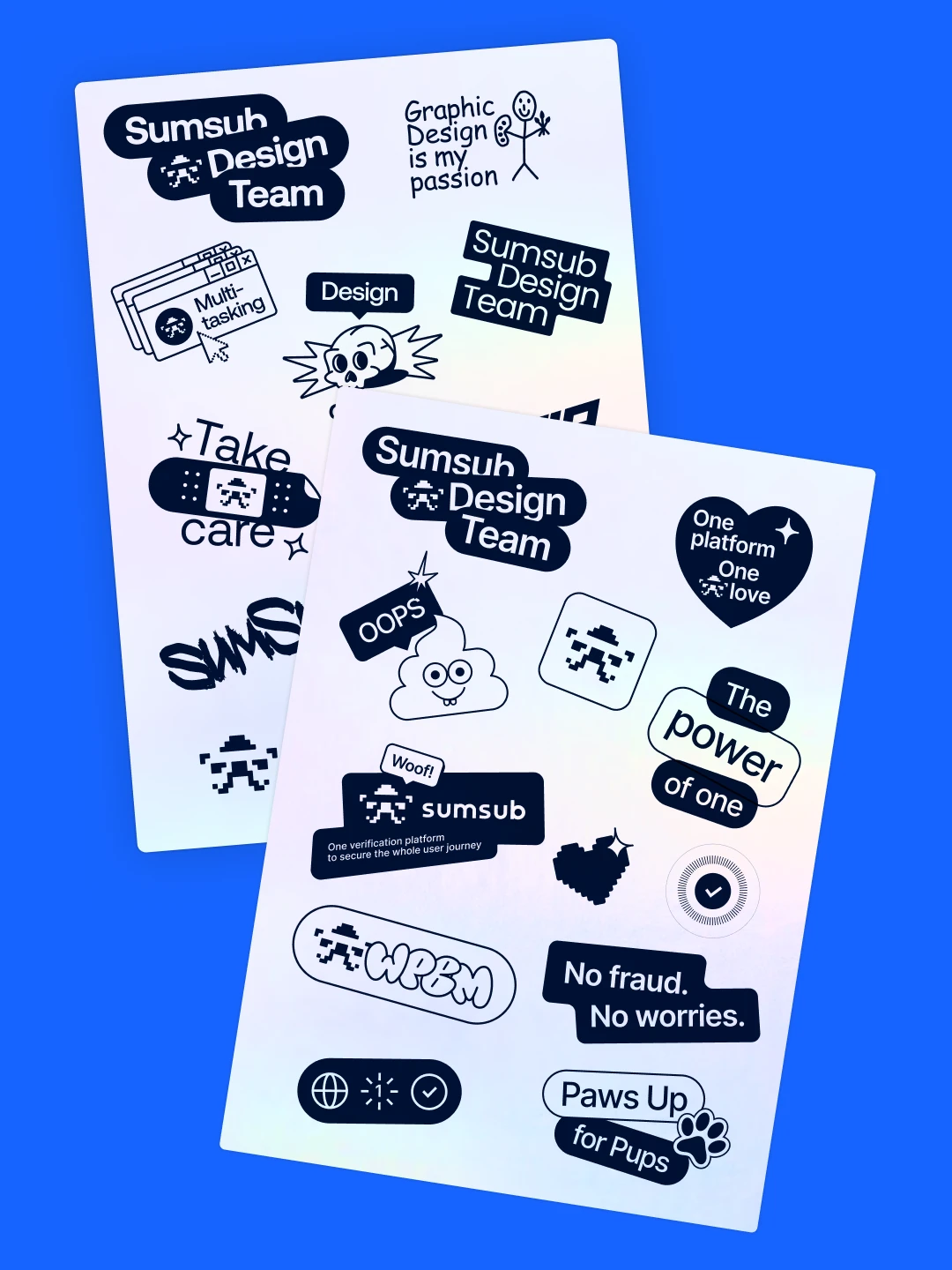
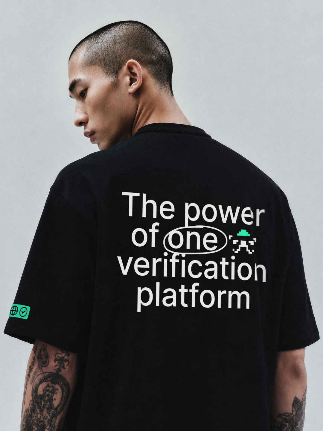
The brand grew with the company from 400 to 1000+ employees. Clients responded positively, social channels gained real traction, conferences filled venues, and the work earned international recognition. The Greenflag project is one I’m proud to have shaped visually—the brand packaging was my work, and it went on to win significant international awards. Instagram grew from zero to 30–40K followers, built together with the social and marketing team through consistent content and a strong visual identity that made every post immediately recognizable. Special projects like the Multiverse and Roadshow conferences ran at least twice a year each—each time filling the room and generating strong community engagement around Sumsub’s anti-fraud mission. Each required a full production cycle: booth design, screen content, presentations, merch. At live crypto conferences in Dubai and Singapore I worked hands-on—preparing booth materials for print, producing video for screens, and creating custom merch on-site. Hand-painted t-shirts and tote bags drew queues, sparked social buzz, and opened direct conversations with clients. The identity became distinctive enough that competing startups began copying it. That’s the clearest measure of visual trust a brand can earn.
Team

I led the brand team at different stages of the company’s growth—both a larger brand team and a smaller, focused creative unit at different points. At peak the brand team reached up to 10 people, covering visual and motion design. The team was international; mentoring and cross-departmental communication happened in English. My approach was consistent: thorough portfolio reviews with defined growth goals, craft-focused design mentoring, task planning, and inter-team coordination. I ran internal brand surveys to map perception and identify improvement areas. The designers I hired became the reliable core of the brand team—highly agentic, proactive, and capable of owning the most complex challenges. I’m genuinely grateful to each of them for the trust and the work we did side by side—never dropping the quality bar, regardless of deadlines or the challenge at hand.
Challenge

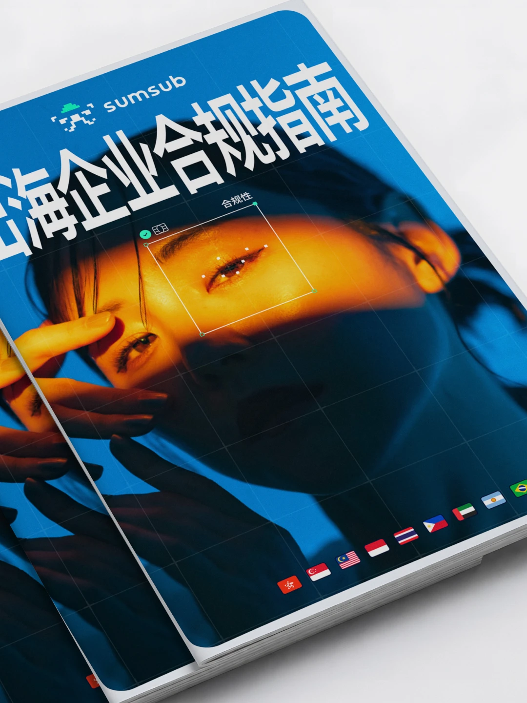
B2B compliance platforms tend to default to the same visual register: corporate blue, banking-grade seriousness, templated type. Sumsub already had one recognizable asset—a pixel-based logo—but nothing existed around it. No color logic, no layout principles, no unified approach across channels. The identity needed to work across dozens of contexts—conference booths, ad banners, sub-brands, special projects. It had to sustain the pace of a marketing team producing assets at high velocity. And it had to remain instantly recognizable as Sumsub, whether on a trade show wall in Dubai or a 300px social banner.

Solution

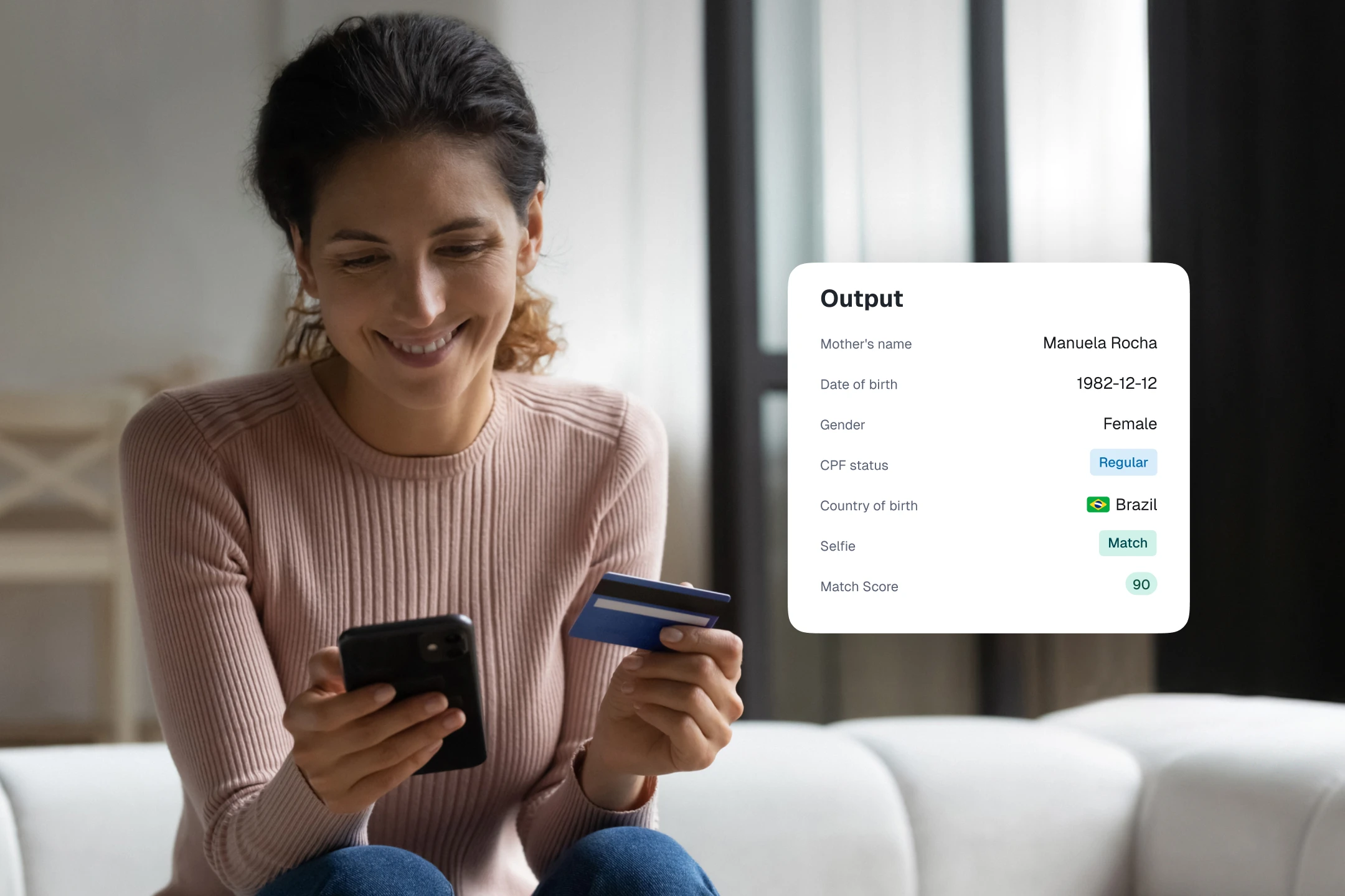
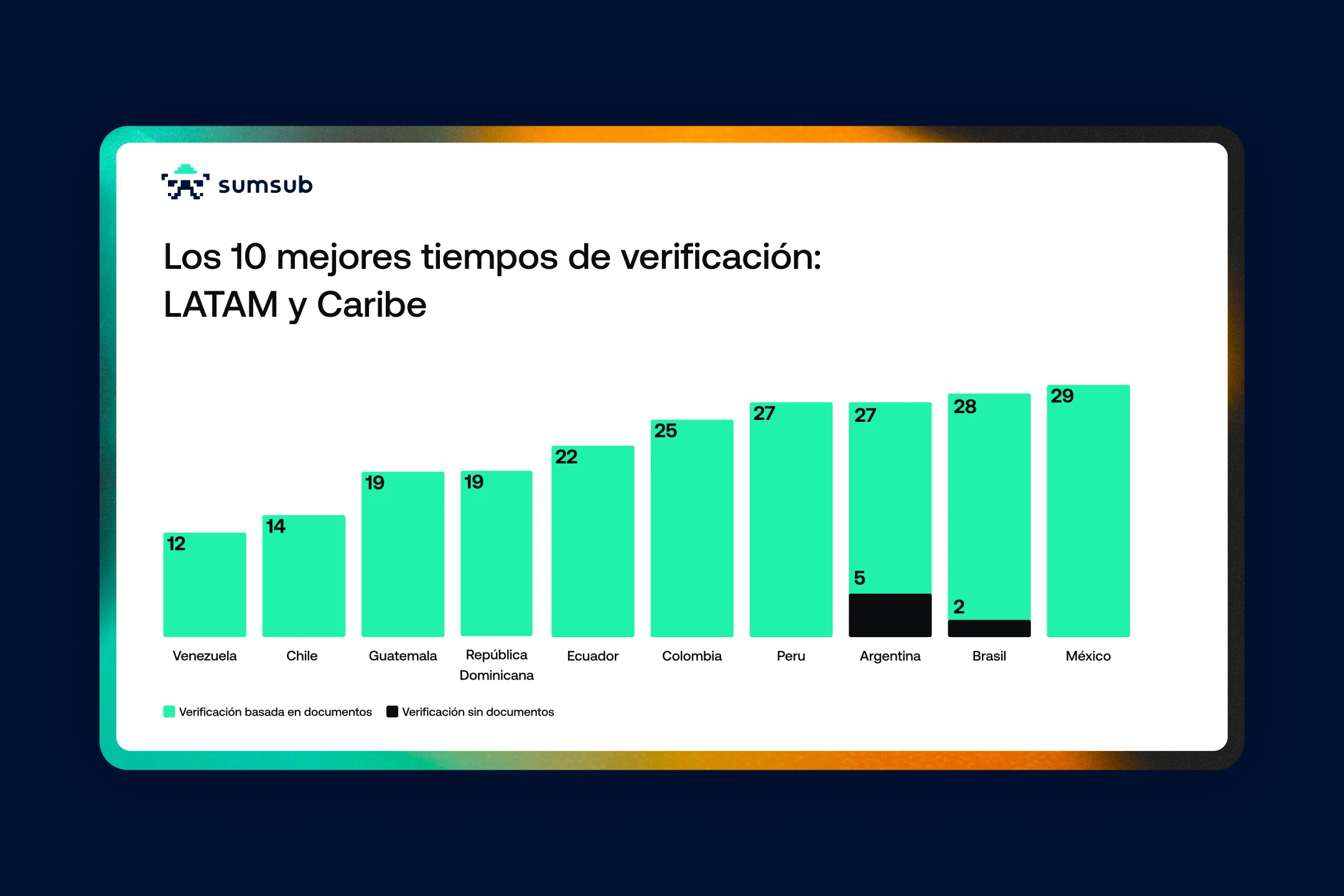
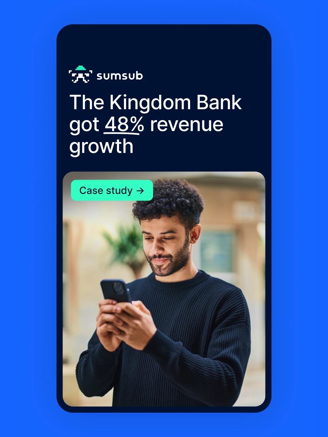
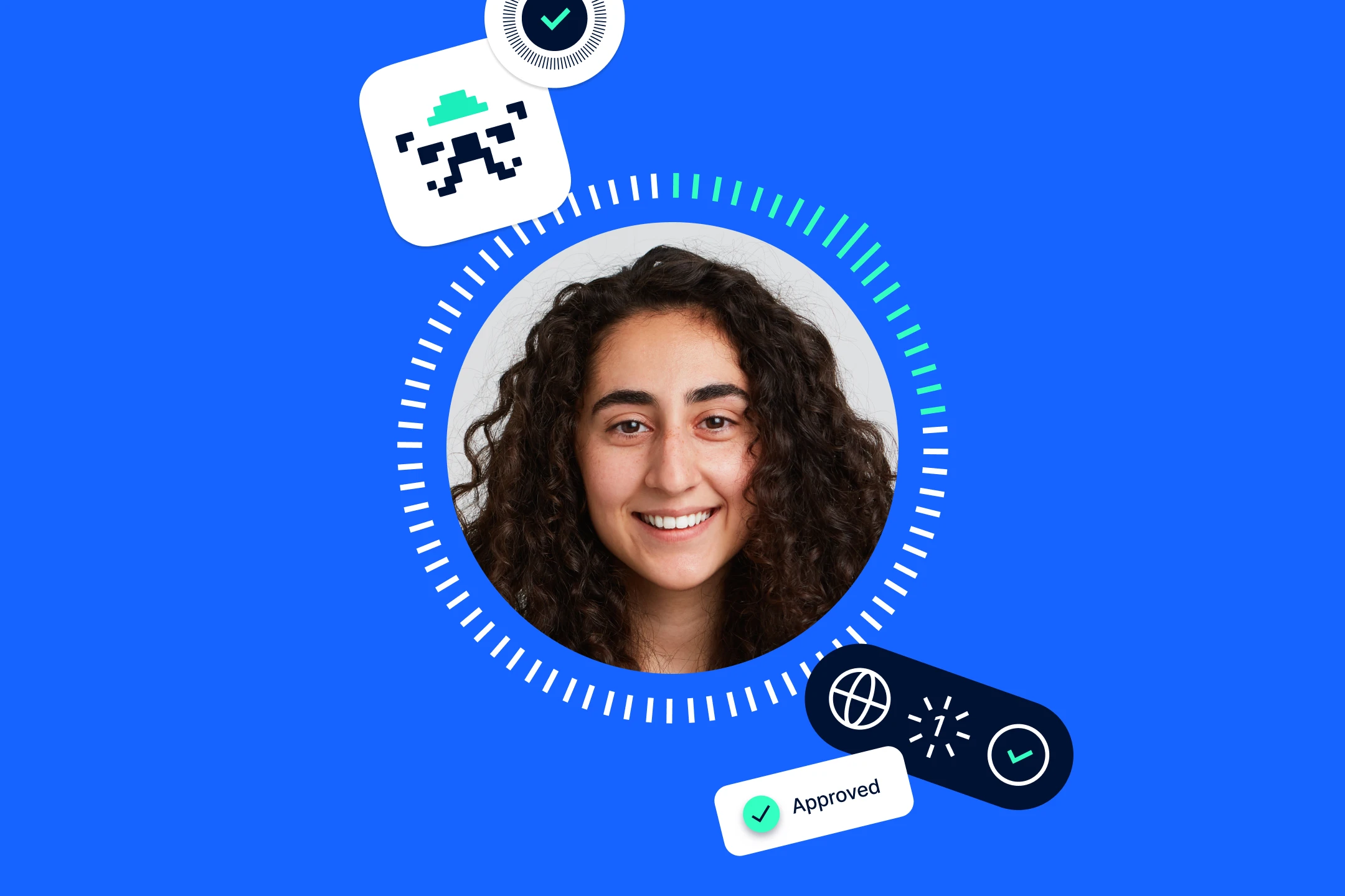
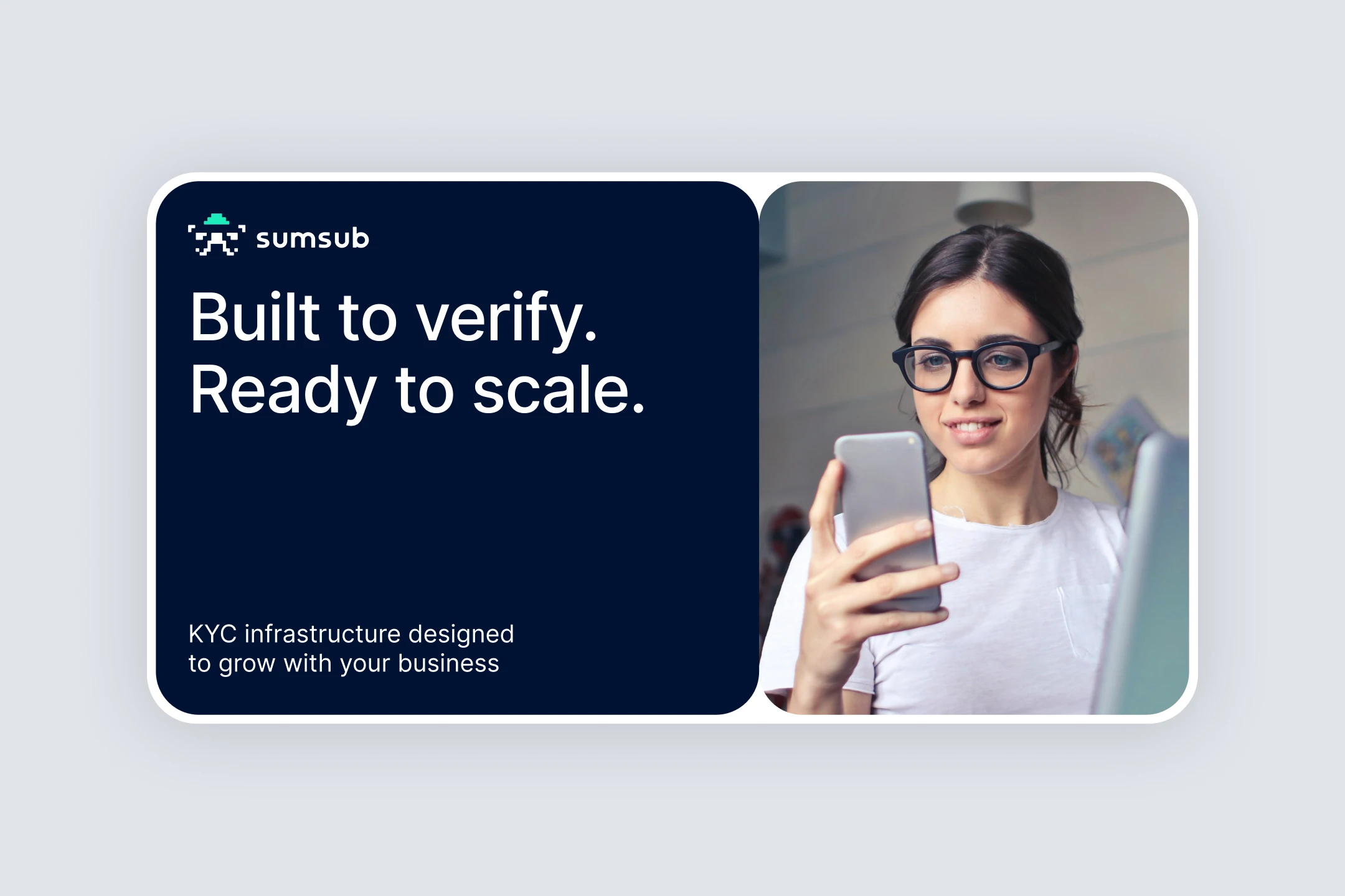
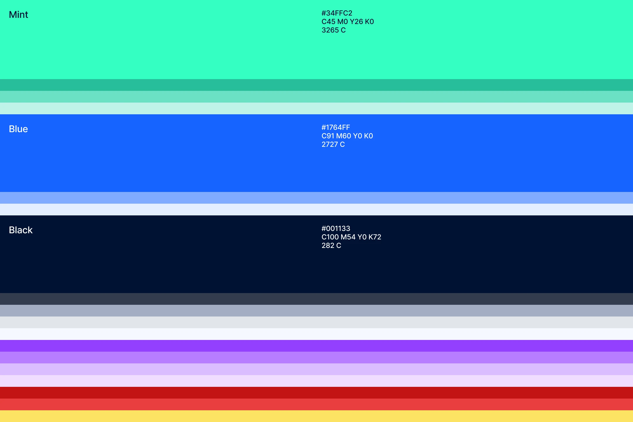
The pixel logo became the anchor. Its structure gave the brand its core idea—an identity built on digital pixels and bento blocks, a modular visual language reflecting the nature of the product: an all-in-one compliance platform you can configure to fit. The block-based grid scaled from a single banner to a full exhibition booth without breaking. The existing color palette was refined into a clear system. The bento blocks acted as a frame—consistent enough to be recognized, open enough to hold any creative content inside. This is easy to see across the marketing banner archive: the visual style is immediately coherent, yet no two campaigns look identical. For every sub-brand or product launch, we packaged the identity into concise Identity Passports—compact reference files that gave any team member an instant, clear understanding of how to work with that project visually. As the brand matured, AI became part of the creative process—as a collaborator for generating visual directions and analyzing briefs before strategy was set. In iGaming system it produced the 3D cubes, animation, and a consistent character style; in Crypto identity, nearly every image and 3D object. The system stayed open to evolution, and the brand grew with that openness. A huge thank you to every colleague and designer I built this with.

Scroll to top